


A great landing page does not only look good, but also converts well. Firstly, it makes its purpose absolutely clear, and then encourages the viewer to take the desired action. Below are some brilliant landing page examples that fit the definition, and the reasons that make them work. (The list follows no particular order of merit).
Shopify
Shopify is a complete eCommerce solution which enables you to showcase your goods and sell them efficiently.
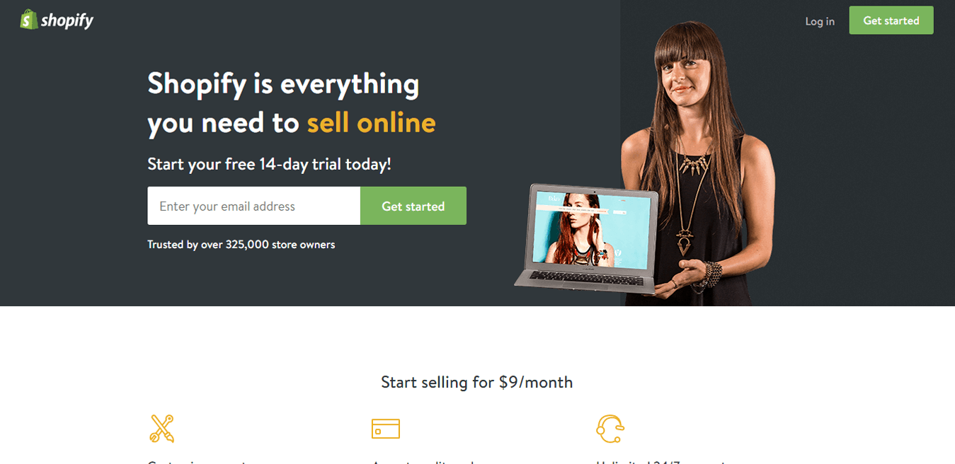
Why is this landing page on my list?
- Great use of the image – The image instantly gives you an idea of what the page is about – it seems like something that can help you set up your online store. A smiling person proudly displaying her online store certainly conveys the point, while grabbing the attention.
- Clear headline – The headline is very clear. ‘Everything you need to sell online.’ To a person who isn’t really tech-savvy, the task of setting up a completely functional online store might seem overwhelming. There are several questions in their head, but then they land on this page. A headline that tells them that they’ll get “everything they need” in one place comforts them. This comfort, clubbed with the offer of 15 day free trial would encourage them to take an action.
- Highlighting the important info – Sell online is bright orange, giving it a contrast and highlighting the most important piece of information.
- Minimal form – Shorter forms = more form fills. Seems obvious enough. Shopify has, very intelligently broken down the signup process into steps, and uses just one field on the main landing page.
- Trust – Shopify has lots of users worldwide, and they have showcased this number on the landing page just below the form. It alleviates the visitors’ fears some more, because now they have the confirmation that there are hundred thousand shop owners just like them using the platform. It acts as a conversion catalyst.
Udemy
Udemy is a marketplace where you can learn or teach new skills. Currently it has over 45,000 courses from highly reputed instructors.
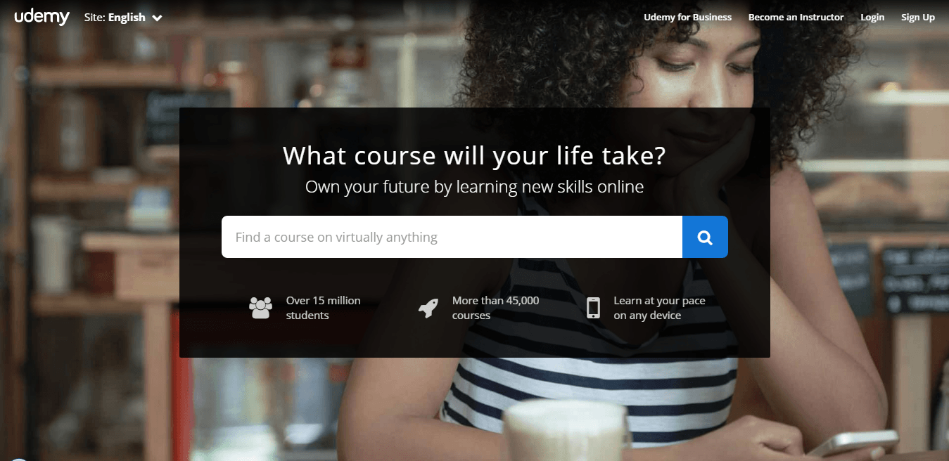
Why is this landing page on my list?
- Emotional trigger in headline – A simple but brilliant play on words “What course would your life take” makes an instant connection with the potential learner, strengthening their will to change the course of their life by learning something new. The equally strong sub-headline with another strong emotional trigger (urging students to control their own life) supports the headline brilliantly.
- Search form – It’s a no nonsense form. They are just letting the learners find what they want to learn. Once they find the course, they can enroll – it’s as simple as that. Udemy does not ask for a signup straight away, for the simple reason that it doesn’t make sense.
- Benefits – The benefits are laid out nicely just below the form. It clears all the doubts which a visitor may have in his mind. Trust, variety of options and ease of learning is illustrated beautifully with the icons.
- Background image – A student looking down directs your attention to the form. Doesn’t it?
Basecamp
Basecamp is a web-based project management tool launched in 2004. It has a 30-day free trial and it is free for teachers.
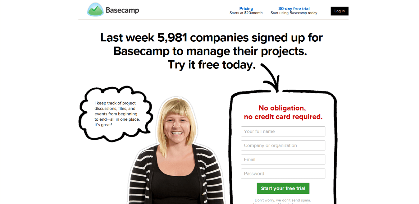
This is one of my favorite landing pages of all time. They have changed their landing page recently, but I have retained the older version on my best landing pages list.
Why is this landing page on my list?
- Trust-worthy headline – People trust what other people say about the brand more than what a brand says about itself. Basecamp stamps its authority with a very strong number (5,981) in a very small time-frame (one week) right on the headline.
- Real person’s image – No stock image can match the credibility of a real person’s face. Basecamp uses a customer’s image with her testimonial, making the page look infinitely more genuine than it would otherwise have.
- Encapsulated form – Encapsulation directs our attention to the form, making it look very important. The form looks unconventional, capturing our attention, but fits right in with the overall design of the page.
- Intuitive colors – Red makes us pause to read no credit card required and green gives us a go ahead with a free trial. Brilliant use of colors.
LeadSquared
LeadSquared is a marketing automation and CRM platform which helps businesses amplify their lead to deal conversions. It has over 12,000 users across the globe.
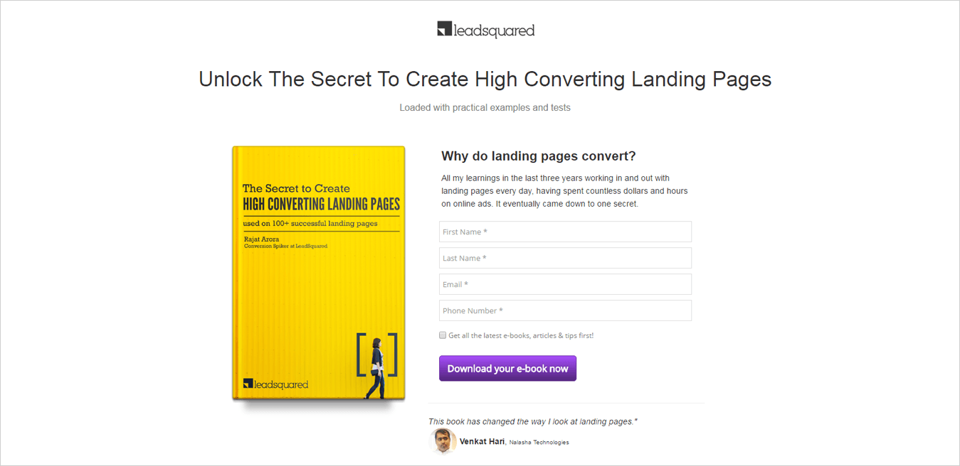
Sorry for the shameless plug. ? It does seem odd to have a landing page that I designed on my own list. But this one converted very well for us (over 60%) so I thought of keeping it in the list.
Why is this landing page on my list?
- Powerful headline – Power words like Unlock and Secret makes a visitor curious and encourage action.
- Minimal design – The minimal design and a plain white background gives a very good readability to the page. We tested the page with different background but the black and white variation worked the best.
- Contrasting call to action – The purple call to action goes perfectly with the yellow book cover. The copy on the button is very clear.
- Trust – A reader’s testimonial right below the call to action reinforces the call to action.
Okdork
Ordork is a website run by Noah K who blogs about marketing, startups, self-exploration, and tacos.
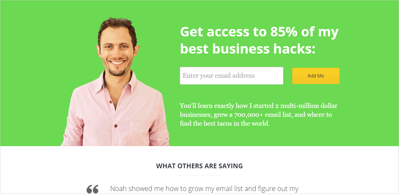
Why is this landing page on my list?
- Smile – Smile is a very powerful emotion and Noah knows it. He greets everyone with a big smile on his blog.
- Curiosity – Who wouldn’t want to know 85% of his business hacks. Excellent use of curiosity. Why 85?
- Trust and humor – Just below the form, you can see exactly why you should care. Started 2 multi-million dollar businesses, grew a 700,000 email list and likes tacos. ? He backs it up further with a testimonial below.
- Color – The green color looks very soothing to the eyes, subtly indicating growth. The yellow call to action compliments it perfectly.
So, this was my list of best landing page examples I have seen on the web. I hope you have learnt something new about what makes a great landing page great. Please share it if you like it. It will inspire us to create more content like this.
[Also read: How we increased conversions by 39% with these landing page design hacks?]
(If you want me to review your landing page, give you tips on improving it, or write about it, if it’s already an awesome, high-converting page, please write to me at rajat.arora [at] leadsquared.com)


