


The driving force
What if a customer sees an attractive hoarding, enters the restaurant, checks the menu, but doesn’t order food? Or sees a great movie trailer, reads all the good reviews but still isn’t motivated enough to watch it.
You need a force that drives the user to take that final action – of ordering the food or booking that movie ticket. How would you get this driving force?
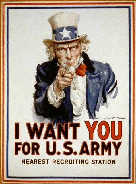
You must be familiar with this very popular portrait of “Uncle Sam” used by the U.S. in WWI to encourage military recruits. This might as well be the most popular poster of all time as over 4 million copies were printed in a year. But what makes it so successful? How it encouraged all of America to stand up and do their part during the war? Design, maybe?
Again, It is a copywriter’s job to create compelling actionable offers, but the design also plays its part in providing the driving force to act. Like in the above example – Uncle Sam pointing figure directly at you, staring at you. It feels he is actually talking to you. Would the copy have the same effect without the illustration?
In the remaining part of the book, we’ll see how design can help motivate action.

with
PART I
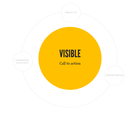
VISIBLE CALL TO ACTION
Call to action or CTA is an instruction to the audience to provoke a response. A visible call to action button is the action center of your marketing campaign enabling you to encourage action from your targets. This is what you want your visitor to not miss. Your call to action should be:
- Contrasting
- Above the fold
- Color intuitive
It is also important to make your call to action look like a button. We are used to clicking buttons. It gives us the cue that we are supposed to do something now (take an action).
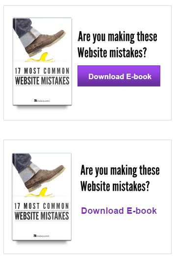
1) Keep it contrasting – Squint test

Stand a little far away from the monitor and squint your eyes. Do you still see the call to action button clearly? This is a popular test to gauge the effectiveness of the call to action.
Squinting eyes
The last one fails the squint test because of the lack of color and size contrast. You can use the color wheel to find the right color contrasts (the opposites) to encourage action on your CTA buttons.
2) Keep CTA above the fold
Keeping it above the fold increases its chances of getting clicked. If your page is long, repeat the CTA below the fold as well.
A button like call to action nudges the visitor to click it.
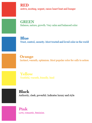
3) Use Intuitive colors
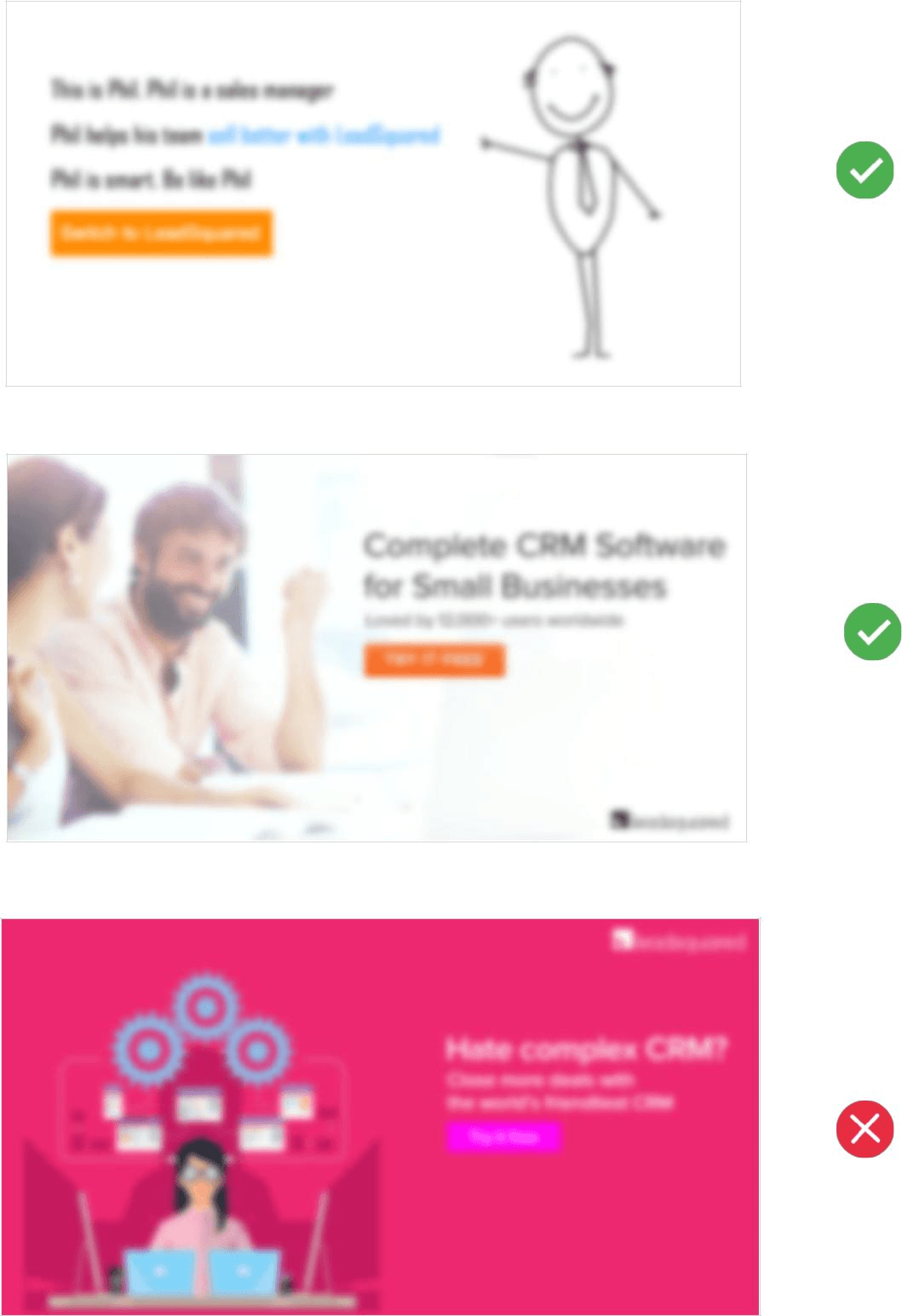
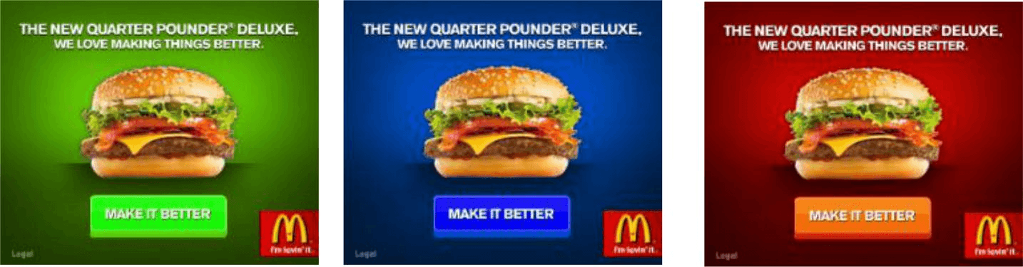
Colors deliver information really quickly. They can also change the meaning of the message, influencing the buyer’s decision making. For example, we see red on a traffic signal and we stop. We see green and we feel we are good to go. We perceive color before we absorb any other form of information.
McDonald’s banner ad
Check out the ads below. I have changed the color tones of the McDonald’s banner ads
A link makes it looks less compelling to click.
You will notice that each of them are highly saturated (a lot of color brightness) and catch attention but something looks wrong in the altered colors, because it does not evoke the right type of emotion.
The green banner makes the burger look like a vegetarian one.
The Blue banner gives the perception that the burger would be cold.
The red just fits right.
The red color is associated with most of the fast food companies as well because it increases heartbeat and is proved to increase hunger.
Colors have been used in design for centuries to add meaning. You should also use them properly to have the right kind of effect.
PART II
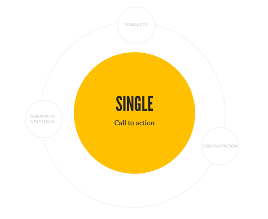
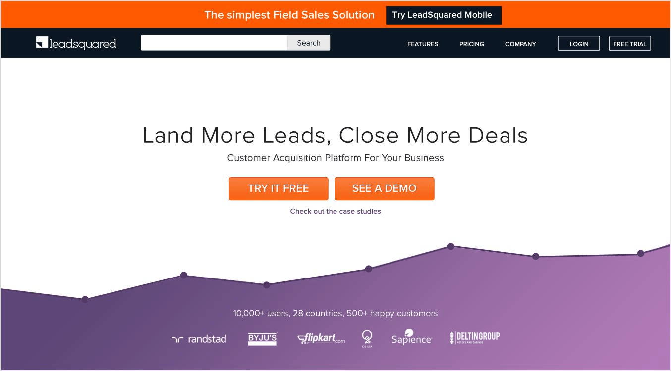
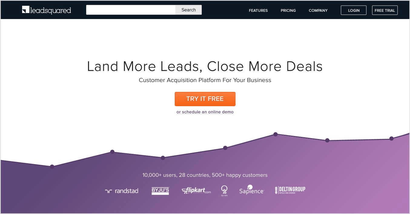
SINGLE CALL TO ACTION
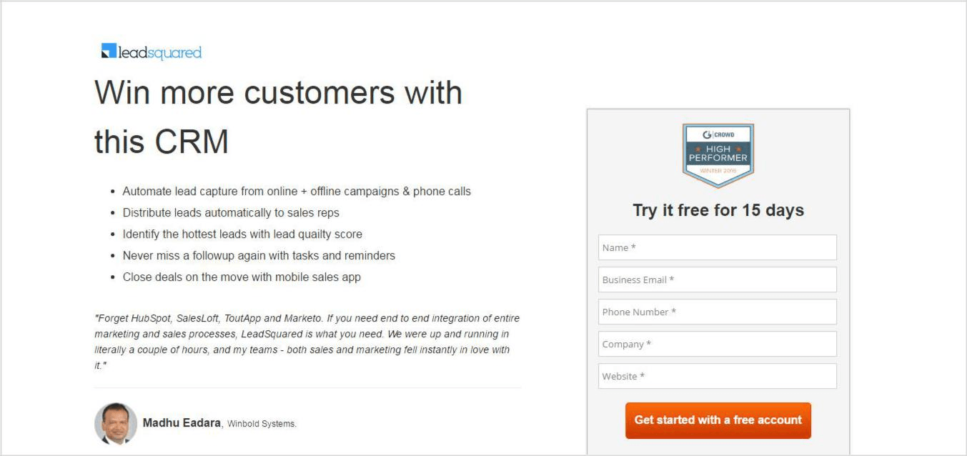
It is important to understand that too many choices can create anxiety and make it difficult for the visitor to decide, which eventually may lead to no action at all.
Multiple choices create anxiety
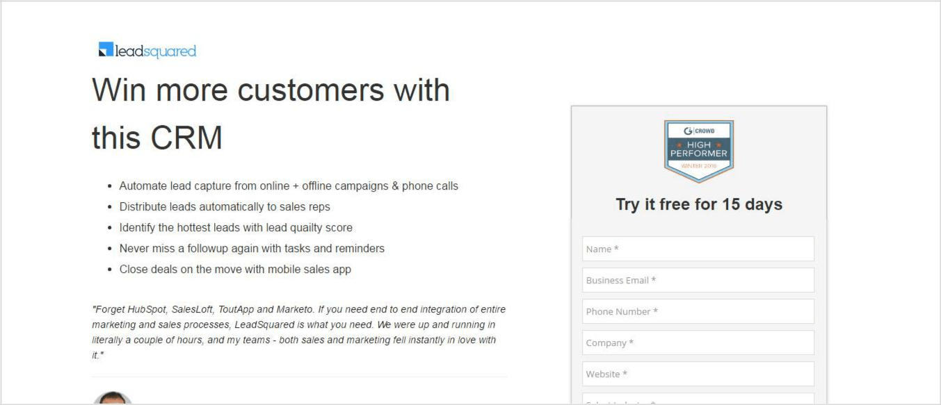
Single choice makes it easy to act upon
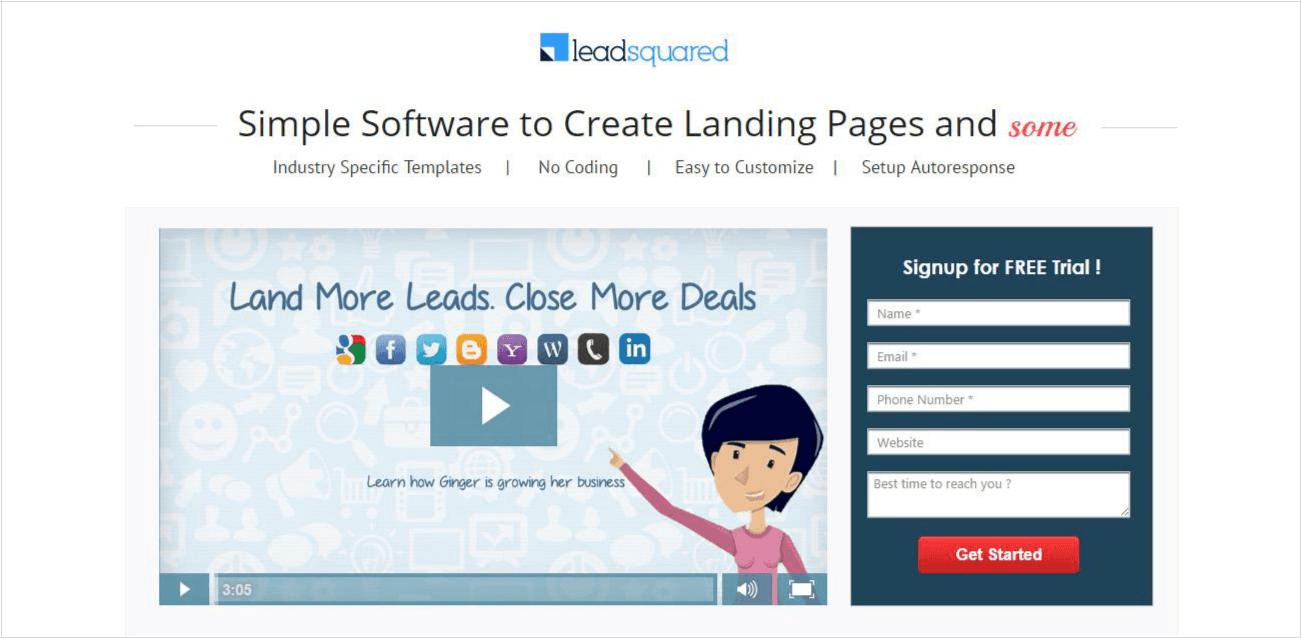
LeadSquared homepage
PART III
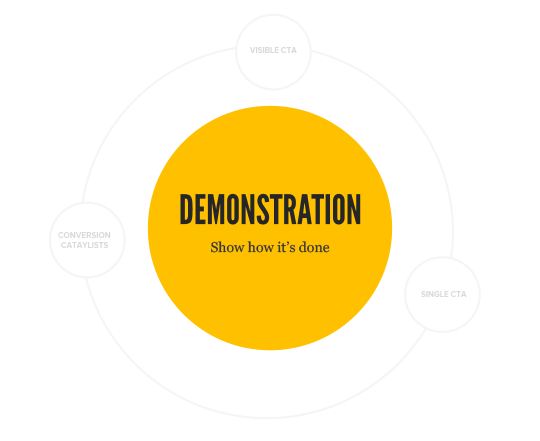
DEMONSTRATE HOW IT’S DONE
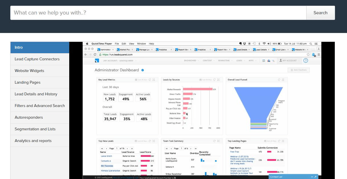
Showing something in action itself promotes action. The longer the visitor watches your product/service in action, the more likely he is to take the next step.
A few months ago I saw a Dholki (popular Indian double sided drum) seller just outside work. I did not intend to buy it. But, he played it so well that it caught my attention (just attention). He asked me to try it. I did, with zero buying intention. To say “no” with conviction, I told him that the quality didn’t look good enough, and it would break. In response, he placed the dholki on the ground and stood on top, putting all of his 80 Kg frame on it. I couldn’t say no after that.

CTA above the fold tells a visitor to take the next step.
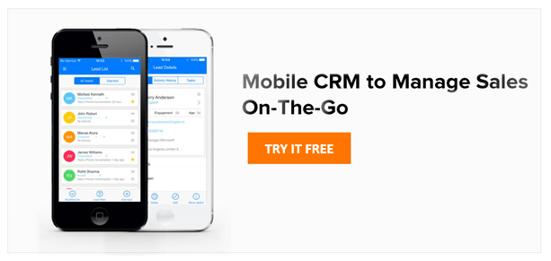
Demonstrate your offering and make it easier for a visitor to visualize what it can do for them and encourage them to take the next step. That is the reason for the popularity of demo videos. You will often find them on the home pages and the landing pages.
Example of product demonstrations
CTA below the fold decreases its possibility of getting clicked.
PART IV
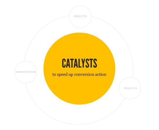
ADDING CONVERSION CATALYSTS
Catalysts increase the rate of reaction. In this particular case, the ideal reaction is when a visitor acts on your CTA. There are a few tricks which can help a visitor take that action quicker.
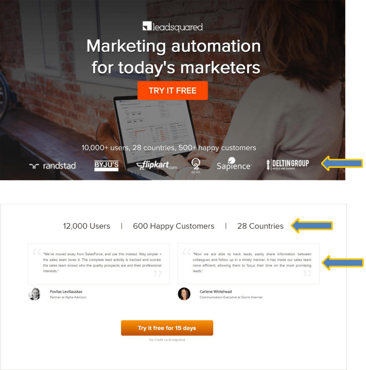
- Adding trust elements – If you make a claim, prove it by adding trust elements on the page. People like facts and social proof. They are powerful triggers and help convince the visitors to take the next step.
- Creating urgency – The fear of missing out (FOMO) as they say in We are more keen on saving a dollar than earning it. It is a powerful action trigger which is based on the loss rather than the gain.
- Reference points – Reference points tell the visitor where they are, and how long will it take them to complete the process. It makes the action intuitive and encourages conversion.
In the next few pages, we will see how to place these conversion catalysts at the right place to maximize their effect.
1) Adding trust elements
Trust elements like reviews, testimonials, awards, client lists, press coverage lists assure the visitor that he is not alone in choosing your
product. Make sure to keep them near your call to action.
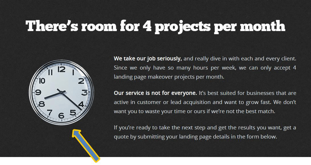
2) Adding urgency
Limited Offer, Till stocks last, Limited Time are some examples of urgency. Check below how the warning sign and clock adds to the urgency to message.
Pain from loss > Pleasure from Gain
See how Quicksprout uses it
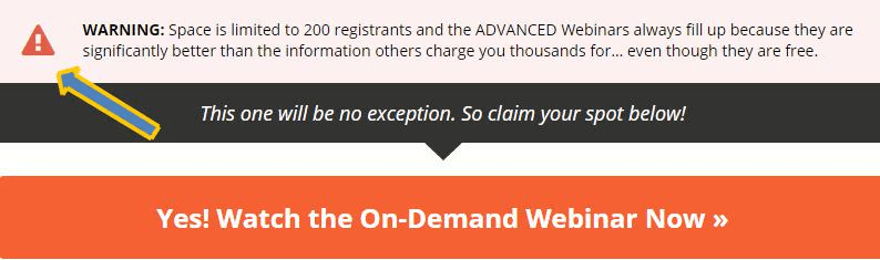
Another example from landingpagemakeover.com
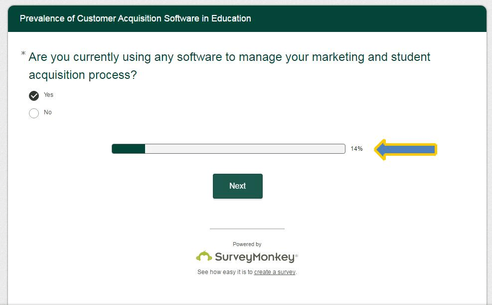
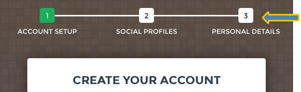
3) Point of reference
While doing a complex task, people like to know where they are. More importantly, how much work is still left. Making it clear and intuitive avoids frustration and helps a visitor to stick, increasing the chances of conversion.
An example of point of reference in Survey
Product video on the support portal
Multi-step form indicating 3 steps
Overview video on the landing page


