


Our last webinar on Best Practices of designing conversion optimized Landing Pages was a great success. It not only saw outstanding participation, but was such a big hit that we had to do an encore of the same. We recently held another webinar and the topic of discussion was “How to Create Conversion Optimized Landing Pages with HABITS framework”. Some brilliant questions were posed at us and a few of them have been compiled in the form of a FAQ.
Question 1
Is it good to use calls-to-action multiple times on a landing page?
One of the first and foremost landing page basics is to have one primary CTA per landing page. For a well optimized landing page, calls-to-action should direct visitors onto one particular course of action. If there are too many CTAs in a single landing page, the main objective may not stand out and may lose its importance, thereby increasing bounce rate.
However, if it is absolutely necessary, you can also have more than one CTA on your landing page. This again entirely depends on your offer and campaign.
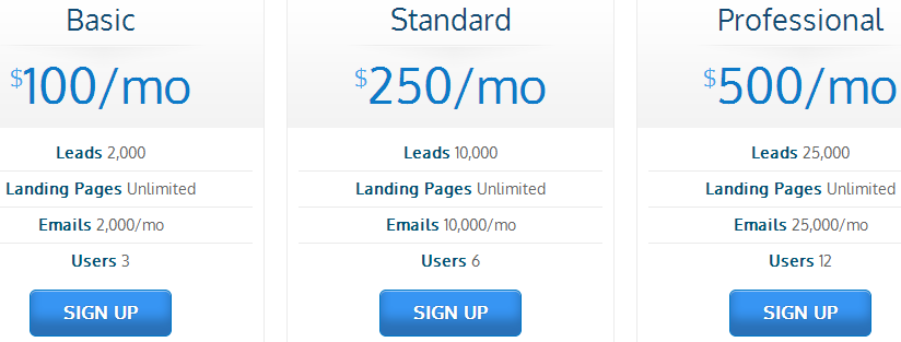
For example, like you can see in the image below, there are 3 CTAs on the same page. This is so, because it shows the pricing details of our product. As soon as a website visitor decides which plan he wants, he can click on the ‘Sign Up’ CTA and buy the deal immediately.
You can also you a secondary CTA beside the primary CTA.
Here’s an example for this. Say, a college has a registration form on its website and its main goal is to get students to fill in their details on the form. So, the primary CTA has to be around the sign-up form. But, what if the landing page also offers a ‘Download’ for the college brochure, then a secondary CTA has to be placed for people who wish to know more about the same.
The above example can also justify the statement that you can have one CTA above the fold and another below. You can have the primary CTA around the form fill above the fold, the first half of the landing page and the secondary one, the ‘Download’ CTA below the fold, the lower half of the page.
Question 2
What are some of the best practices for a call-to-action (CTA) button?
A good call to action should by all means ‘call’ and prompt a website user to take an ‘action’. It is one of the most important part of a landing page and should not be neglected. It can be a button or a text that will aid in eliciting a response from your website visitors. You can take a look at this blog for best practices for call to action buttons that convert.
Question 3
Is it good to add full description on a landing page?
NO, do not add too much information on your landing page. The content that you mention on your landing page should be
a. Straight to the point
b. Show what benefits a website user will get
c. Powerful enough to drive him to take the next step
d. Should have the right keywords so that the website user can find you easily through organic search
e. You should ideally add more information about your product and company in the 2nd fold of your landing page
You can take a look at this article for tactics for compelling landing page copy.
Question 4
Which layout is preferred for a landing page – two columns or a single column?
This completely depends on what you are offering and the visual elements present on the landing page. However, normally 2 columns is considered better than 1. Just make sure that you A/B test single column landing pages against two-column landing pages to see which one is faring better.
Question 5
Should I link my home page to a landing page?
Yes, it is a good practice to link your website home page to your landing page.
For example, a visitor who wants to get more information about your product/service should be taken to a landing page via a strong call to action where he can fill the lead capture form and connect with you.
Question 6
Should there be a navigation on Landing Pages?
Ideally, there should be no navigation bar on a landing page. Its is highly distracting.
But, if you want to have a navigation tab, place your company logo on the landing page and link it to your website. Another practice is to keep the navigation bar really small and at the very bottom of the page. (However, we recommend that you don’t have a navigation bar at all.)
Question 7
What is an ideal page that a user should see after clicking on the ‘Submit’ button?
Once a website user has filled in his details, he should ideally see a ‘Thank You’ page. This page should have the next course of action from your end, like, ‘Thank you. Someone will get in touch with you soon’ or ‘Thank you for downloading this EBook’ etc. You can also provide a link to your website home page or blog on this page. If not a page, then a pop-up thanking the user also suffices.
You may also take website users to your homepage directly after form fill, but this comes with a drawback. They may get confused as to whether the form fill happened or not.
Question 8
Should you optimize a landing page for SEO with keywords?
Yes, you should place keywords in your landing page so that its is searchable, but do not stuff keywords deliberately. Also, add the keywords to your images on the landing page.
Question 9
Is it a good practice to have a phone number on a landing page?
It is a very good practice to implement a phone number call to action on a landing page. It makes it easy for visitors to take an action immediately. If you want your website visitors to know you, why not make things easy for them to help them get in touch with you directly? By strategically placing a phone number, you will increase your chances of getting more leads.


![[Webinar] Sales Automation 101: Unclog your Sales Pipeline](https://www.leadsquared.com/wp-content/uploads/2024/04/automation-webianr-popup.gif)