


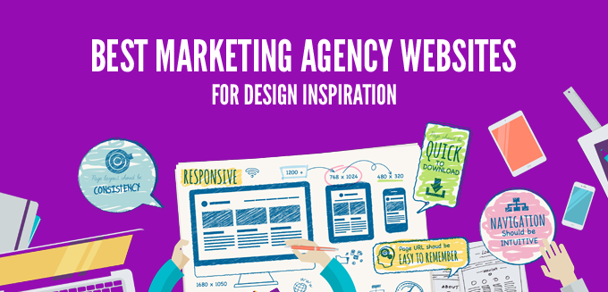
This year I reviewed hundreds of landing pages and websites. Surprisingly, despite the continuous emphasis on the importance of good websites, majority of the ones I saw, failed to get their point across. But among the chaos of mediocrity, I also saw some stunning ones that tempted me to write this post. Below is my list of best marketing agency websites to inspire you in 2016. Hopefully you can learn a few things from them.
Before we move ahead, let’s remember that a website’s purpose is not to win design awards, but to win business, and that’s what we’ll base our list on. On, that note, here’s the list.
1. ConversionXL
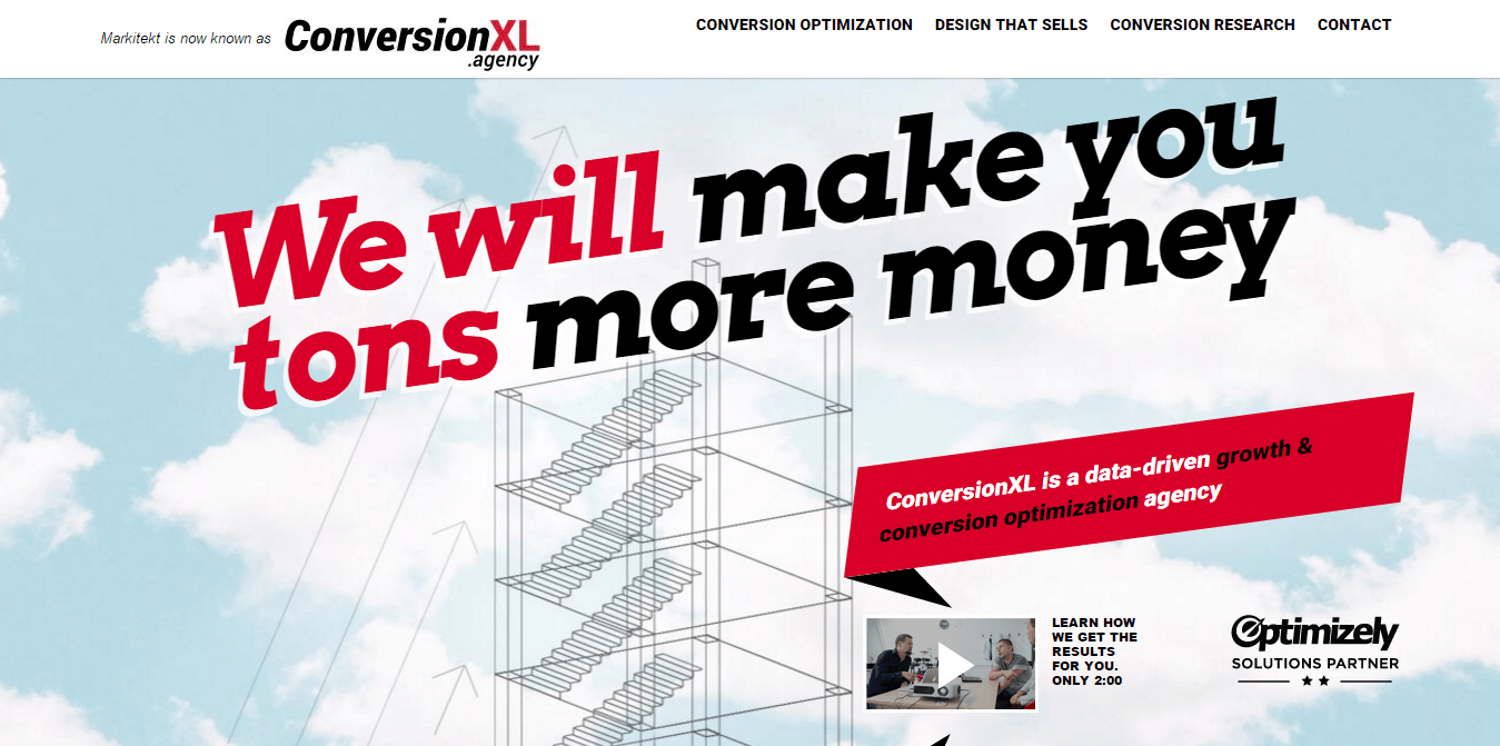 No doubt, ConversionXl is on top of the list. They provide conversion optimization and design services, and are led by Peep Laja, one of the best conversion optimization experts on the planet.
Why is conversionXL on top of this list
- Headline – Instead of bragging about the services they provide, the headline talks about their audience’s pain points. Why is anyone even here – to make more money! That’s what they promise to solve –we will make you tons more money. Clear, emotional and loaded with benefit.
- Video – In 2 minutes, a video conveys a message more clearly than two-pages worth of written content, and that’s what they are doing here. You can also see how the red banner above it points towards the video providing a visual cue.
- Breaking the pattern- The horizontally tilted headlines and the banner above the video immediately catches attention.
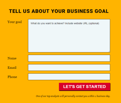
- Repeated form all along the page- It is a really long page, which might affect conversion rates adversely. But they have kept forms at the most motivating places. Thrice in the whole page.
2. Gyro
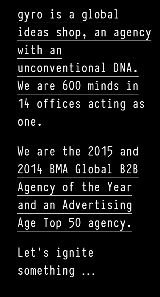
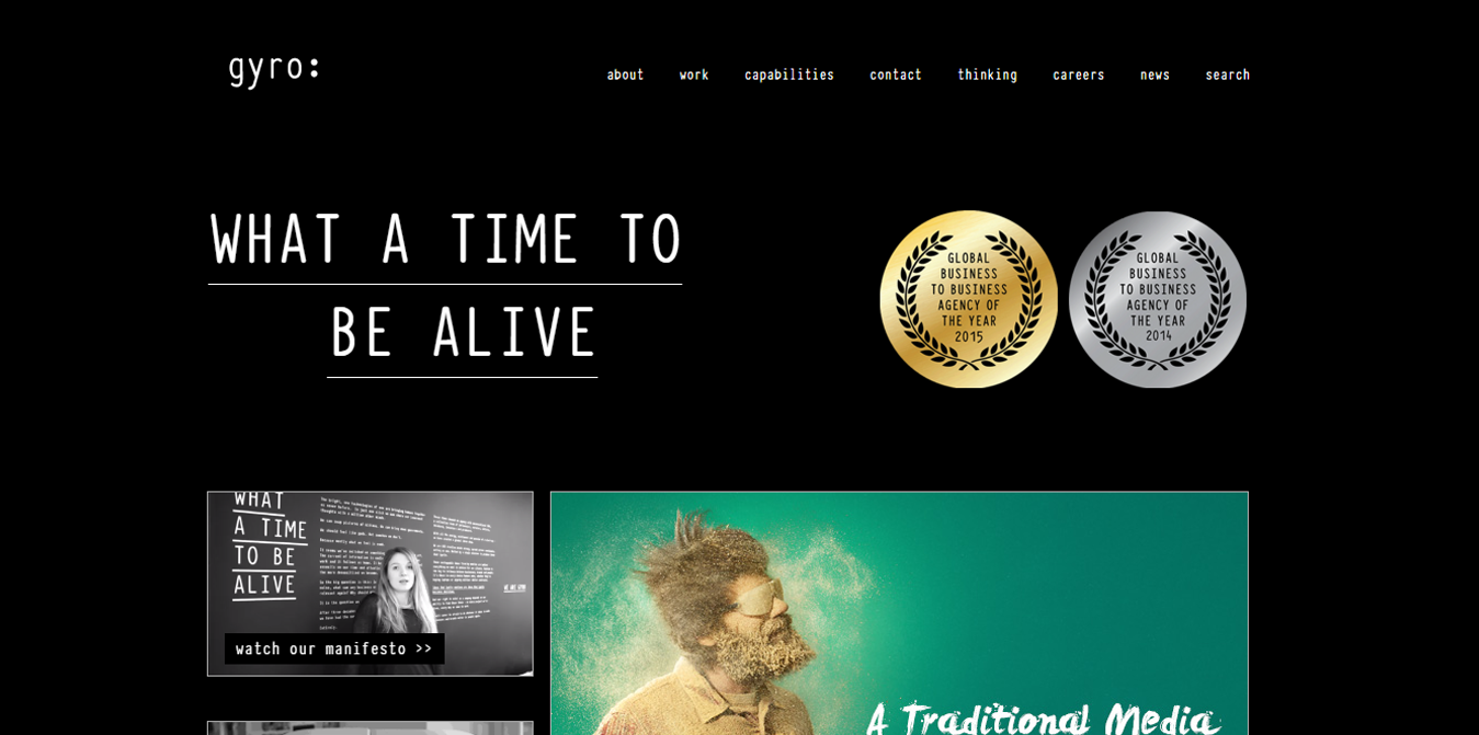 Gyro is the winner of Global B2B Agency of the Year for 2 consecutive years (2014 and 2015). Based in New York, they currently have 600+ employees and offices at 14 locations.
Why is Gyro on this list
- Unconventional : Their website reads “Gyro is a global ideas shop, an agency with an unconventional DNA.” They definitely come across as unconventional on their website. They have broken the pattern of plain traditional websites with something new and exciting, but very clear at the same time.
- Story telling : The whole content of the website flows like a story, which triggers the emotions and easily lets the visitors engage and connect with them. Check out the About page.
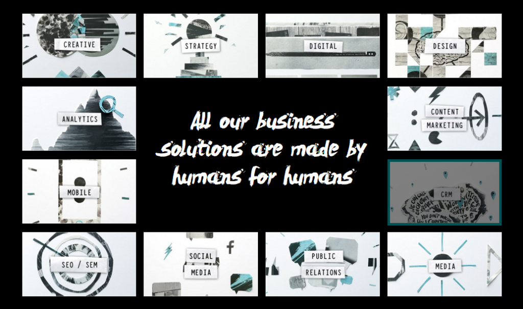
and the Capabilities page
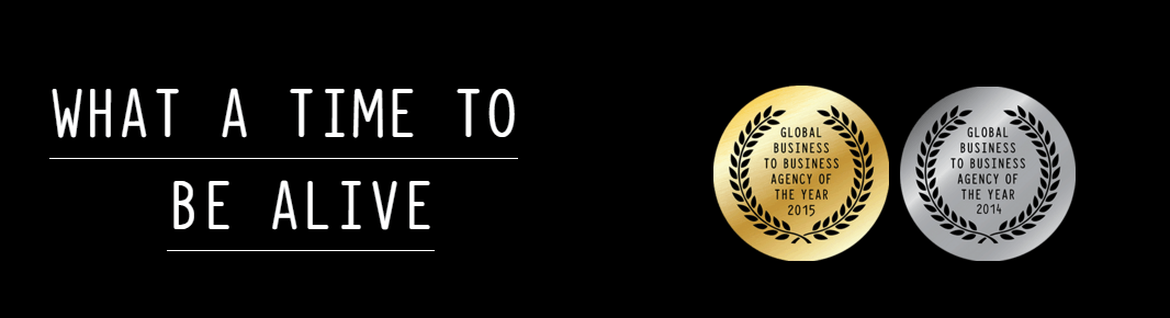
 Trust : No matter how good looking, creative or refreshing your website is, a viewer (potential buyer) are only going to even think to hire you if he trusts you. Gyro does it nicely by showcasing the awards right at the start of the homepage
 Dynamics : If you notice the homepage, you will find subtle movements everywhere. The e-book, the video, testimonial, carousal, news…wherever you look. This movement catches the attention and keeps the visitor engaged.
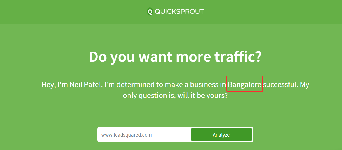
3. QuickSprout
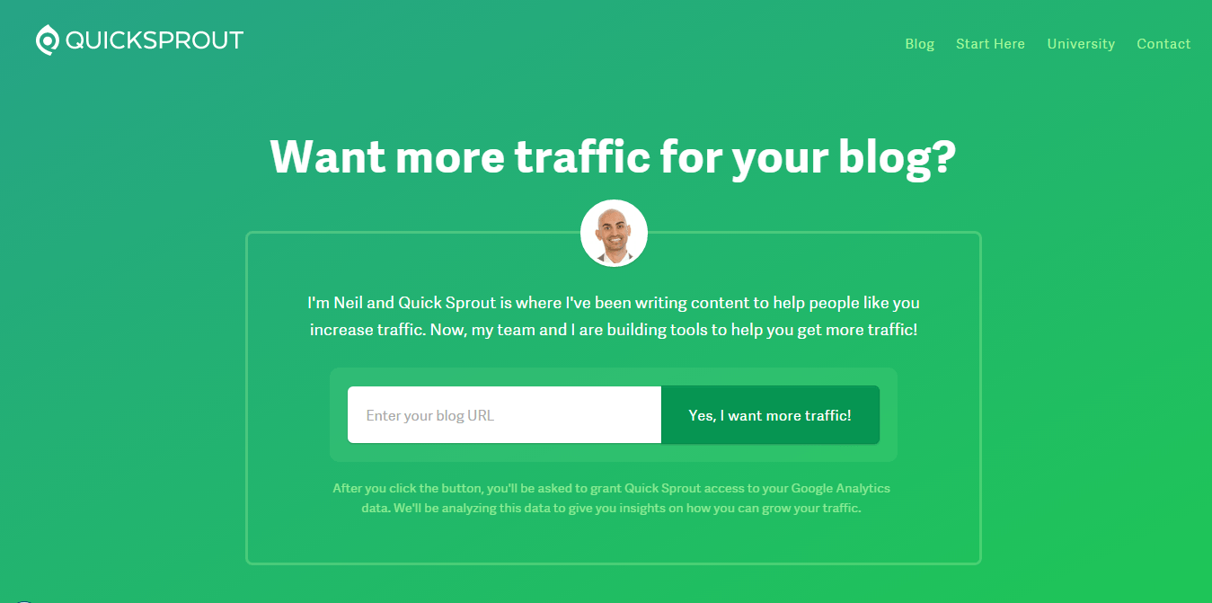 If you want to learn how to create quality with simplicity you should follow Neil Patel. This website impresses me because of its simplicity and compelling content.
Why is Quick Sprout on this list
- Simplicity – The layout, navigation bar and the hero shot are so simple that it comes out as a whole unit. The only thing you’ll read first is the clear headline, which is exactly how it should be.
- Compelling offer – Yes, I want more traffic! Who can deny such an offer, although granting access to the Analytics account, and inviting 5 people is kind of a hiccup.
- Introduction – Loved the way he has introduced himself; people like to know who they are working with. Although he is a big name, but still is smart enough to not assume that everyone knows him. Adding his image also adds up to the credibility
- Personalization- If you go to consulting page, this is where you reach. It captured my city – Bangalore. This looks personalized and tailored for me and hence encourages me to take further action.
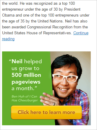
 Testimonials- People trust what others say about the business more than what the business says. Quick Sprout has done this well. Client’s smiling face and stat in the testimonial makes it very clickable. Check out the image below:
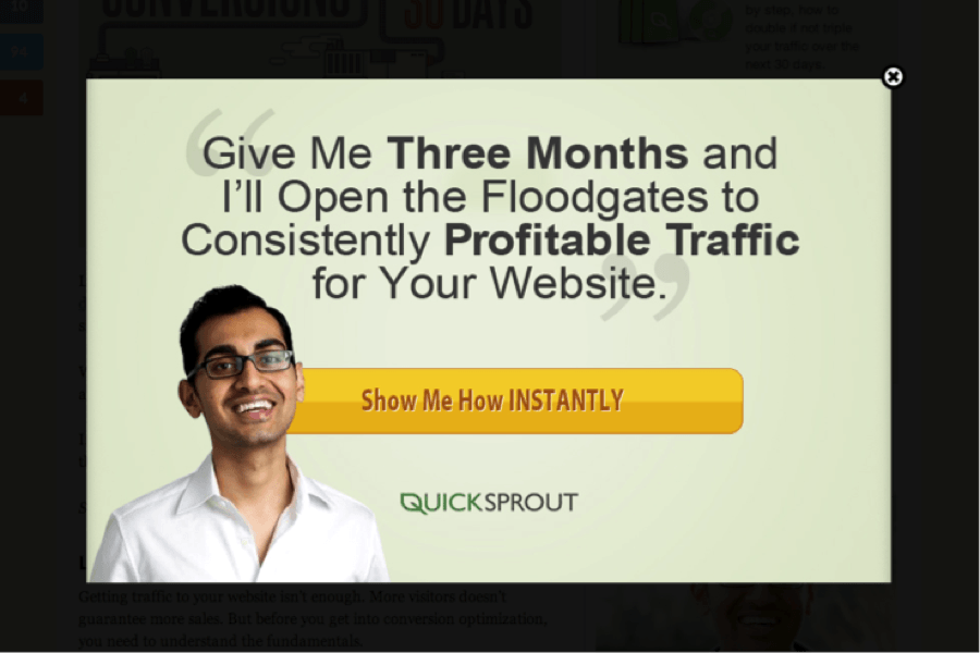
Exit popup- Most of the websites now a days use exit popups, but very few use them well, at the right time and the right page. Most of the times, they appear too soon (making them very irritating), but that’s not the case with Quick Sprout. You will get this popup only when you have spent a significant amount of time on the website, and viewed the pages that mean business.
4. Three Deep Marketing
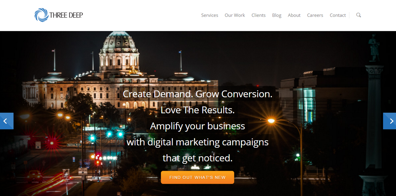 Three Deep is a digital agency from Minnesota specializing in client acquisition, lead generation, email campaigns, conversion optimization and lead nurturing to name a few.
Why is Threedeepmarketing on this list
- Right on the point – “Create demand. Grow Conversion. Love the Results.” Short, clear and to the point. Most of the website visitors judge the website with their headline only. If you miss your headline, you probably have lost them.
- User controlled slider- Slider is a tricky thing to balance. It should not be too fast, nor too slow. The best way is to let the user control it, like Three Deep has done. The transition is smooth and there is plenty of white space which makes for very good user experience.
- Work samples -It is a good idea to showcase the work examples on the homepage itself. It gives a clear picture of what the company has achieved and can achieve. When you slide the hero shot for this website, this is what you get:
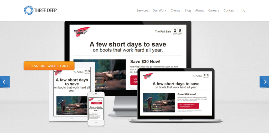
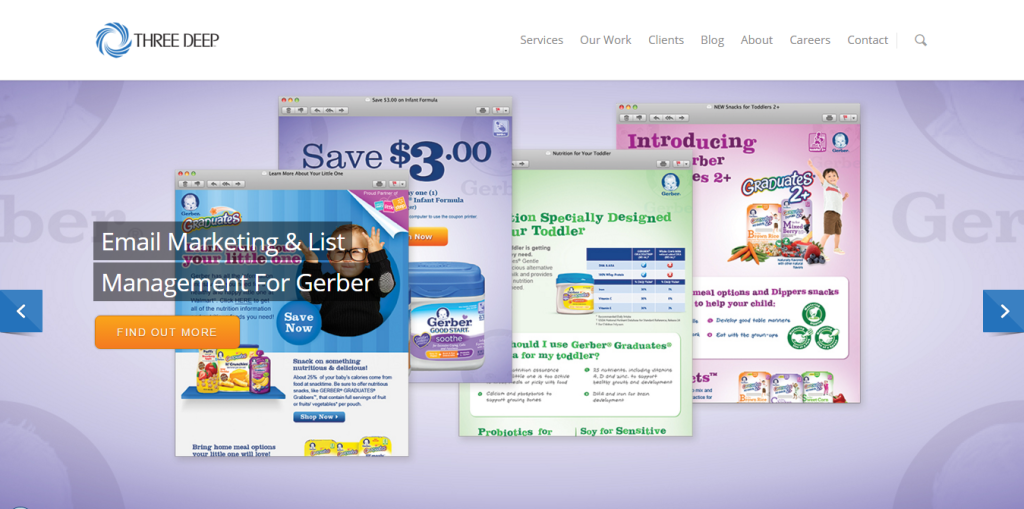
As a visual is consumed 60,000 times faster than the words, it conveys the point immediately
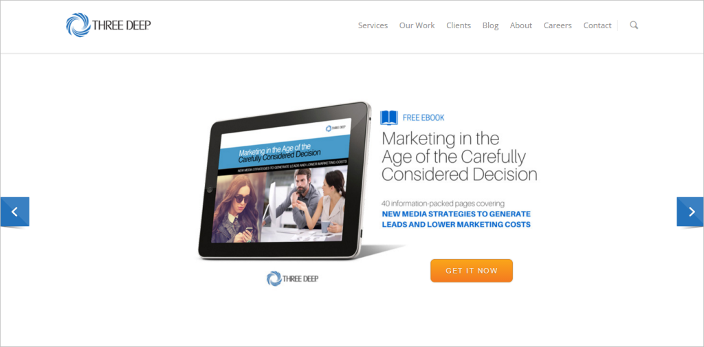
- Freebie– The second slide has a very good top of the funnel offer. A valuable free resource creates an everlasting impression in your prospects’ mind.
5. IMPACT
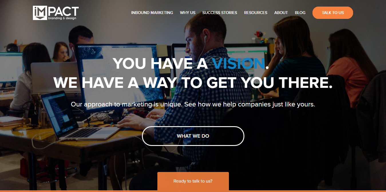 IMPACT has been recognized as one of the top inbound marketing agencies in the world. Their services include everything from lead generation strategy to web development and design.
Why is IMPACT on this list
- Belivable hero shot -The hero shot is of their team – what better way to show to your prospective clients who they are working with.
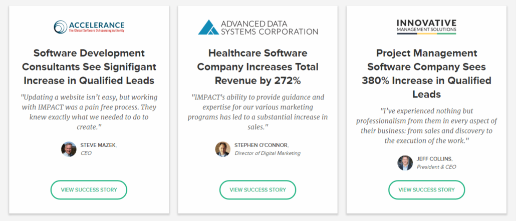
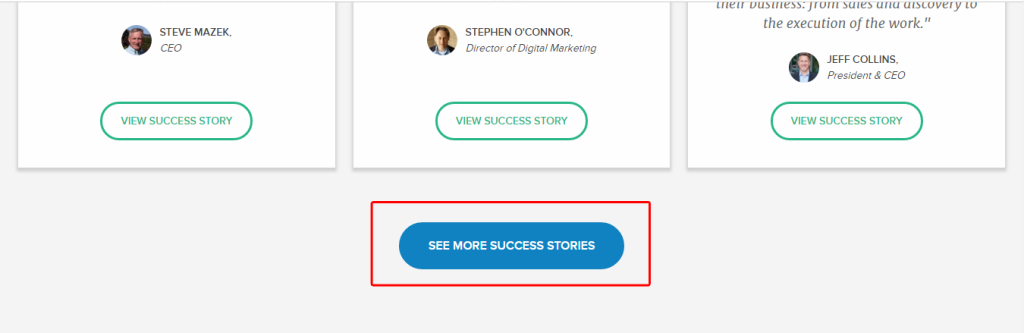
- Stack of testimonials – Before they even speak about their services, they want to build trust. Another good thing is the use of stats in testimonials, which reinforces the value proposition.
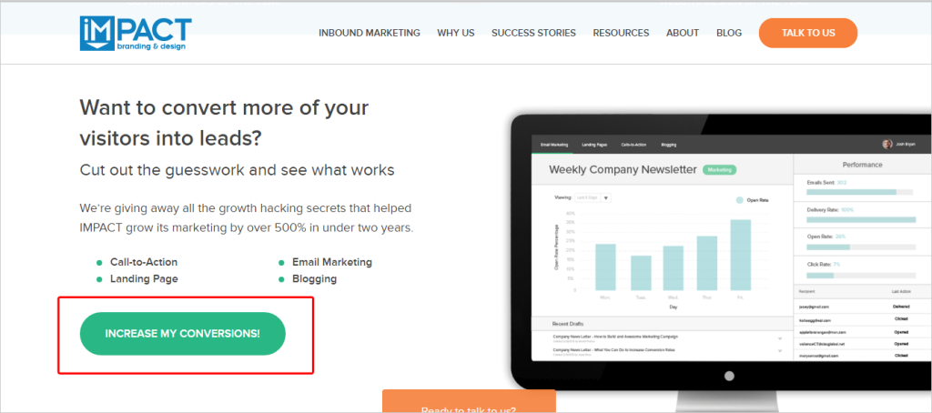
- Actionable buttons – Many times you will find passive call to actions like submit, know more, read more etc, but not with this website. They use very actionable buttons at each section of the website.
 and
and
6. Greenwood Campbell
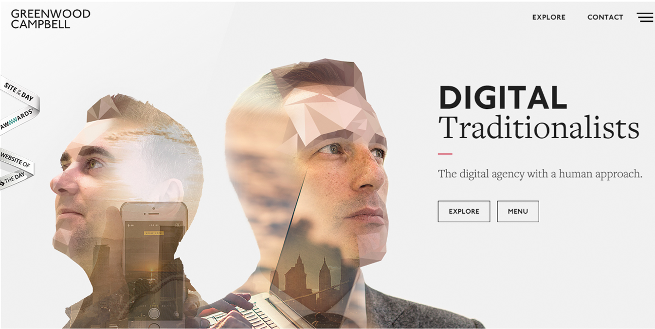 Greenwood Campbell is a UK based agency, that specializes in digital marketing, design and innovative tech solutions. Although this is not the best website from a conversion optimization stand point, but thanks to the user experience and stunning visuals it makes it to the list.
Why is Greenwood Campbell on this list
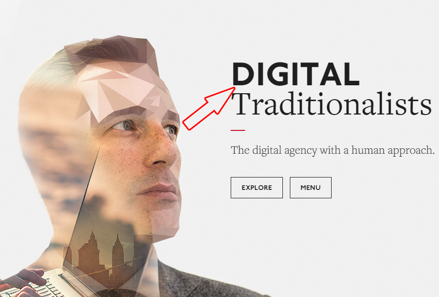
- Beautiful conceptual image -The abstract image is eye catching and the white background compliments it really well. The way they compliment “Traditionalists” with the image is incredible.
- Visual cue: Notice how the person is looking at the headline “Digital Traditionalists”. It makes the visitor also look in that direction.
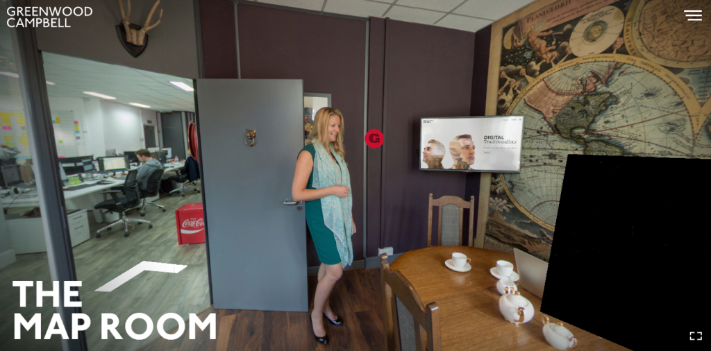
 Incredible user experience – Click the explore button to see what I mean. A truly unforgettable user experience.
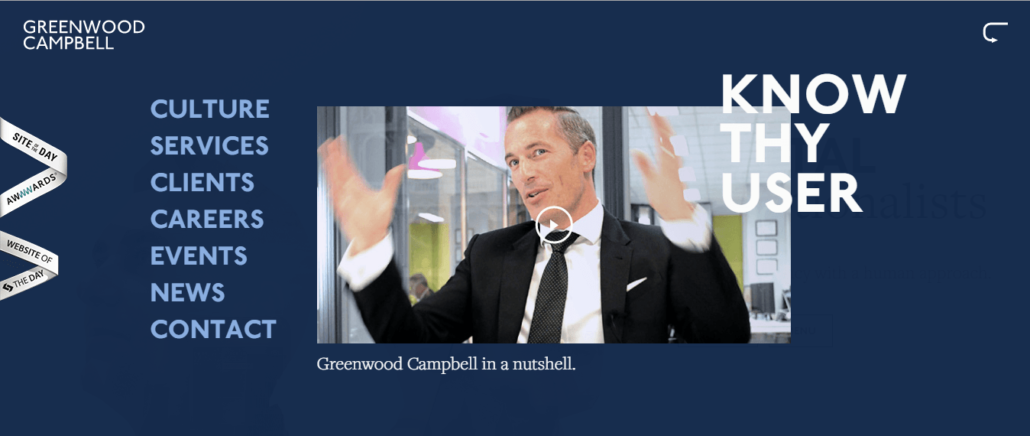
 Minimalism- Excellent use of blank space on the website. Check out the menu, the content on the homepage. It has only the necessary elements. Check out how the menu expands itself
7. Seer Interactive
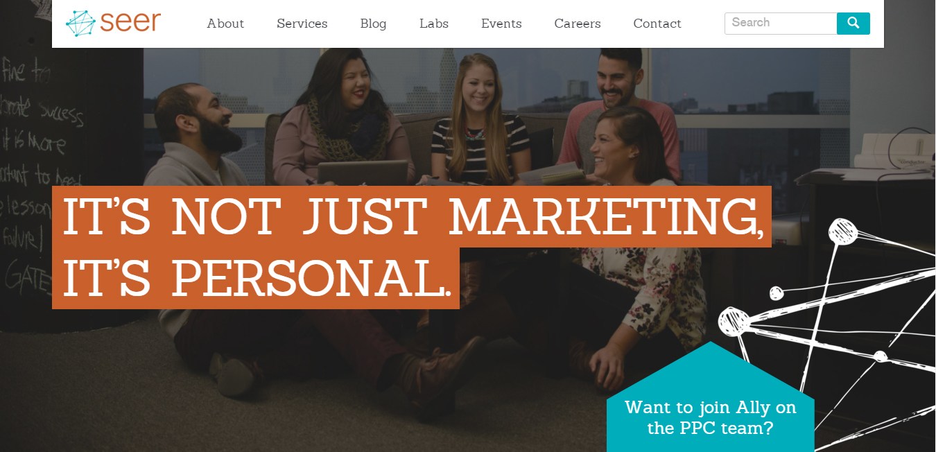 Seer Interactive is a digital marketing agency based in Philadelphia and San Diego with expertise in SEO, PPC and Analytics. It was a solo venture founded in 2002 by Wil Reynold, a popular keynote speaker at events like Pubcon 2015. Today they are over a 100 people strong.
Why is Seer Interactive on this list
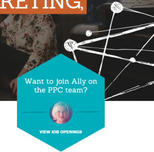
- Getting personal – It’s not just a headline – they mean it in every element of the website. Checkout the blue “Job Opening” box. It introduces a team member to invite potential recruits – “Want to join Ally on the PPC team.” This continues throughout the website. The image is very friendly and looks very real and believable.
- Consistent creative branding – the logo looks cool, it probably means connections. It is noticeable how they are following the same style all across the website. Very Creative indeed.
 and
and
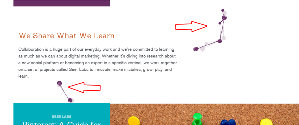
- Intelligent visual cues- If you scroll down, you will see these animating threads guiding the reader to the very bottom; this subtle engagement insists reader to stay with the website for a longer time.
- The search bar- This is the only website in the list with a full search bar. It is not a bad idea at all especially when you have a lot of content.
So, this was my list of best marketing agency websites for design inspiration. Hope you enjoyed it; if you think, there’s one (or many) that I missed, please share it in comments.


