


MARKETING
Hold Interest
Contents
After getting attention, the next step is to hold it, long enough to persuade your audience into taking an action.
Keeping the audience interested is probably more difficult than attracting them. Arguably, it is the function of copywriting, but what if the viewers can’t read what you have to say, even when they want to.
For example – sometimes we see a fantastic email subject line in our inbox, but when we open it, the design is so bad that it loses all its credibility and you just can’t stay on the page anymore. You completely forget about that subject line which looked so great a few seconds ago.
All the hard work of crafting an attention-grabbing subject line was undone by poor design (unclear communication). I won’t say that good content always need great design, but I can safely say that bad design can effectively ruin excellent content.
Navigating through bad design is a pain that your readers shouldn’t have to undergo. Therefore, in the next chapter, you will learn how good design can help convey your message better, by making it easy to understand.
with
PART I
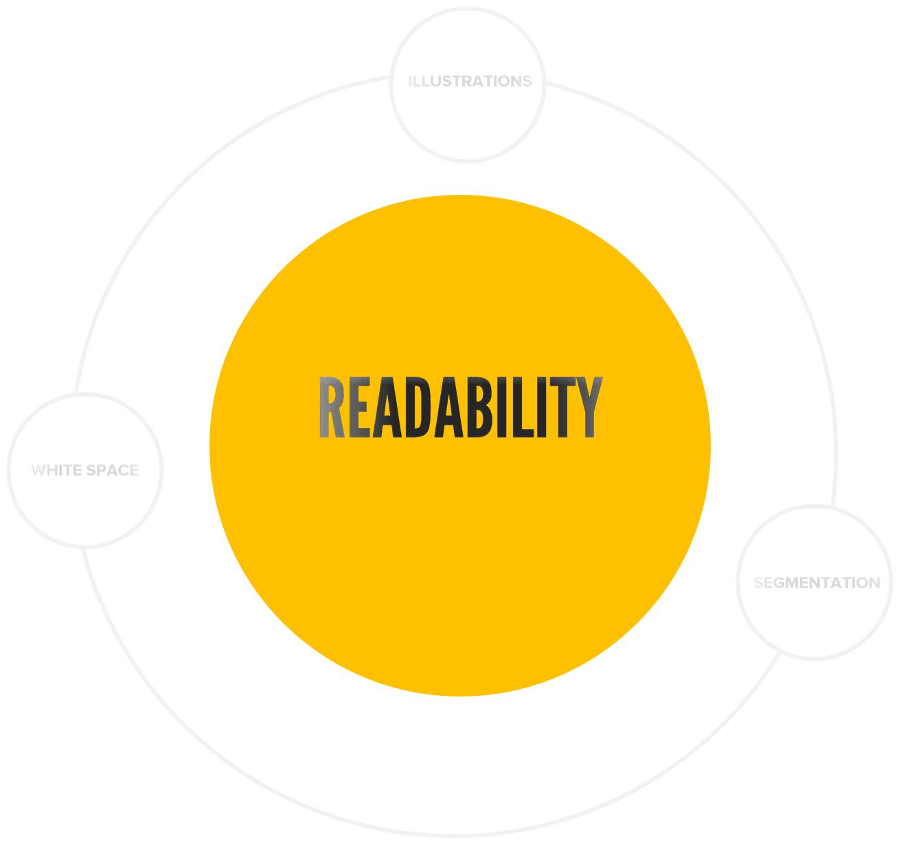
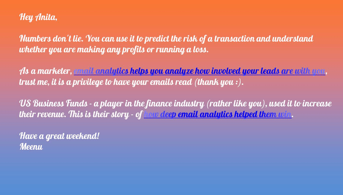
Readability is the ease with which the audience can read your message. Because of course, for a written message to succeed, people should actually read it. Typography and font faces play a very important part in readability, mood setting and perceived article length.
There are a millions of fonts available for free which makes a very avoidable mistake very common – picking fancy over simple. Early in my career, I made this mistake way too often. Overwhelmed with choice, I always chose fancy fonts, ruining the simplicity and readability of the page.
When it comes to retaining the visitor, readability is the number one priority. Spend some time choosing your fonts, as they define the personality and character of your message and can also affect the mood of the visitor.
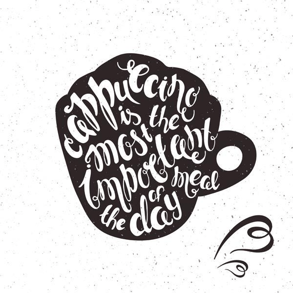
The arrangement of text on a document or a creative is called typography. You can get very creative with it. But, when our focus is highly readable content, a sudden burst of outrageous fonts and shapes can be a distraction.
An experiment, conducted by Errol Morris, tested whether or not typeface influences the way that people consume information. To conduct the experiment, 40,000 readers were presented with the same passage, but in six different typefaces. The readers were then asked whether or not they agreed or disagreed with the passage. Those readers who were given the passage in Baskerville were much more likely to agree with it, especially when compared to Comic Sans and Helvetica. Clearly, the study illustrates the importance of typography and its influence on the reader.
Source -https://www.outbrain.com/blog
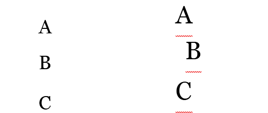
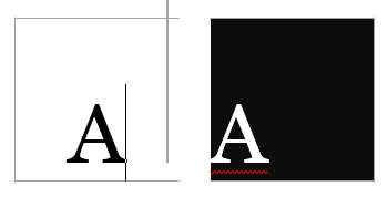
Line spacing is the vertical distance between the lines of text. It has a big role to play in the readability of the content.
Which one is easier to read?

Alignment is arranging objects in correct relative positions. When the elements are aligned on a page, you get a stronger cohesive design which is much easier to read and looks attractive.
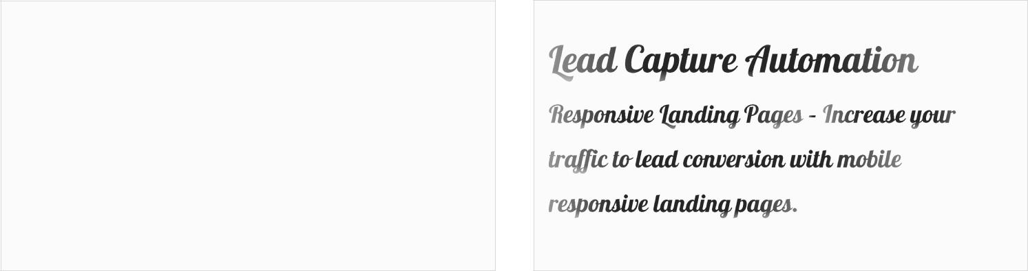
LeadSquared’s webinar email template
In the initial pages of the book, we saw how to use different types of contrast to gain attention. In this chapter, we will understand how contrast can affect the readability of the page.
Black on white may look great for a few seconds, but reading a full paragraph of black on white tires the eye. It might work well while scanning, but the reverse works best when you want the person to read.
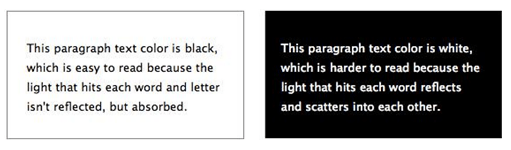
Black on white was preferred on newspapers because it demanded less ink. But later, it became the standard as the readers found it less stressful to the eye.
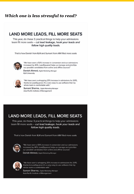
Which one is less stressful to read?
PART II
artistic and captures attention, but not readable
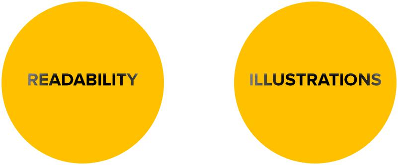
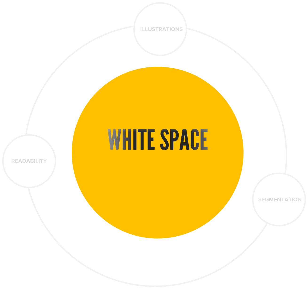
White space or negative space is the empty space around the design elements on a web page. Often ignored, it is one of the most beautiful aspects of design. It is literally ‘nothing’ but it makes other things pretty.
LeadSquared’s ad creative:

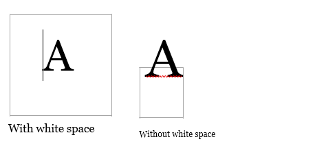
White space example: LeadSquared email template
See how white space in this template makes the other elements more attractive and improves readability
PART III
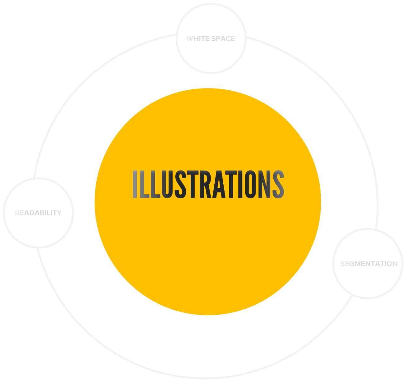
Illustrations help break the wall of words & make the content easily understandable and pleasing to the eyes. A visual is processed 60,000 times faster than the words because we think in visuals, not in words.
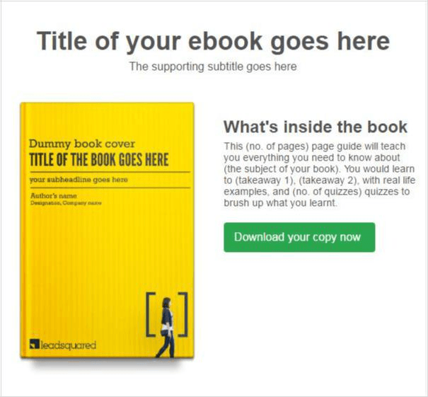
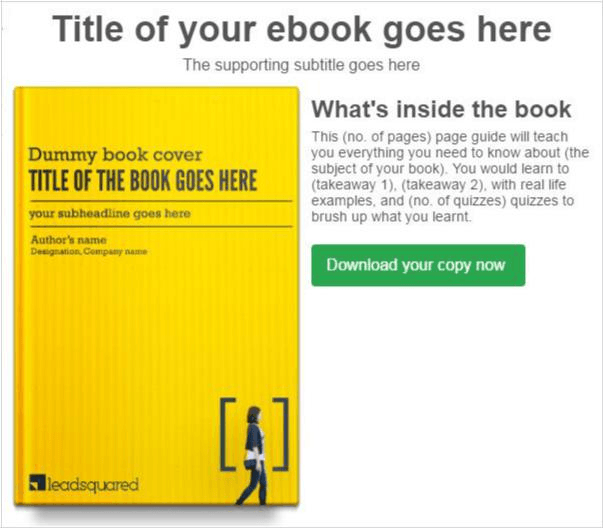
An example from our current website
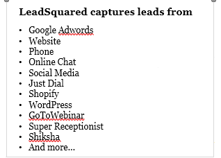
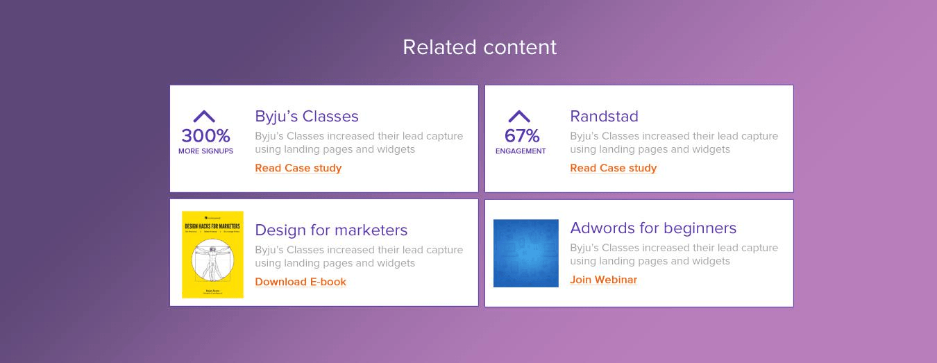
Illustration example: LeadSquared landing page
The illustration makes the page easy to scan and understand

email template with beautiful white space
PART IV
email template with no white space reduces its readability
Segmentation is the arrangement of objects in a meaningful manner. A well-structured page can be the difference between highly loved and highly repelling content.
Think that you enter someone’s drawing room
In our already chaotic life, we don’t need more clutter, especially not online. Visitors bounce off quickly if the information is not structured clearly.
You can segment the information with the tricks we learned earlier – colour, contrast, encapsulation, alignment etc. The only difference here is the motive – you have already caught the visitors’ attention, now you would use segmentation to make them comfortable enough to stick around.

Enter your details and we'll send you a quick confirmation email to verify your address.


 Encourage Action