


MARKETING
Web Portal Design: How to Build Mobile Responsive Portals?
Contents
 5 min read
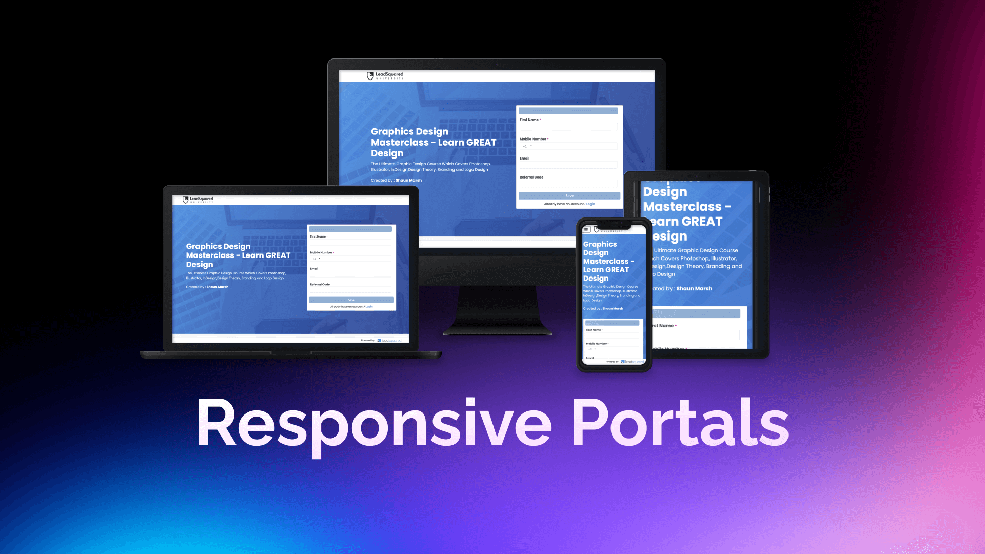
How can we make a website or web portal squeeze into every device around the world without compromising the user experience? How can we maintain the images and not have them stretch out? Is it possible to keep the CTAs not squeezing each other or overlapping other text?
It’s not as complex as it sounds. You just have to know how to build LEGOs!
So, let us dive into the basics of web portal design. In this article, I will tell you how to build mobile-responsive portals.
Portals built using the portal designer are infinitely scrollable vertically but have a fixed horizontal scroll width. But this width can vary based on the device the user is using.
But is there a universal unit to measure this? Let’s make it a little simpler to understand.
Let us divide the screen into rows and columns so that it looks like a grid. We can have infinite number of rows. But the number of columns will be finite and change according to the device we are using.
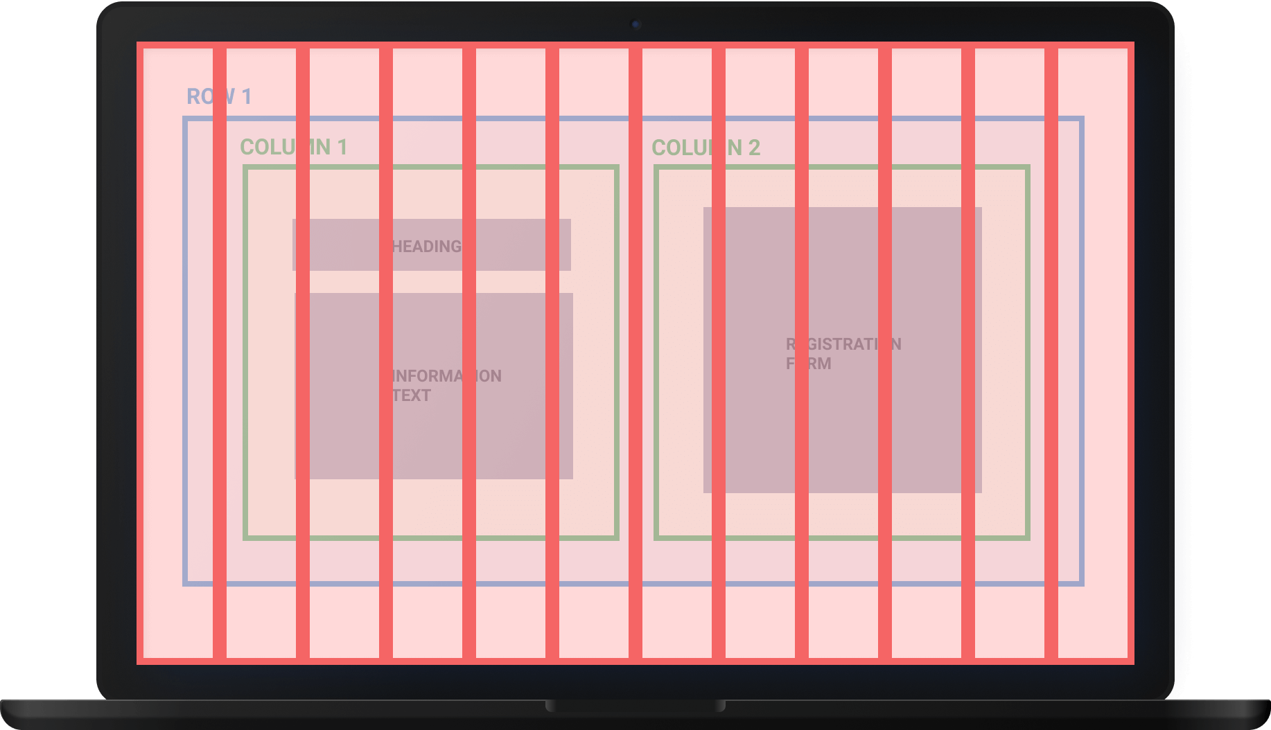
Now just for reference, consider that a desktop/laptop has 12 columns and infinite rows.

Whereas an iPhone occupies four columns and an infinite number of rows.

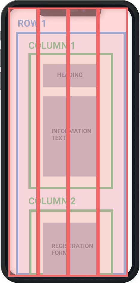
This grid is our shelf, and the components (forms, images, text) are our LEGO boxes that we want to add to our portal. Each LEGO box can occupy one or more grids based on its size. For example, a registration form occupies four grid places at the least, and a text can occupy one grid place at the least.
Imagine you want to build a landing page for your university with a welcome heading, text instructions, and a registration form. These will be the components of our LEGO blocks.
Now, we want the text instructions below the heading. The heading + informational text and the registration form should be adjacent to each other.
How can we organize them in this fashion?
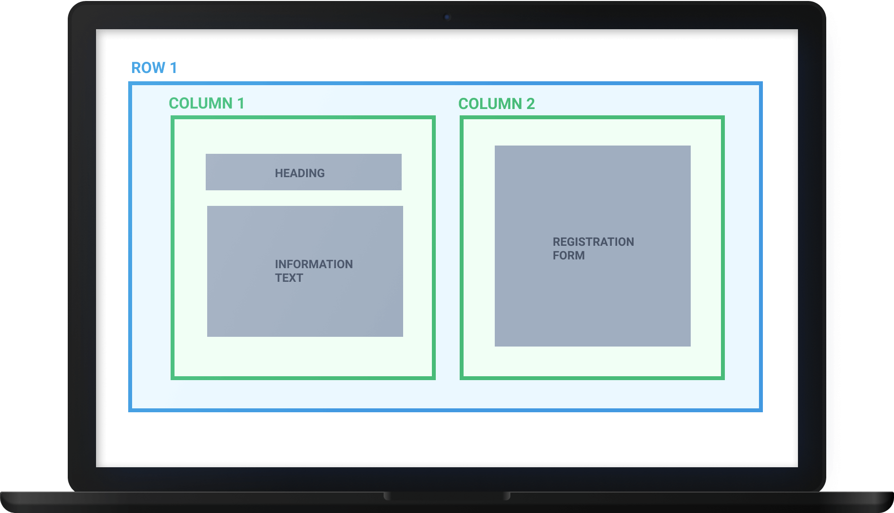
Since the information text should go below the heading, both heading and text should be in a column. And since the text and the registration form should be adjacent to each other, they should be arranged in a row.
Hence, we will place a row that will encapsulate two column components adjacent to each other. And each of these columns can later contain more components or even rows for more complex arrangements.
The browser quickly splits the web page into columns to understand how it can fit the website/portal in the limited width of the device. Based on the number of columns it can accommodate, the browser then rearranges the components on the grid according to the blocks they consume.
On desktop/laptop: Since desktop/laptop can accommodate 12 columns, our portal comfortably fits the width.
On mobile: Consider an iPhone. Its browser can only accommodate four columns instead of twelve. Hence the browser rearranges the items accordingly.
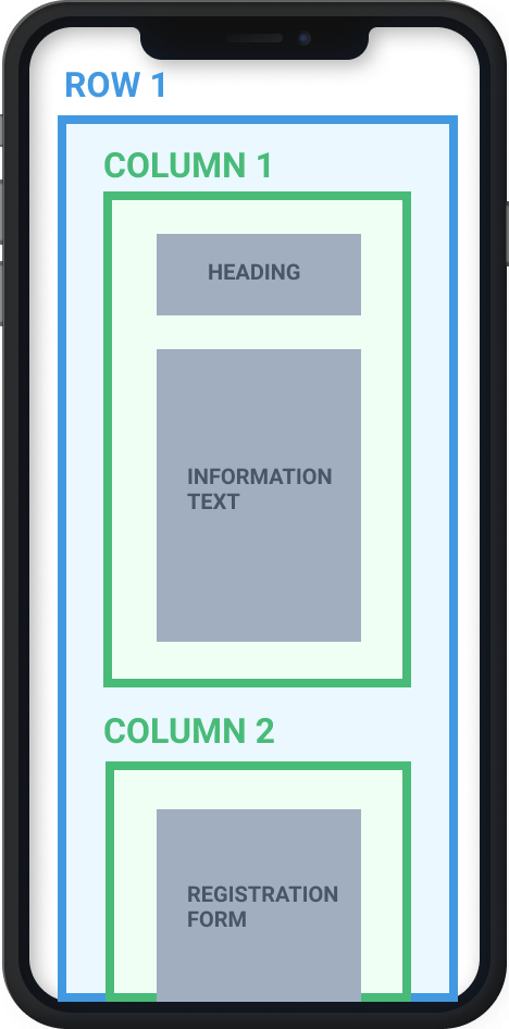
Now, this is where the arrangement of components plays an important role. When the components are arranged properly in rows and columns, the browser can rearrange them to fit the varying device width.
Here, we organized our components in two columns inside a row. The plan is to let the browser know from where it can organize or split the blocks to fit mobile or smaller width devices. Else it will overlap different content or text, and the UI gets squeezed.

I hope you found this information insightful.
LeadSquared helps you build no-code mobile responsive, self-serve customer portals for applications, payments, and more. It tightly integrates with your LeadSquared CRM to connect sales, marketing, and service teams.
A responsive website is the one that changes the size and position of objects (text, images, video) based on the screen size of the mobile device. For example, in a responsive design, texts and images change from a three-column layout to one column layout if that fits your device’s screen perfectly.u003cbr/u003eIf you are on a website on a desktop and want to see if it is responsive, shrink the window and observe whether the display changes to match the window size. You will also see that there is no horizontal scroll bar in responsive websites.
A mobile-friendly website is the one that can easily fit in a user’s mobile device – a tablet or smartphone. Users should be able to navigate the website without zooming in or adjusting their settings manually.
The term mobile responsive refers to the accessibility of websites across different mobile devices, such as smartphones and tablets – without disrupting the user experience. The device browser can automatically rearrange mobile responsive portals to fit the devices’ screen width.
Mobile-responsive CRM portal means that anybody accessing it on a mobile device, such as a tablet or a smartphone, has an experience designed to fit that particular device.
Yes, LeadSquared CRM allows building mobile responsive portals on its platform.
Enter your details and we'll send you a quick confirmation email to verify your address.
 13 min read
  5 min read
  8 min read


 Sales and Marketing Alignment: Strategies and Best Practices
