


MARKETING
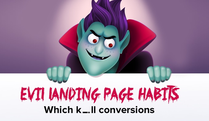
Breaking Bad PPC Landing Page Habits That Kill Conversions
Contents
There is no use going on about the obvious – landing pages are important. I know that, you know that. But, what beats me is why businesses spending tons of money on ads, and getting landing pages designed, don’t pay attention to whether their PPC landing pages are really getting them conversions or not.
To be fair, marketers now do spend time and money on improving their campaign landing pages, but there still are mistakes that creep in, and this isn’t a rarity – I have seen more PPC landing pages with some very obvious mistakes, than I could have imagined.
Let’s cut to the chase and discuss some evil landing page practices that are probably killing your PPC conversions very slyly.
Greek king Sisyphus was condemned to roll a boulder up the hill for eternity, only to see it roll back down when he neared the top.

The futility of things we do every day!
Sisyphus under a curse, marketers because of unclear objectives or just the regular burnout slack.
Sisyphus was cursed. But, you as a marketer cannot afford to waste time running ad campaigns not helping you meet your objectives. So, the very first thing:
One common mistake stemming from a lack of objective is directing an offer campaign to a very vague website.
Let’s take a look at this ad for “GMAT training institutes,” for instance. The headline and the offer are fine – it says “free demo.” Fair enough!

But then, the ad directs the visitors to the following web page.

Guessing from the ad, the objective here should be to get more people to sign up for the demo.
But, the page doesn’t have a single mention of GMAT itself, let alone the free demo. It isn’t equipped to capture leads either. This page and several others I found completely miss the point, and probably many opportunities because of that.
Yes, sometimes directing traffic to website has worked better than a landing page, but that’s when the website is easier to navigate, the offer easy to spot, and website equipped for conversions. None of that works in this page’s favor.
Here’s another example of the same mistake with another search term “french classes NYC.”

Even though the ad is for “French classes” explicitly, the page has references to all the different classes the school offers, with the CTA to “email” or “call” the school buried deep in the text after a long page of copy.
I did a quick search for “french classes NYC”, and found this page 1st on the list. It’s a good webpage, seem very credible, but isn’t really ad campaign material.

Now this isn’t a landing page, so navigation definitely is a distraction point. In addition, there are multiple calls to action, including “Join Mailing List” and “Why Learn French.” “Why Learn French” is not needed here, for ad campaign traffic. So, it would help if they have a dedicated landing page for the campaign, instead of using this website page.
Also, the “Join Mailing List” is the only form visible here; the main CTA “Click here to enroll” is buried under a heap of copy. Instead, you need to focus on the getting people to enroll as that’s the objective of this page, not getting people to join your mailing list.
Take a look at this page for example. This is linked to an ad for the search term “deals on travel packages”. Not only does it have way too many fields than necessary, thus increasing friction, it has no credibility elements.
Why would someone fill out an 11 field form, without getting any proof of the credibility of this website?

Here’s another example of this. Even though the search query in the following example is for “GMAT training institutes,” which reflects on the ad, but the visitors are once again asked to select the course in the form. This would definitely create some friction in filling the form. Once again, don’t make the prospects do all the hard work.

Let’s consider the same travel landing page we saw in the last example.
“Studies suggest that a typical traveler takes around 30 days to actually book the package after deciding on the vacation, and all this time is spent researching different locations and deals.”
So, if your PPC landing page gives no information to help this research, the chance of visitors sharing this much information in exchange for some package details is slim.
They would instead go to websites like TripAdvisor and try to read real traveler reviews from there. So, one way can be to embed reviews from TripAdvisor and other third party websites on the landing page. You are already spending money on the clicks; why not give your landing page some credibility as well.
I had no intention of questioning my fellow marketers’ good sense by including this very obvious mistake. However, I saw more businesses making this mistake than I had expected, so I had no choice. Here’s a MakeMyTrip ad that shows up 2nd on the paid listings for “deals on travel packages.”

And this is what it is linked to:

That’s probably eating up a lot of your advertising money, folks!

There is a lot that is wrong with this landing page design-wise, but I will not get into that. Just look at the message mismatch between the form header and the CTA. They say “Get access to 10+ hours of free course material” on the header, and “Start my Free Trial” on the CTA.
This is a very short form, and might get submissions, but what’s the next step? Based on the offer and the number of fields, I would also question the objective of this landing page. If you are offering 10+ hours of course material, you can be upfront and ask for phone numbers as well. Otherwise, you would get many junk form fills and later unsubscribes.
Consider the same landing page above. Using hyperbole, like “World’s Best GMAT Prep Course” without any proof to support the claim is a bit of a stretch, that too on a page that seems to have no credibility at all looking at the other page elements.
Yes, you shouldn’t stuff keywords, but there should be at least some text content on the page – it would help with the landing page relevance. All the content on this page is in the form of images, which would also increase the page load time, thus increasing bounces.

One-third of last quarter’s paid search spend went to mobile, according to research from Covario, a San Diego, California search marketing agency.
“The quarterly analysis – which covers Covario clients in the tech, consumer electronics, and retail industries – found that smartphone and tablet media spend have been steadily increasing for the last two years, while desktop search spend has dropped from 91 percent of search spend to just 67 percent.”
So, if you are not optimizing your PPC landing pages for mobile, it is likely that you are just losing money on clicks. If you have disabled your ads on mobile search, it might save you from losing money on clicks, but it would also lose you a good percentage of traffic that comes from mobile
Using the same search keywords, I found quite a few landing pages that were not optimized for mobile search. Take a look at these for example:
 |  |
Overall, of all the landing pages on paid mobile ads that I saw, around 30% were perfectly optimized for mobile, 20% were optimized but had some issues, and rest were not mobile optimized.
We are the most easily distracted generation of digital surfers. The average attention span of an internet user is less than that of a goldfish, as you would have heard. If you are therefore not optimizing your PPC landing pages to load faster, you are giving your visitors another reason to bounce off. I have already discussed this point in the example above where all images are used instead of using text.
Check the speed of your landing pages and optimize images that you use on the landing page to begin with.

There is one fundamental mistake these guys have made. In addition to the fact that this is a website home page, they claim “More than 85% of students, who do a demo with us, ultimately join us.” This claim concentrates on the business not the students – they should instead focus on how the course would help the students.
While optimizing your landing pages to follow best practices is a great thing when you begin, modifications need to be made continuously after analyzing the results. So, everything that’s been discussed above needs to be tested and should not be taken as a rule of thumb. Never fall for any best practices, without actually trying them out.
In reality, this is the only mistake you need to avert – “don’t put recognized best practices over actual results.”
While searching for examples for this post, I came across many ads ranking for search terms they shouldn’t rank for. Please make sure to show your ads only for keywords relevant to you, otherwise you would just lose money. Use negative keywords feature in Google Adwords for this. Here’s an example:

So, there! Here is my list of PPC landing page mistakes you need to avoid. Feel free to share your examples of mistakes you have noticed, or made and recovered from.


 Mobilegeddon – Where Do You Stand a Month After the Roll Out?