


EDUCATION
Best Practices for College Website Design
Contents

The importance of your website cannot be overstated. Looking at the best college websites can provide inspiration for creating a site that is both aesthetically pleasing and highly functional. It’s where you:
Above all, your website is bound to be the first place prospective students and their families turn to when considering which schools to apply to.
Considering the demographic you target, it’s hard to deny your website has to meet higher standards than most businesses. An overwhelming majority of your incoming students are bound to be digital natives, which means they have the highest expectations and the shortest attention spans. As a higher education institution, it is crucial to design a website that effectively serves prospective students, current students, and alumni.
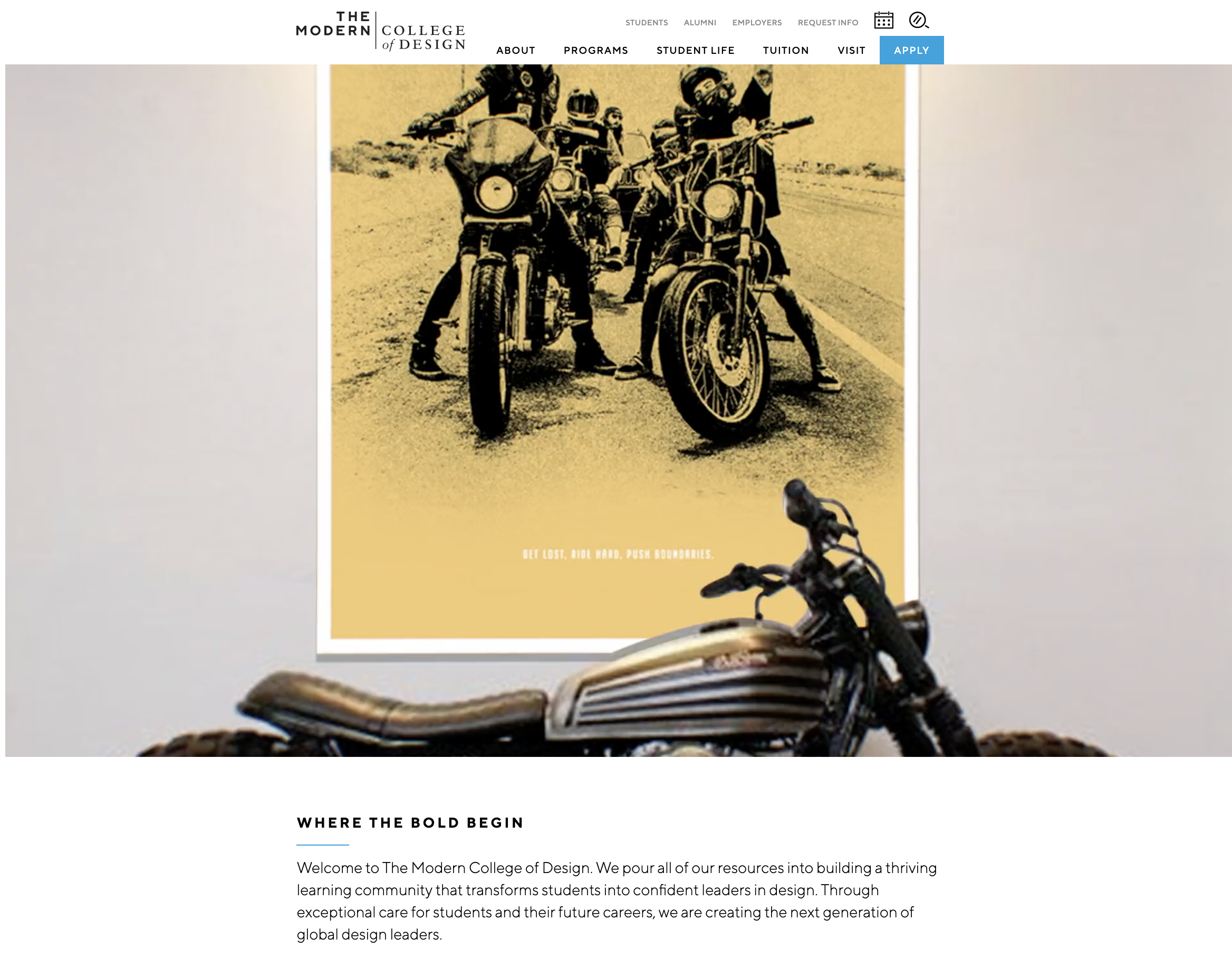
The homepage of The Modern College of Design is too cool for words. It starts visitors off with a flashy montage of students at work creating all kinds of designs.
A post by Cardinal Digital Marketing claims students look to universities as a progressive place to advance their career into the future and the public looks to universities as thought leaders.
The author writes, “A shabby website makes it seem like you’re stuck in the past,” and goes on to say, “Universities have to keep up a thriving image or risk getting a reputation for sub-par standards.”
You pour all kinds of resources into pulling prospects into your website. You might be throwing good money after bad if visitors have anything less than a great experience. If you haven’t revisited the core elements of your college or university website in three or more years, it’s time to ask yourself:
If you were forced to answer “yes” to one or more of the first six questions, or “no” to the final two, it’s time to revisit, revise, and revive your school’s website. The best practices that follow should help make the effort as valuable as possible.
The making of your new website is going to call for a bevy of resources, which are likely to include multiple vendors, tools, and assets. You’ll need to do your due diligence, understand the costs, and present them to those who’ll sign the checks. The following are tips to consider for the planning process:
Successful journeys rely on the use of a map to get from the starting point to the ultimate destination. Websites do too. So, before you get into processes such as writing and design, it’s critically important to create a logical sitemap—or what site planners often call “information architecture.”
Information architecture (IA) is the process of organizing a university website into a logical structure so visitors can quickly flow through to the content they seek. Your content should be organized by topic and importance, with context in mind. Higher education websites benefit greatly from well-structured navigation, clear calls-to-action, and visually appealing content to enhance the experience for prospective students exploring options and resources available through these institutions.
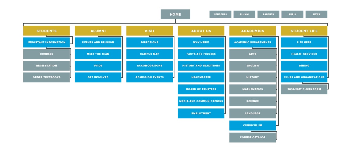
The sitemap is a blueprint for your website, says eCity, that offers the example above.
A sitemap is a diagram that visualizes the structure of a website and defines its taxonomy by grouping related content together. Sitemaps reveal what goes where and how the pages are connected.
Design your sitemap based on the most essential users your website will serve:
Additional user groups might include parents, high school advisors, community members, the media, and more.
Your website should provide an easy-to-navigate guide to everything your college offers. It should assist visitors in finding what they need quickly. Ultimately, its interface will include a main menu, possibly drop-down menus, and a search function.function.
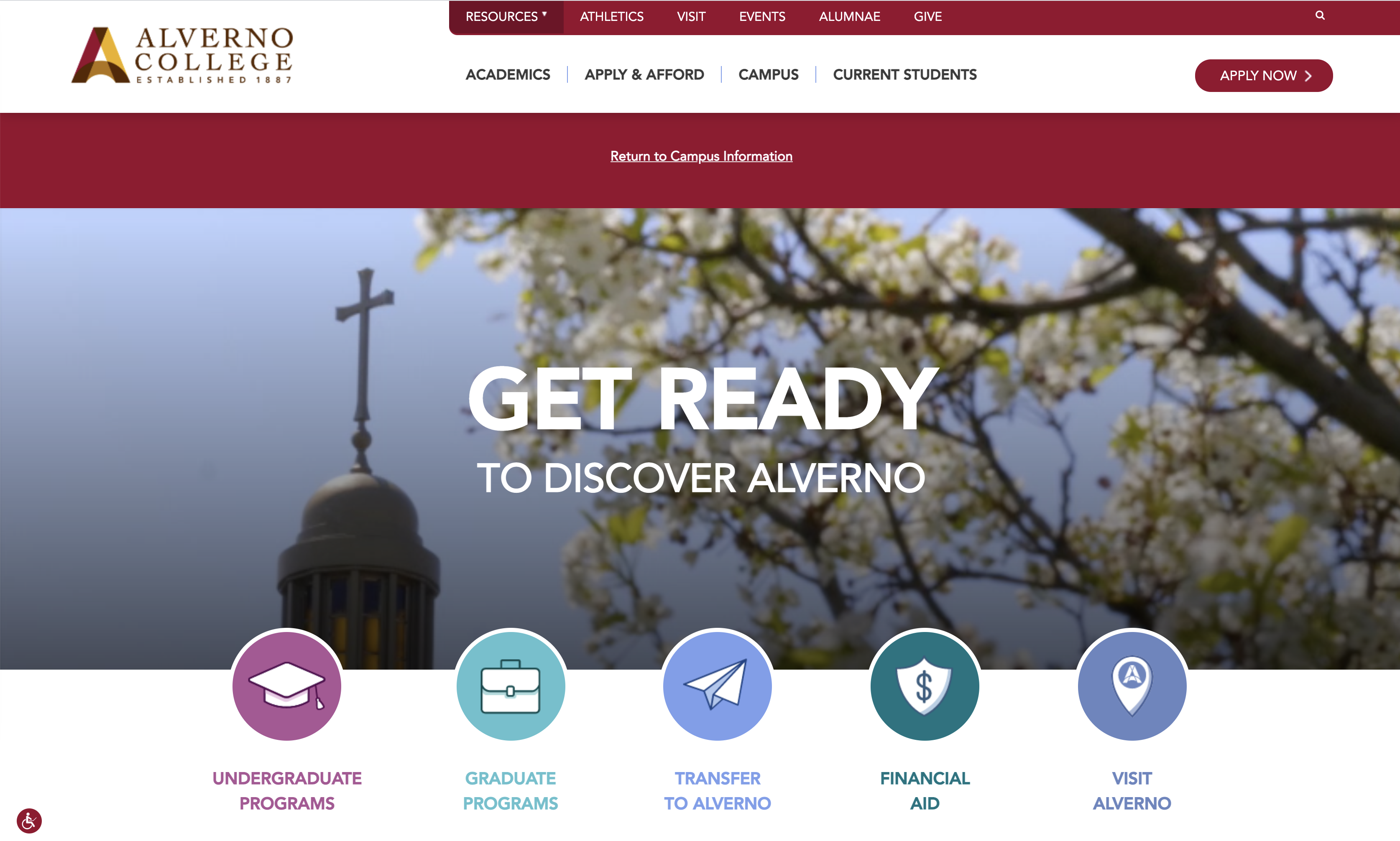
Alverno College does an excellent job organizing and presenting the content visitors are most likely to seek via two navigation bars and clearly labeled buttons.
Unquestionably, the website must serve the needs of the users we’ve identified above, but it also must support your objectives.
After establishing and documenting clear objectives, ask yourself if you’ve locked down messaging strategies to support them on your own website. Ask yourself if the school’s messages to all audiences can reflect a central theme and be expressed in a consistent voice. Finally, explore how you’re communicating offsite, such as in marketing campaigns, to determine if your messaging has the continuity it needs.
A university needs to present many voices in chorus in their media experience, combining messages from the dean and faculty, professors and facilitators, right down to the student ambassadors and alumni.
~ Alex Mebrillo, Cardinal Digital Marketing
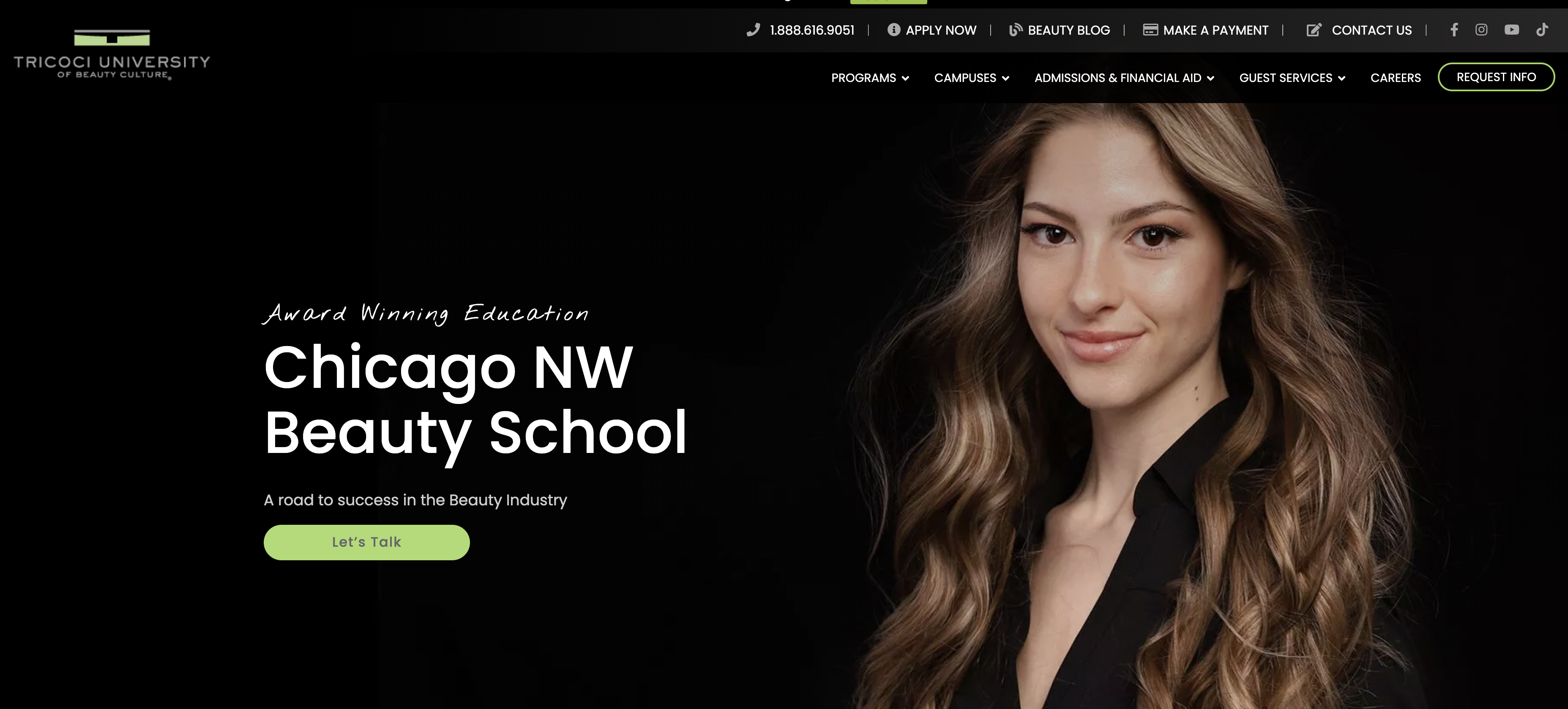
Beauty School Tricoci University establishes a highly branded look and feel and consistent messaging across many web pages that offer multiple programs at a sizable list of campuses.
There’s no one or right way to create effective website content. But let’s tackle some of the basics here and now.
Be it on your website, blog, social platforms, or in print, you already have content. However, you’re creating something new now.
Will that mean starting over? Editing? Retaining and republishing what works? Is some content too old or irrelevant? Does some contain highly relevant information but is presented in a boring or less useful way? Older content might be off-brand. Is yours?
Consider how a private Ivy League university showcases its unique features and benefits. Similarly, think about how a private research university highlights its academic rigor and research capabilities.
Make a concerted effort to audit every relevant resource, make informed decisions regarding these questions, and take your results and plug them in where appropriate.
Chances are producing a comprehensive, persuasive, and elegant website will require the services of more than a single writer. You may or may not have professional copywriters, subject matter experts, bloggers, contributions from the PR department, faculty contributors, and more. Clearly, you face a tough challenge here. Some tips:
Your website should be populated with exciting, original, high-quality visual content. There’s no rule that says you can’t use stock photography in places, but be careful. A plethora of generic, phony, or cliché images is going to turn off your visitors.
Eastwick College creates short videos and features them in the “programs” section of its site. Some have been viewed over 100K times.
Eastwick College creates short videos and features them in the “programs” section of their site.
Some have been viewed over 100K times.
In an effort to talk strategy and avoid the rabbit hole that is an end-all lesson on website design, I’ll offer basic tips:
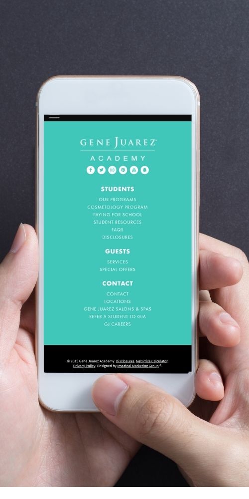
Gene Juaraz Academy offers an elegant footer that looks good on mobile and delivers a convenient mechanism to locate content.
According to Chuck Bankoff, the director of web services for Kreative Webworks, there are six core pages all (or most) educational institutions must have:
You may or may not know the term “social proof,” often used by digital marketers and placed in the “persuasion” file. Social proof is based on a proven psychological concept: people are more likely to engage in action if others are doing it (or endorse it).
So, to provide social proof is to present content such as testimonials, reviews, success stories, insights and/or images from influencers, and statistics. Create it. Encourage students and faculty to create it too. Provide information about the university, including its history, faculty, student life, and research initiatives. And put it in your prospective students’ digital paths as they look for assurance your school is an ideal choice.
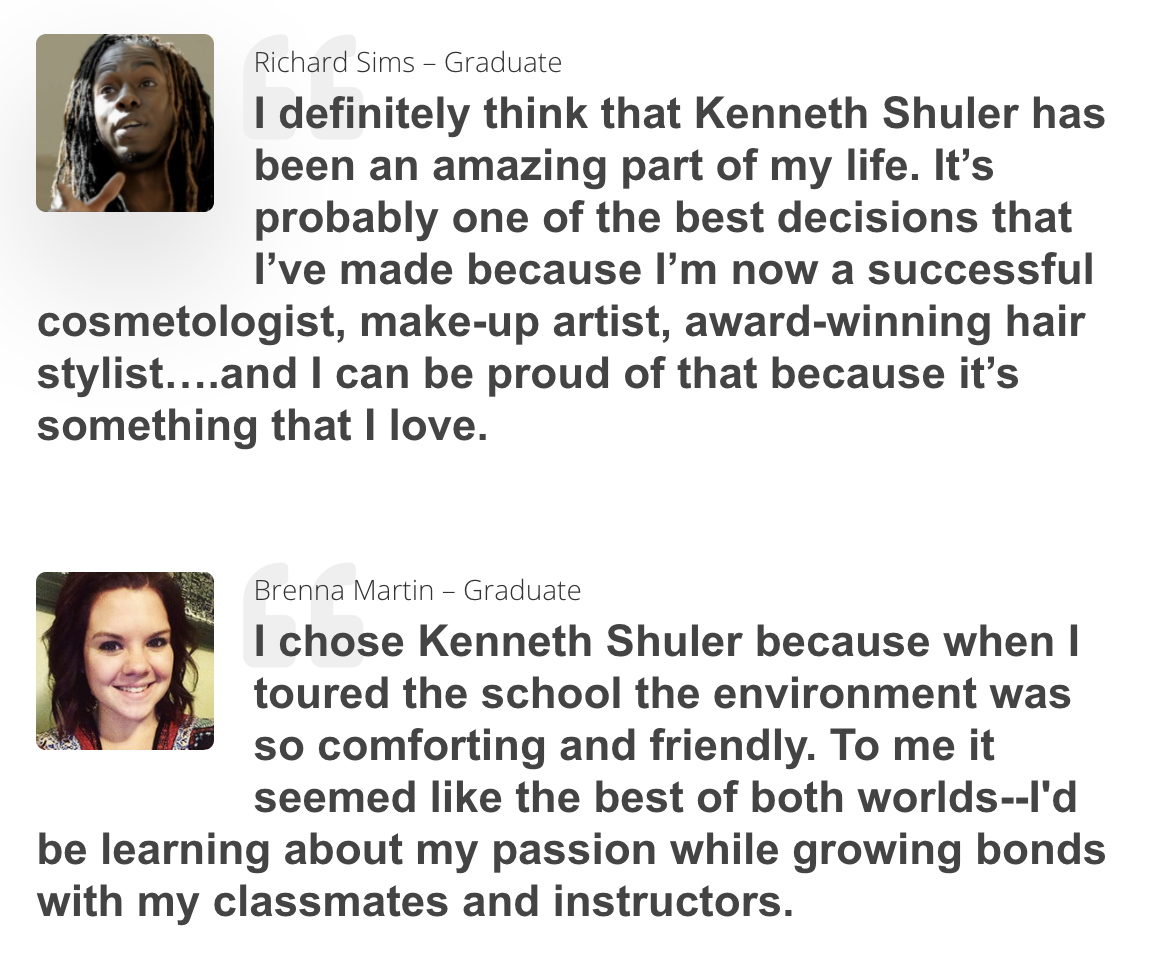
Kenneth Shuler School of Cosmetology collects and presents many student testimonials.
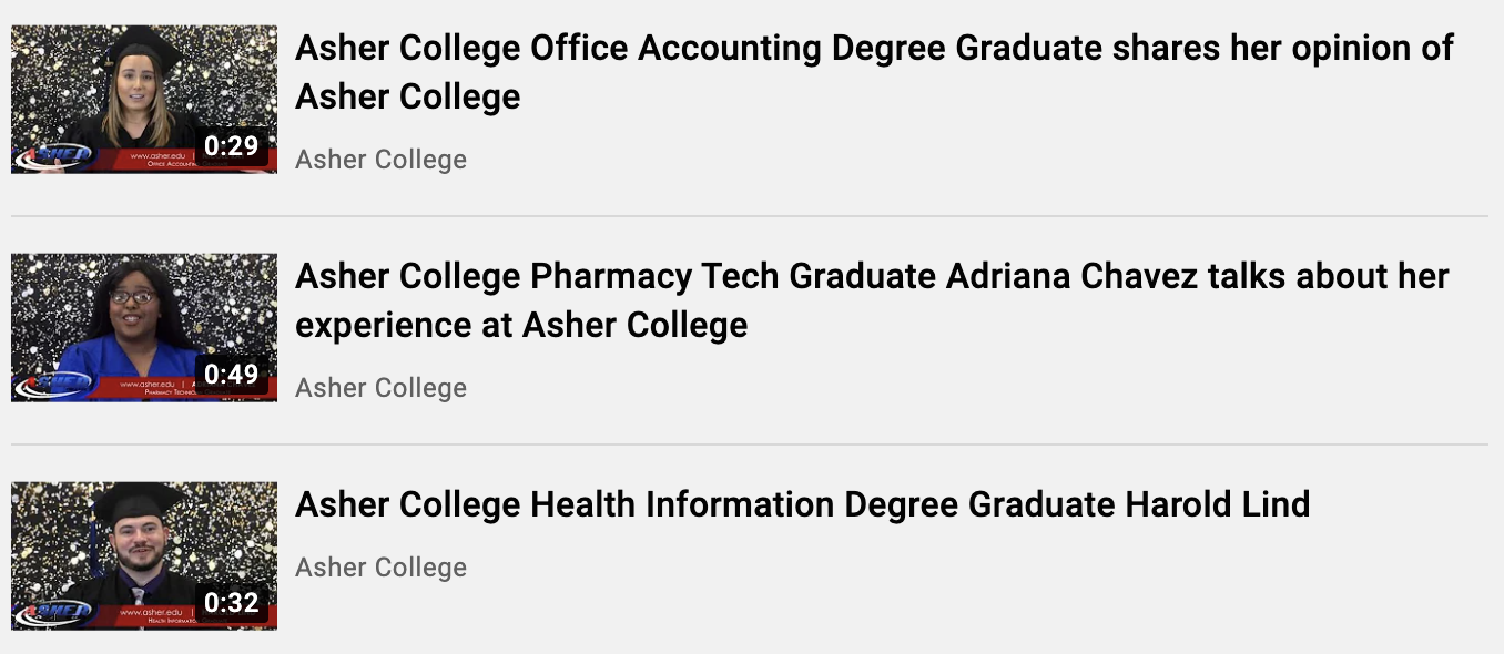
Asher College invites graduates to create short videos about their college experience. The videos are collected in a playlist on their YouTube channel and embedded on the homepage and various pages across the site.
Your college website should not only motivate prospective students to take action, but it should also make it easy and compelling. Address this challenge with call-to-action buttons that are easy to easy to find and understand.
Your call-to-action might prompt an interested student to fill out a form to download a document, place a phone call to the admissions office, or schedule a campus tour. Understand exactly what you deem a success for the page you’re presenting and present your call-to-action with specific statements (not “learn more” or “click here”) that begin with verbs.
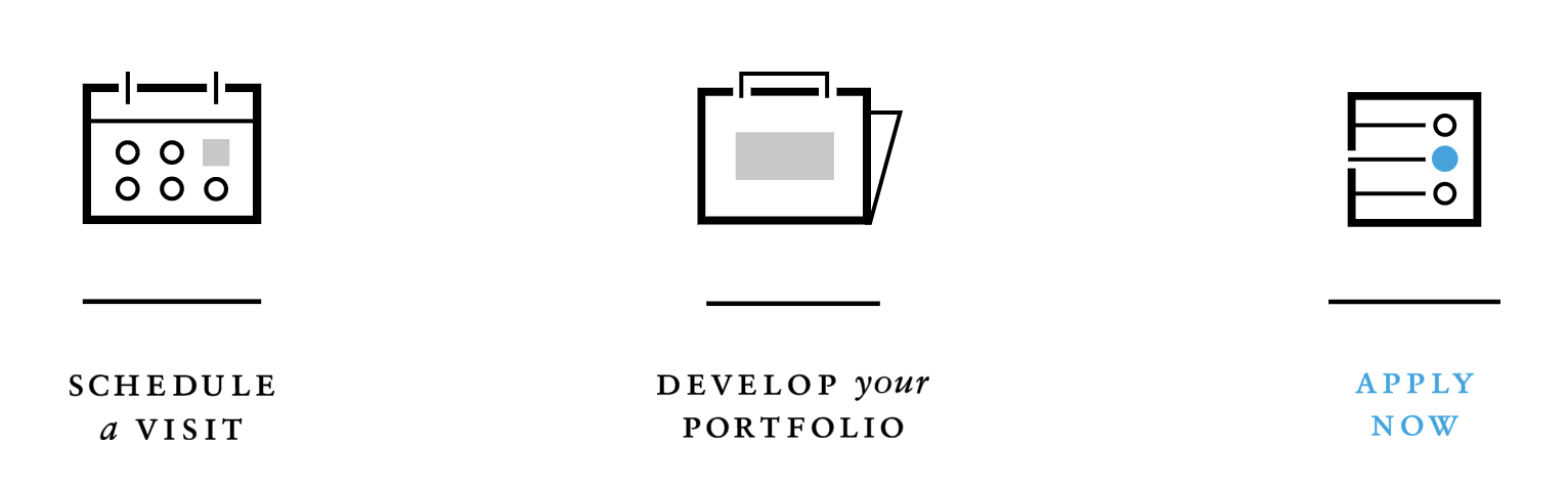
The Modern College of Design presents clear calls-to-action all across their website.
When you hear the term ADA compliance, chances are you think of wheelchair ramps, handicap parking spaces or bathrooms. But, have you thought about how disabled persons use the Internet?
The passage above comes from a page on GetADAAccessible.com, which points out:
American With Disabilities Act applies to all public places and private education. Specific sections apply to schools, so in the making of your site be aware of how the law applies to your college.
For more information, read Roadmap to Web Accessibility in Higher Education, a detailed post about how universities and colleges must upgrade their websites, online courses, and network resources to meet modern web accessibility standards.
Probably not. Completely covering the topic of best practices for web design could include additional advice for:
Rome wasn’t built in a day, nor was the University of Rome’s website. So, we’ll call this post a wrap.
Take all you can and stay tuned for deeper dives into some of these topics. If you have to go away with two simple ideas, they should be:
You have stiff competition. A great website is a competitive advantage for recruitment, retention, and advocacy. And for the digital native, a mediocre website may be a deal-breaker.

While you may get more admissions with a great website, there is also a good way to improve your admissions team’s efficiency – check out LeadSquared’s Education CRM. It helps you digitize admissions, monitor the student lifecycle, increase counselor productivity, enhance the student experience, and do much more. Everything from one seamless platform!
Enter your details and we'll send you a quick confirmation email to verify your address.


 Prepare Yourself for Another Roller Coaster Ride in Admissions