


MARKETING
Get Attention
Contents
Have you ever noticed that as you drive through your daily route, you make it home without even consciously realizing it? This is what we call the autopilot mode, which is how human mind operates when we do everyday things like driving home.
But, the autopilot mode breaks when someone suddenly jumps in front of the car. You are forced to pay attention and act in response to this interruption.
Just like that, there is so much marketing noise on the web, television, radio, billboards and practically everywhere, that people consume them without even registering the message properly. It is becoming exceedingly difficult for the marketers to get their point across. To stand out, they need to interrupt this autopilot mode.
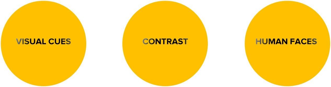
In the following pages, will tell you how to break the pattern of the habitual and get noticed with the help of design.
PART I
The visual cue is a signal to direct attention to something important. We can’t help but pay attention to an arrow or a pointed finger.
![]()
Try this – get a group of people on the street, every one of them watching the sky with their finger pointing upwards. Almost without exception, the passers-by would pause at least for a moment to look in the same direction. That is a visual cue – the line of sight of people and the pointing fingers. Let’s take the example of this ad:
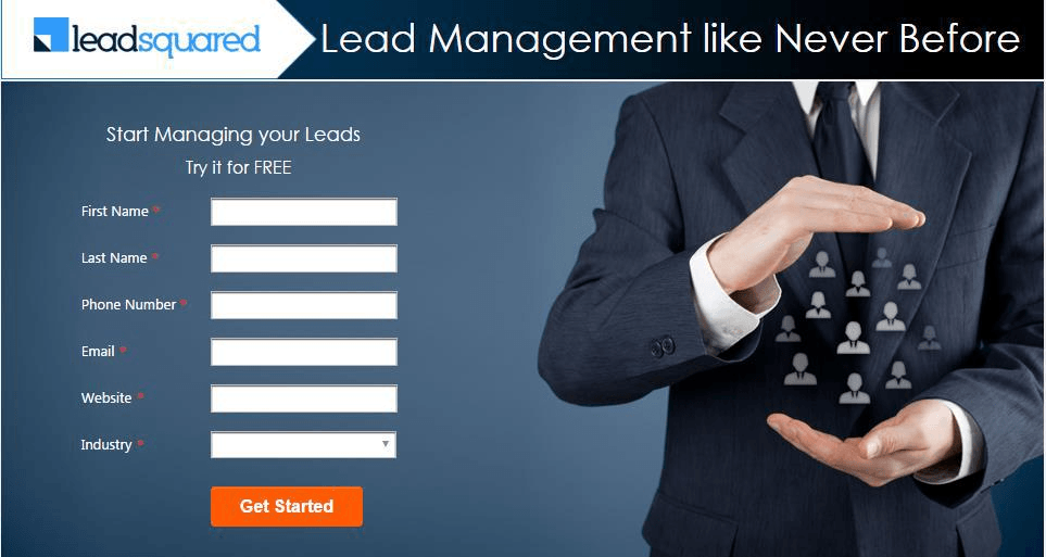
Example of a simple form:

a form without a pointer
Examples of visual cues used on banner ads:
PART II
Contrast is the state of being strikingly different from the surroundings.
When I started writing this e-book, like most people I was thinking of contrast only from the perspective of color (black and white). But as I dug deeper, I realized there is much more to it.
Apart from color, contrast can be for size, shape and position as well. We are attracted to contrasting things because the brain pays more attention to anything that breaks the monotony.
Whether you are making a banner ad, a landing page or any visual creative, the contrast should be given to the most important piece of information. That is why the headline is generally big and bold, and call to action is a different color. They are important and contrast gives them the necessary attention.
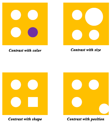
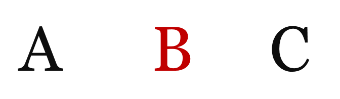
Contrast with color means getting attention with a strikingly different color than the other elements. It is the most common contrast type used in marketing (buttons, error messages, hyperlinks, tips)
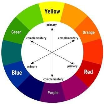
It is important to use proper contrasting colors (opposites on a color wheel) or else it becomes annoying to the eyes.
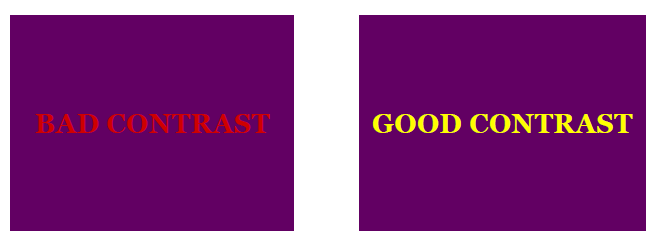
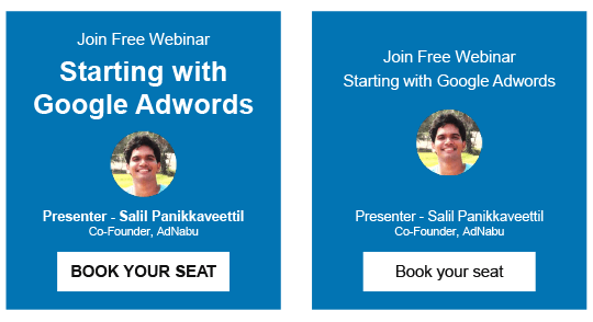
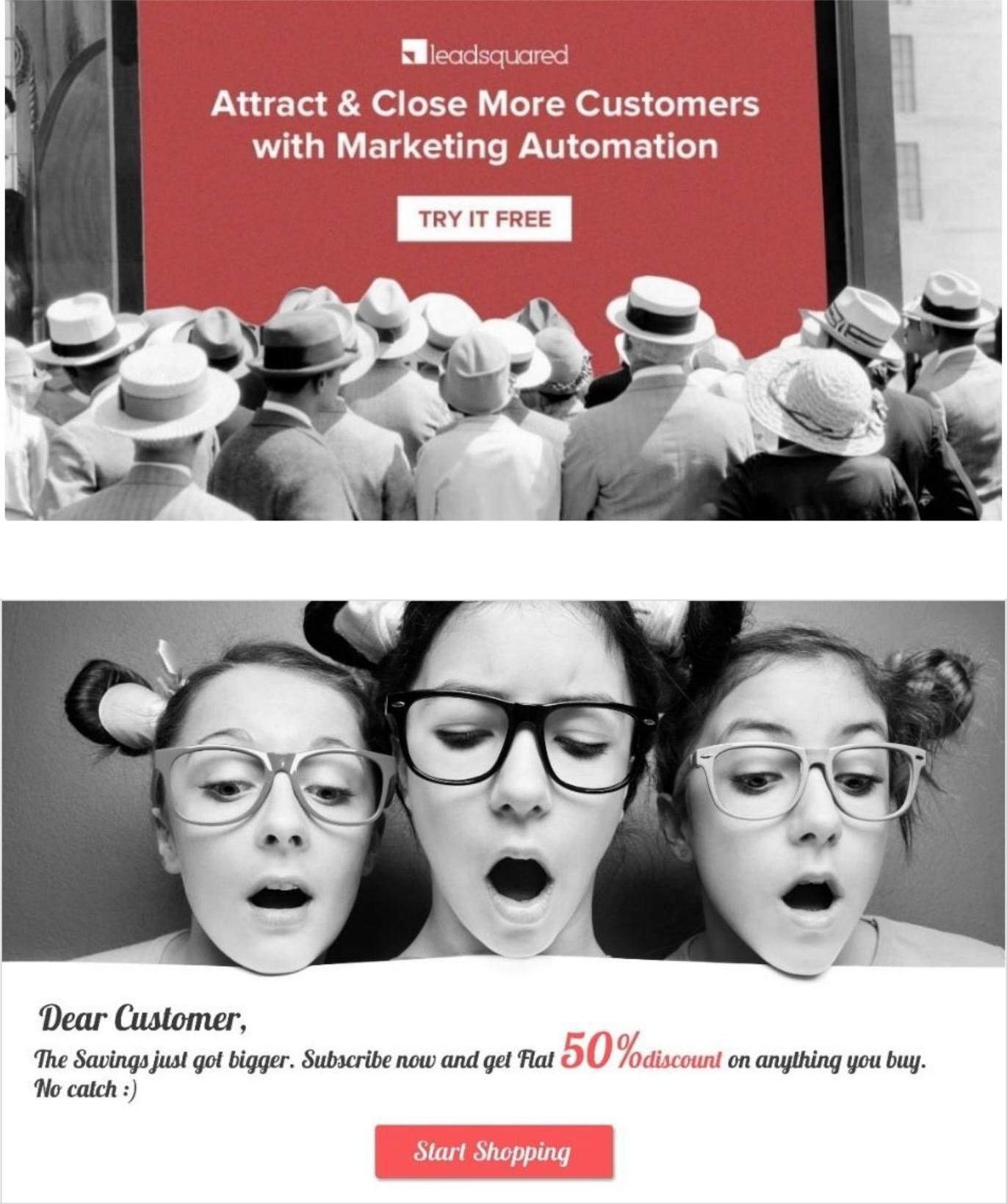
Which one gets your attention?
This is a standard YouTube page where we retarget our prospects:
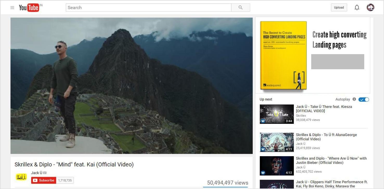

the grey button on the ad gets lost, because of the lack of contrast
You can see 2 versions of the same ad. The ad on the left probably caught your attention. Why?
Because the variation in text size and weight has given us a clue of what to read first. It feels natural to follow the pattern of big size first. Bigger objects attract more attention and are perceived to be more important compared to the smaller ones.
That is why we read “Starting with Google AdWords” before the other text.
Bigger font and weight has added a hierarchy of importance in the otherwise random design (right) and the eye naturally follows the movement from big to small.
a big font for headline provides the size contrast
a big e-book cover provides contrast against the smaller text
Contrast with the shape means getting attention with the shape when compared to other things on the page.
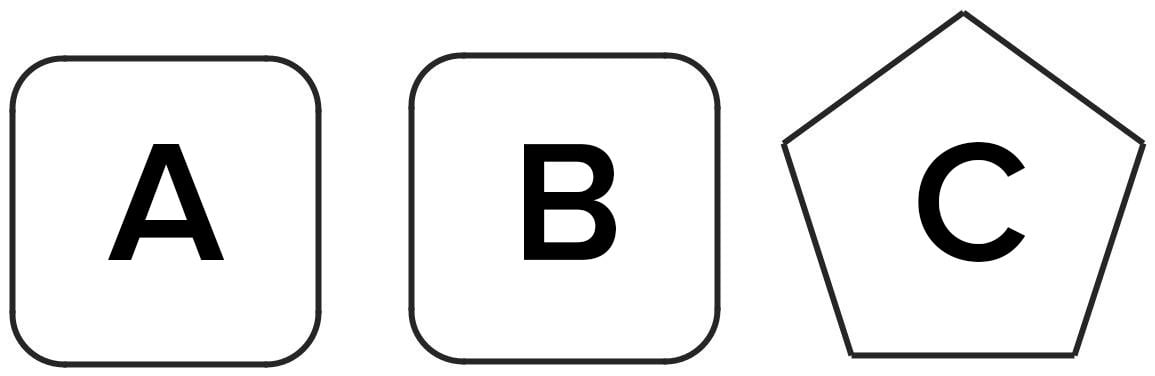
The pentagonal shape is used to break the pattern and catch attention
The triangle at the top left corner catches the eye due to its shape

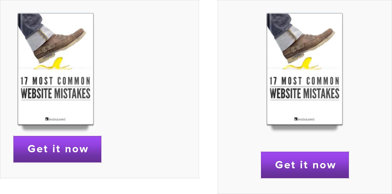
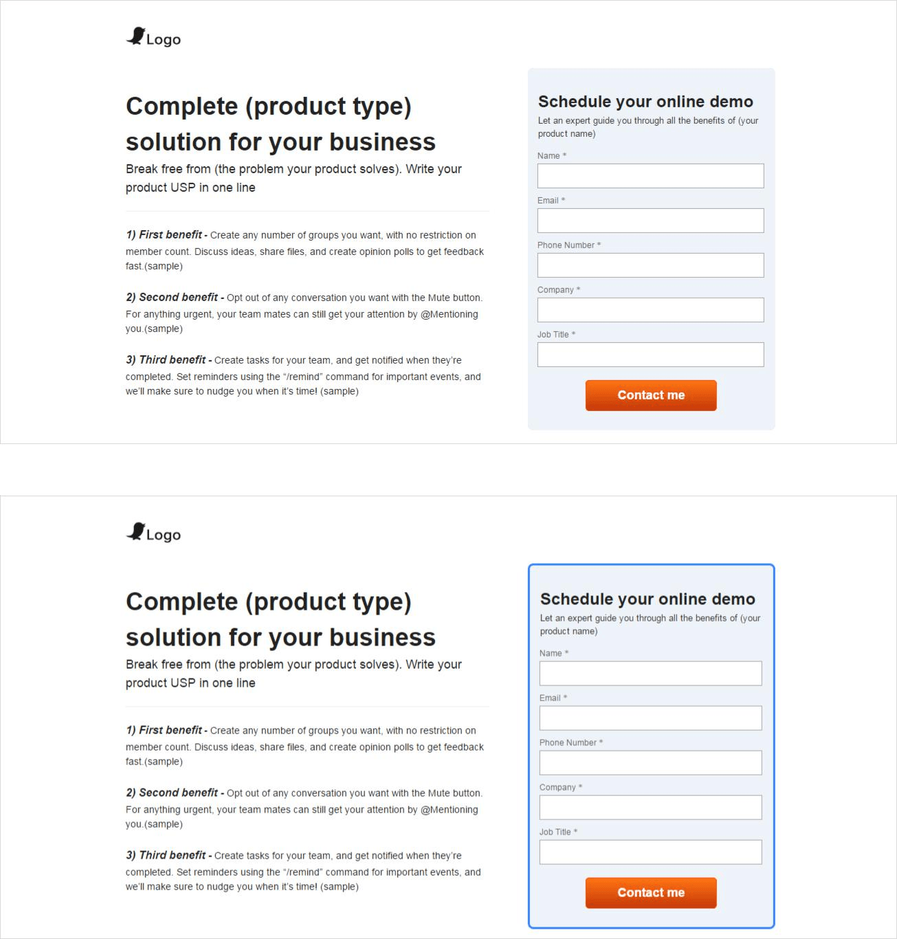
Contrast with position means getting attention with the physical position of an object when compared to other things on the page.
the hand drawn testimonial bubble breaks the shape pattern and draws attention to itself
Below (on the left) you will see that the text pops out immediately because it breaks the positional arrangement and sits outside the linear geometry

PART III

a discount coupon as a cutout on the top right corner catches attention quickly because of its position and shape
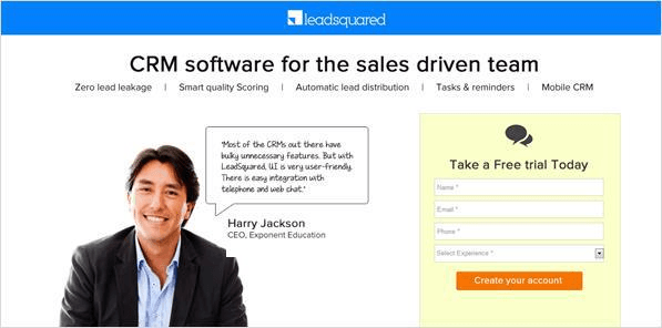
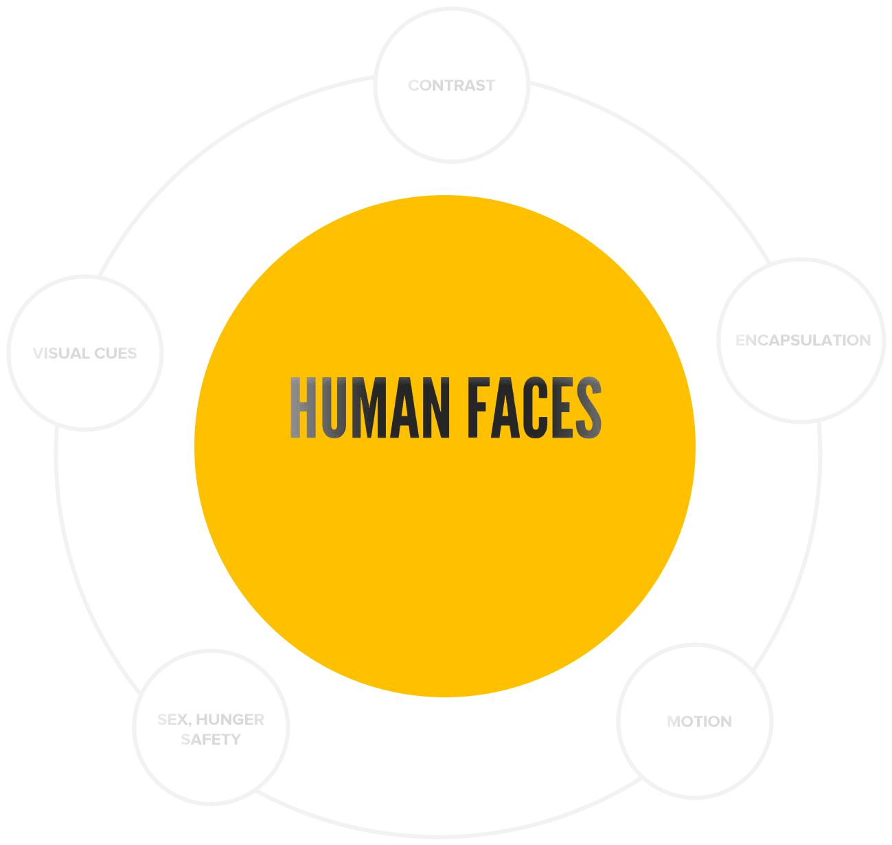
Human faces connect emotionally with the audience quicker than text or a generic icon
an angled headline is noticeable because of its angle compared to other elements
We are attracted towards faces and are curious to know what they mean to us. It has also been proven that a happy face actually makes us happy.
Taking a short story from Nathalie Nahai’s book “webs of influence”
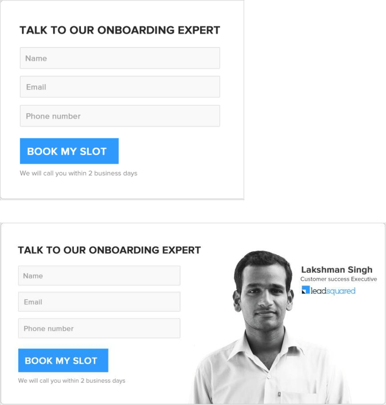
What does it mean – A simple use of a human image can have a significant effect on how the visitors feel and act on the web.
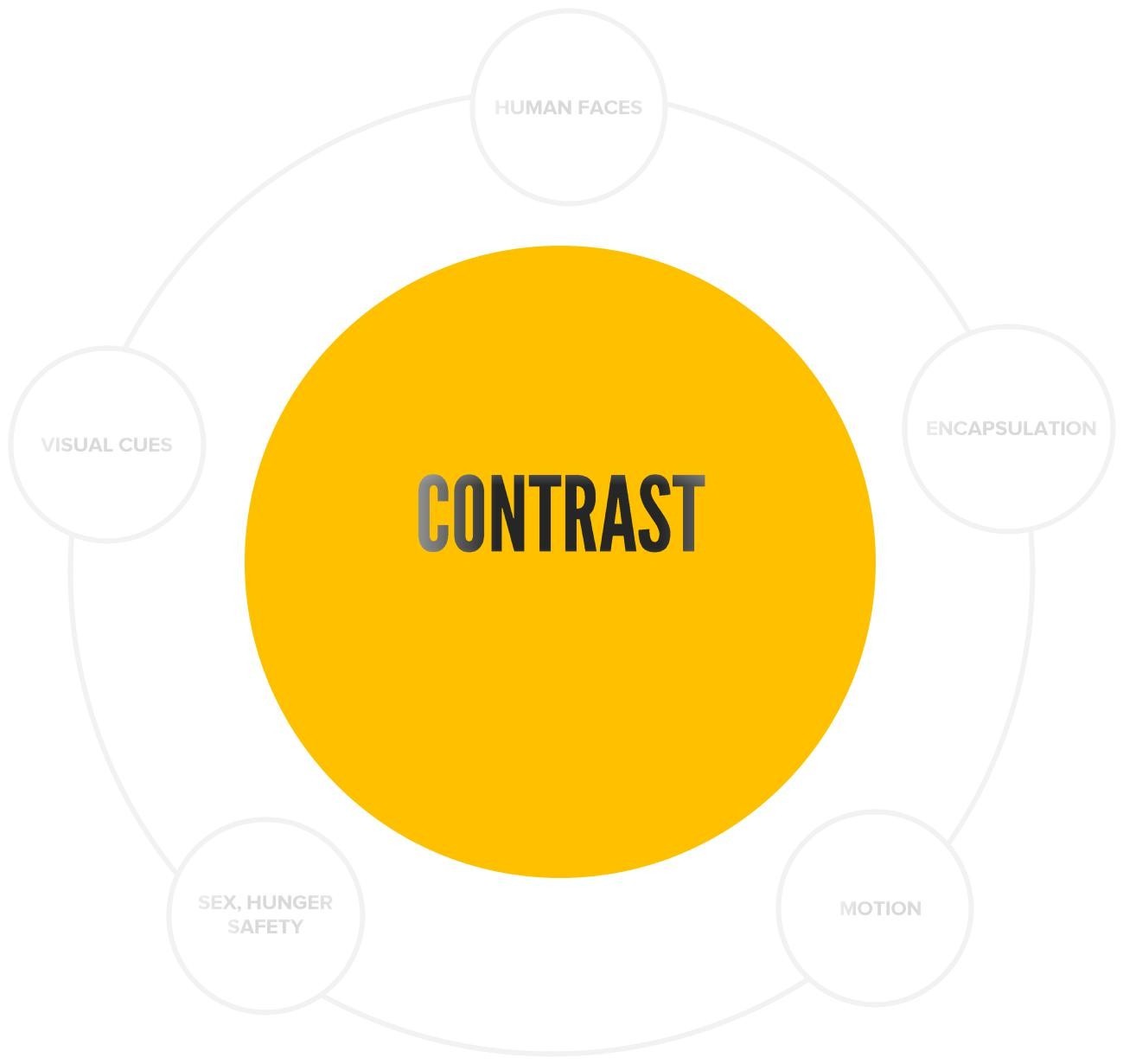
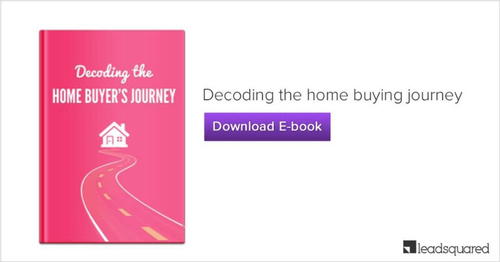
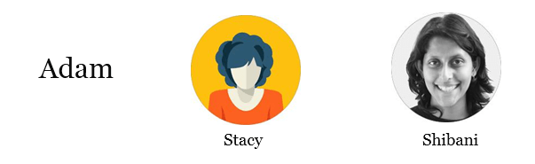
LeadSquared remarketing banners
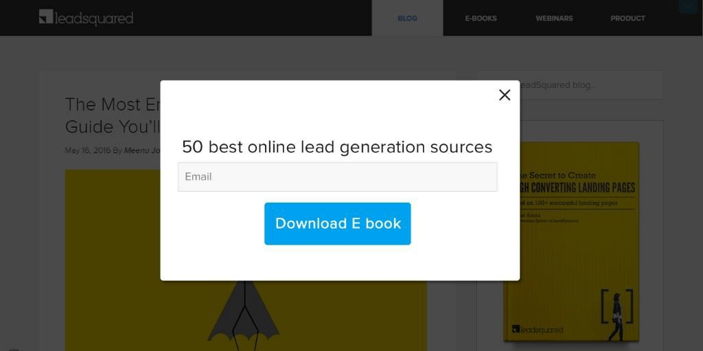
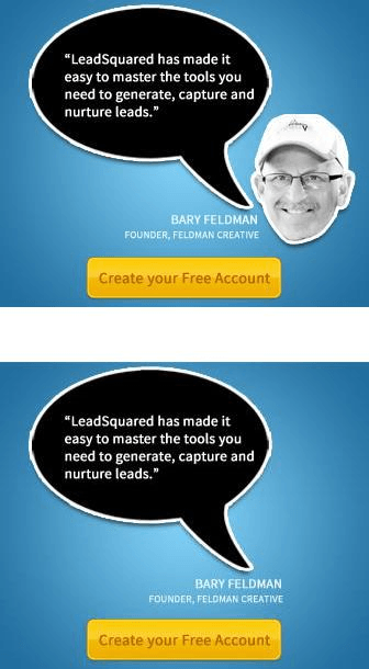
LeadSquared Support Portal pop-up
PART IV
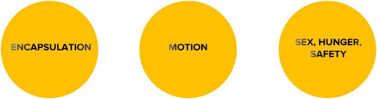
Encapsulation is when you place an object within a shape to highlight its importance.
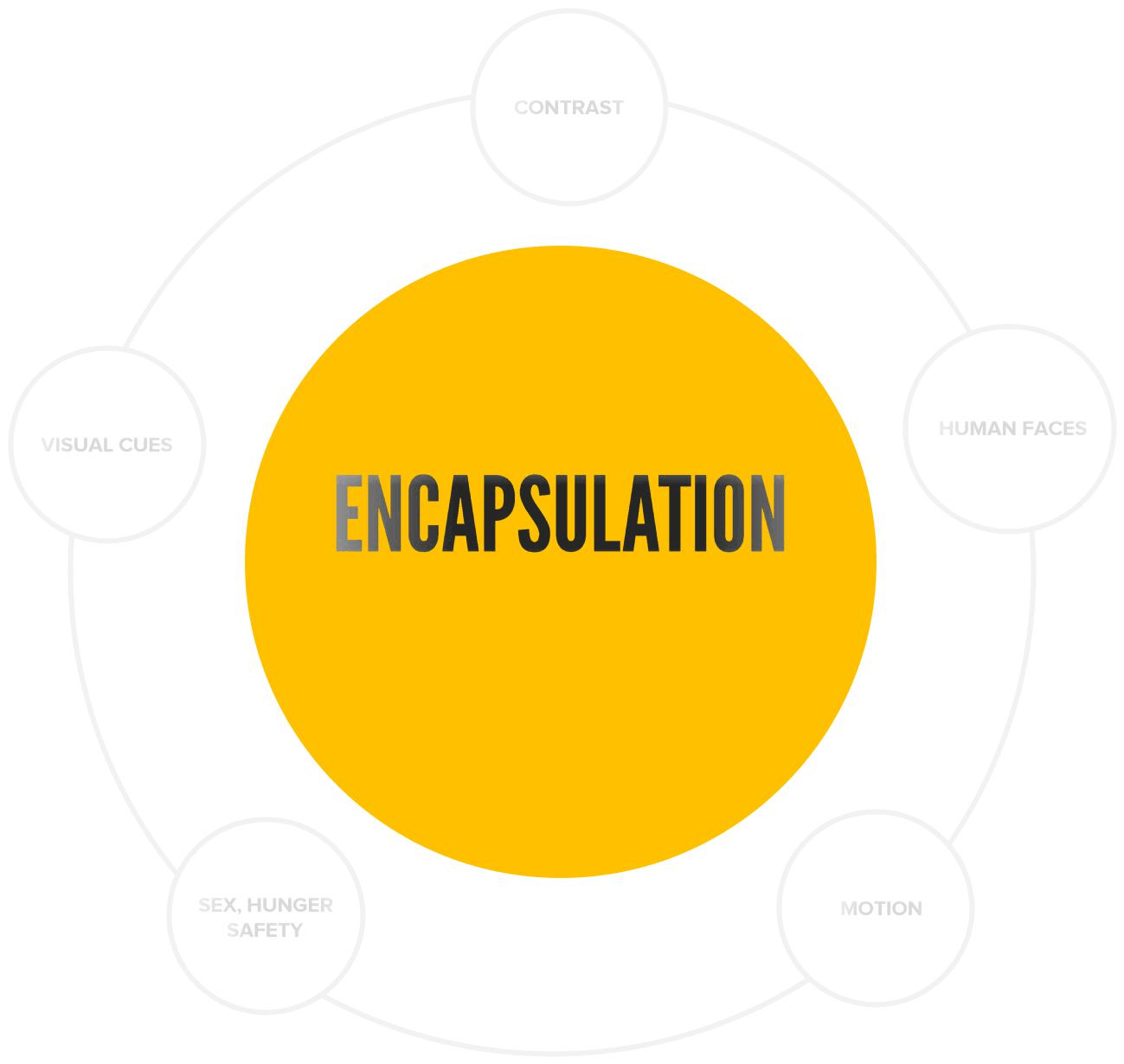

Examples of encapsulation in design
believable than the second one
PART V
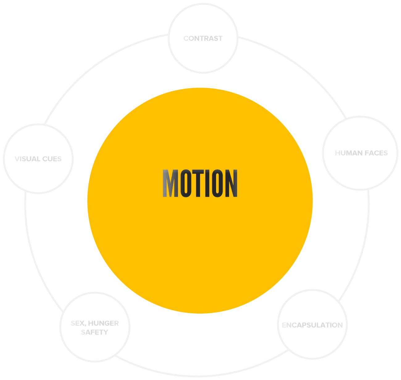
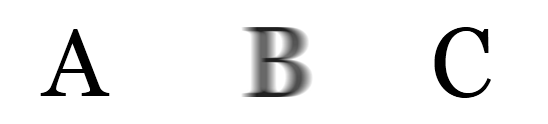
Motion is the action or process of moving or being moved.
Motion alerts us, especially when the surrounding is static. It is an inherent response, probably passed down from our ancestors who perceived motion as an alert for danger. Think a moving tiger or a snake.
the text in the white area gets highlighted
PART VI
the icons encapsulated within the hands catch attention
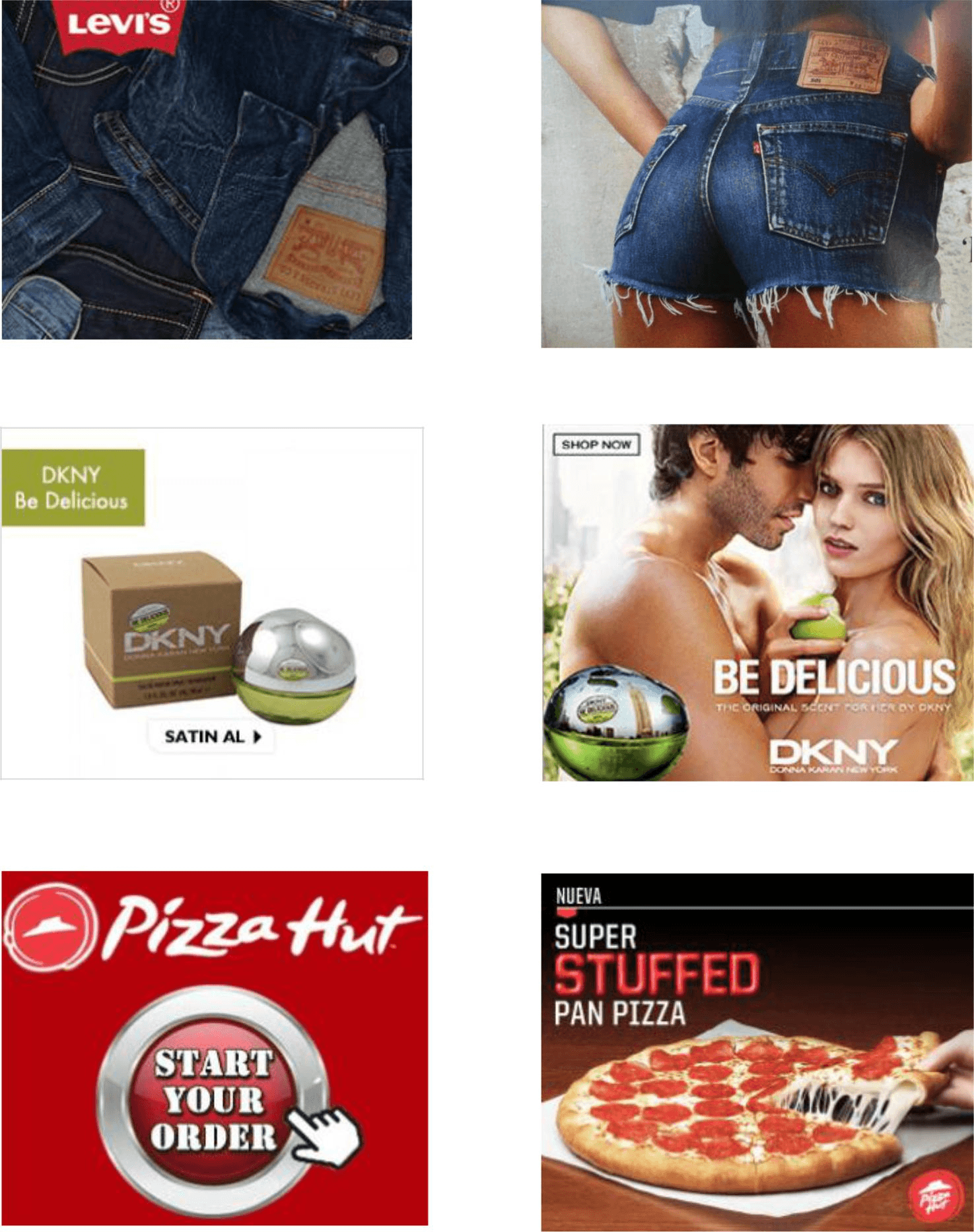
One of the best ways to attract attention is to target the basic physiological needs of human beings – sex, hunger and a need for safety.
They are powerful triggers, widely used in marketing to get noticed.
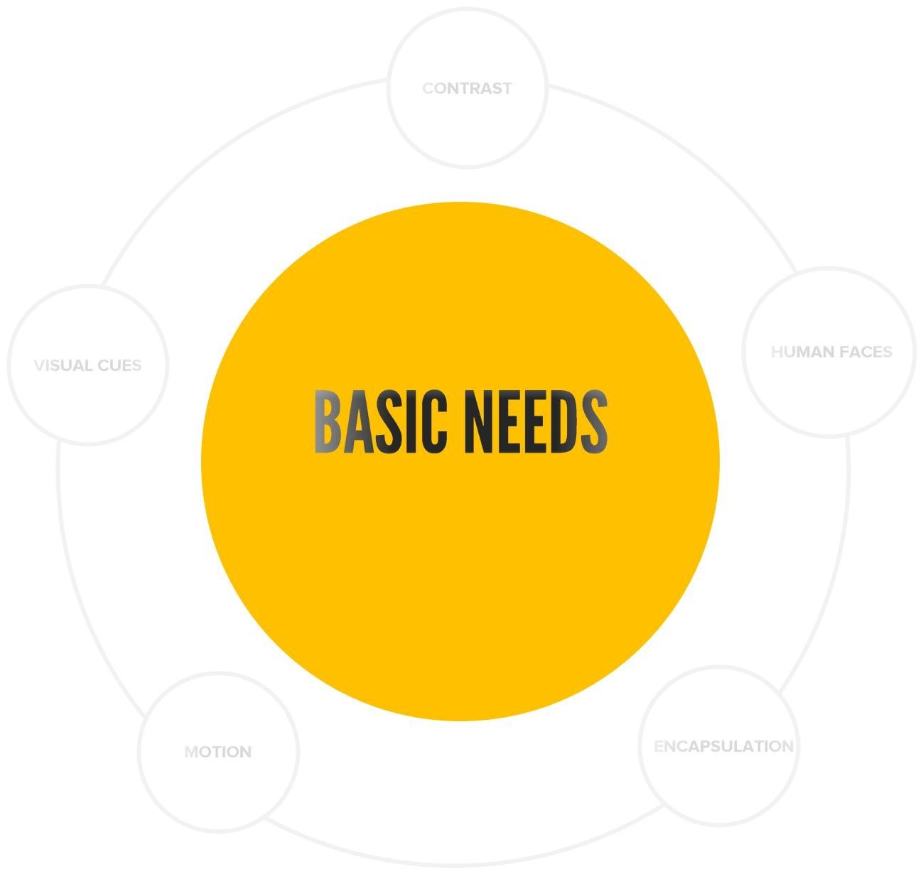
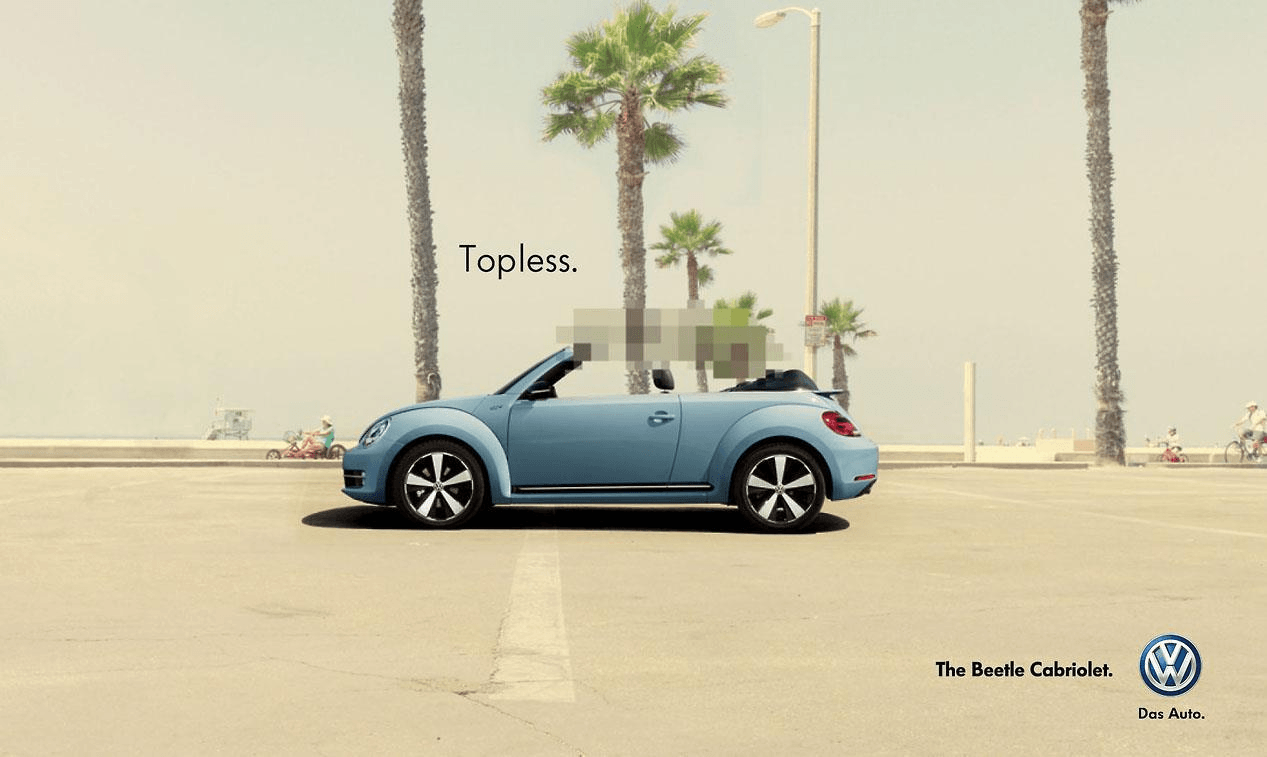
Just like motion, they have a very delicate balance. Overusing them can ruin your campaigns. Check how Volkswagen uses it intelligently.

Which side appeals to you more?
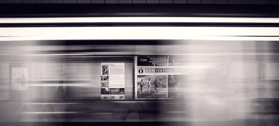
watching a fast moving train causes a headache because of the amount of information our eyes have to consume in a small timeframe
Enter your details and we'll send you a quick confirmation email to verify your address.


 What is Google AdWords (Now Google Ads)?