


MARKETING
Top 7 Health and Fitness Websites of 2015 That Blew Our Minds
Contents

High website conversion rates, especially for health and fitness websites, are not easy pal – it all boils down to the conversion tricks you use! A good ad and awesome marketing are all well and good, but, ultimately it is up to your website to seduce the visitor to conversion.
It is rather like selling to a customer intent on window shopping. A big hoarding and flashy lights might capture his attention. But if the display at the window looks something like this:

and the experience in the shop is amazing, the chances of a sale sky-rocket!
A good website does exactly that – it is your online real estate that builds customer trust and encourages him to convert.
So, right at the start of a great new year, let us look back a bit and learn from the awesome health and fitness websites that carved a niche for themselves in the health and wellness industry. They could definitely inspire your designs for 2016!
The company that sells the popular UP bands – a range of fitness wearable that has the fitness freaks panting. The latest version includes a heart rate monitor as well!
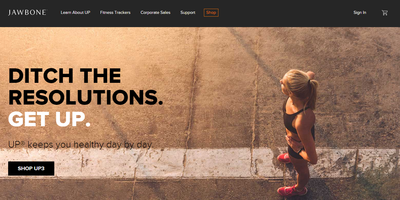
So, they make amazing fitness trackers but that is not why they are here. It is because they have a great website to go with it!
Let me tell you why-
I mean, just look at the basic look and feel of this site. The powerful image and the intelligent use of white space really captures your attention. They take minimalism to a whole new level!
I don’t know if you noticed it – but the woman in the picture is looking at the “Shop” button. Wondering why it is important? Well, the whole “Line of sight” angle. You see, according to a study by marketing sherpa, the consumers tend to follow the line of sight of the subject in the images they see.
I don’t know if it is by design or an happy accident – but a good move nonetheless.
A good headline is one that tells the user why he is on the website – instantly. Full points there! At a time when people are making (and mostly breaking) resolutions, this headlines is spot -on! Talk about “speaking to the audience”.
The other thing that has me excited is the pun with the word ‘up’. They are totally correct in predicting that the foremost reason for most people to give up on their fitness pursuit is laziness (guilty as charged ) and therefore ask you to take action – by getting “Up” – not just from your seat, but their fitness bands! Yes, I know you didn’t need me to spell it out for you – but that is how excited this headline has made me!
The page allows the user to easily identify how the different sections of the page are related to each other. It is also pretty simple to come back to the home page and browse options there.
The site automatically understood that I was browsing from India and showed the country option accordingly. Of course, it does allow you to change it as well. I found that changing it really does not affect the user experience.
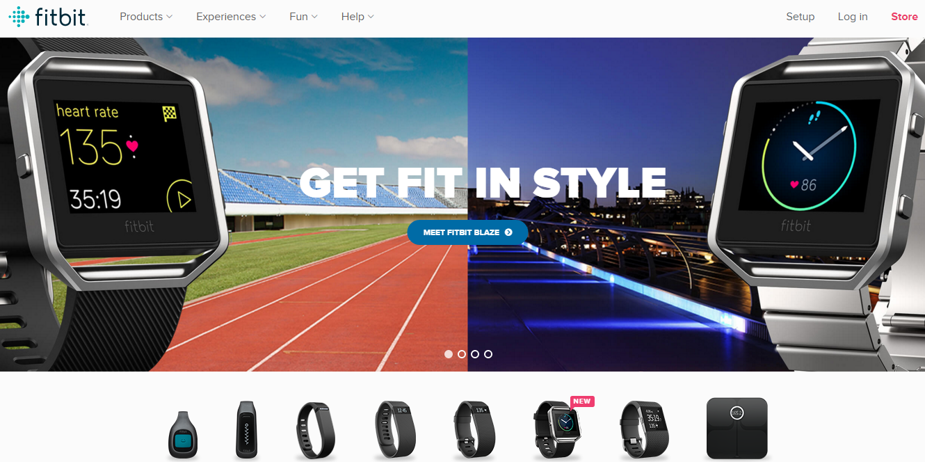
Another hugely popular wearable fitness tracker that is making waves in the market. They have come up with a range of watches that can function as tracking devices. Feel free to go ahead gift me one!
Let us see why it is on the list.
We all know that diagonal lines add a sense of dynamic energy to the image and draw the eye to the subject rather easily. Here the artful juxtaposition of two such images that are also a clear contrast to each other creates a very interesting visual.
I like the fact that they are not just asking me to get fit, but to do it in style! Positioning your brand as an “in” thing to have is a very smart move.
The CTA button is blue. Now, I am generally not a fan of the colour because the contrast of blue and white makes it rather unreadable. But they have hit the correct balance there and have positioned it very strategically – right below the headlines and at the centre of two contrasting images. Draws the eye, that does!
You know what I don’t get – the fact that people ignore the concept of ‘fold’ in their webpage. Just take a look at this site:
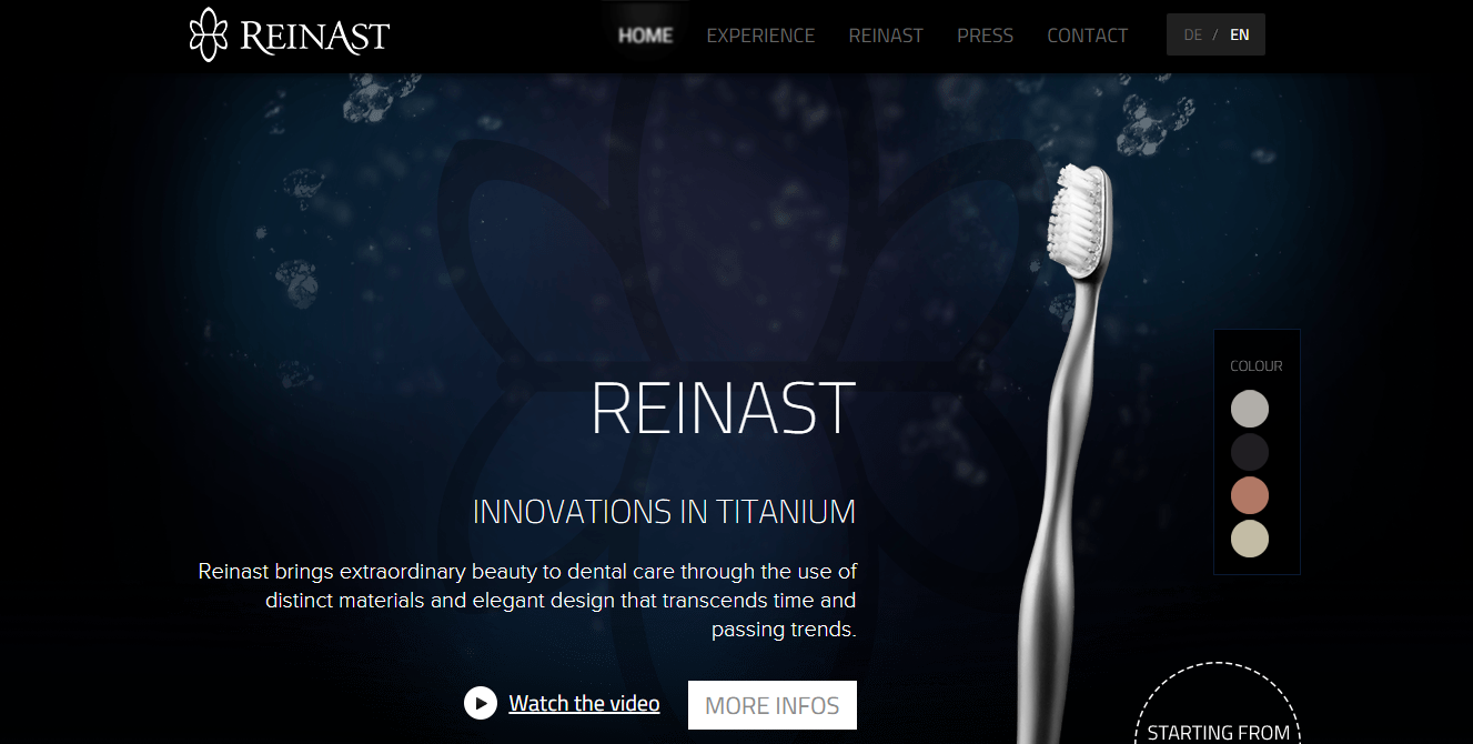
Very beautiful contrast and design. But if you notice, the important information – pricing, is lost below the fold, making people scroll down for it. At the very least, it abruptly ends the positive user experience right there!
In contrast, the folks at fitbit have chosen to display their range of wearable right before the fold – thus ensuring that I (ok, we) dont have to scroll down further to see what they offer.
Moreover, each of image displayed here is dynamic by itself and takes you to the specific product page again! No cluttering the space with redundant text. Kudos guys!
Let us now look below the fold.
For a persistent and curious user, the experience down under matters as well. And folks, these people ‘fit’ the bill (see what I did there – Fitbit, ‘fit the bill’)

Well proportioned text; clean, uncluttered usage of space and dynamic images and CTAs at the bottom. Helpful and clever. Need I say more?
It seems to be raining wearable fitness devices here! Not my fault that they have a compelling website folks!! So, here is one more product to add to the list – Zensorium.
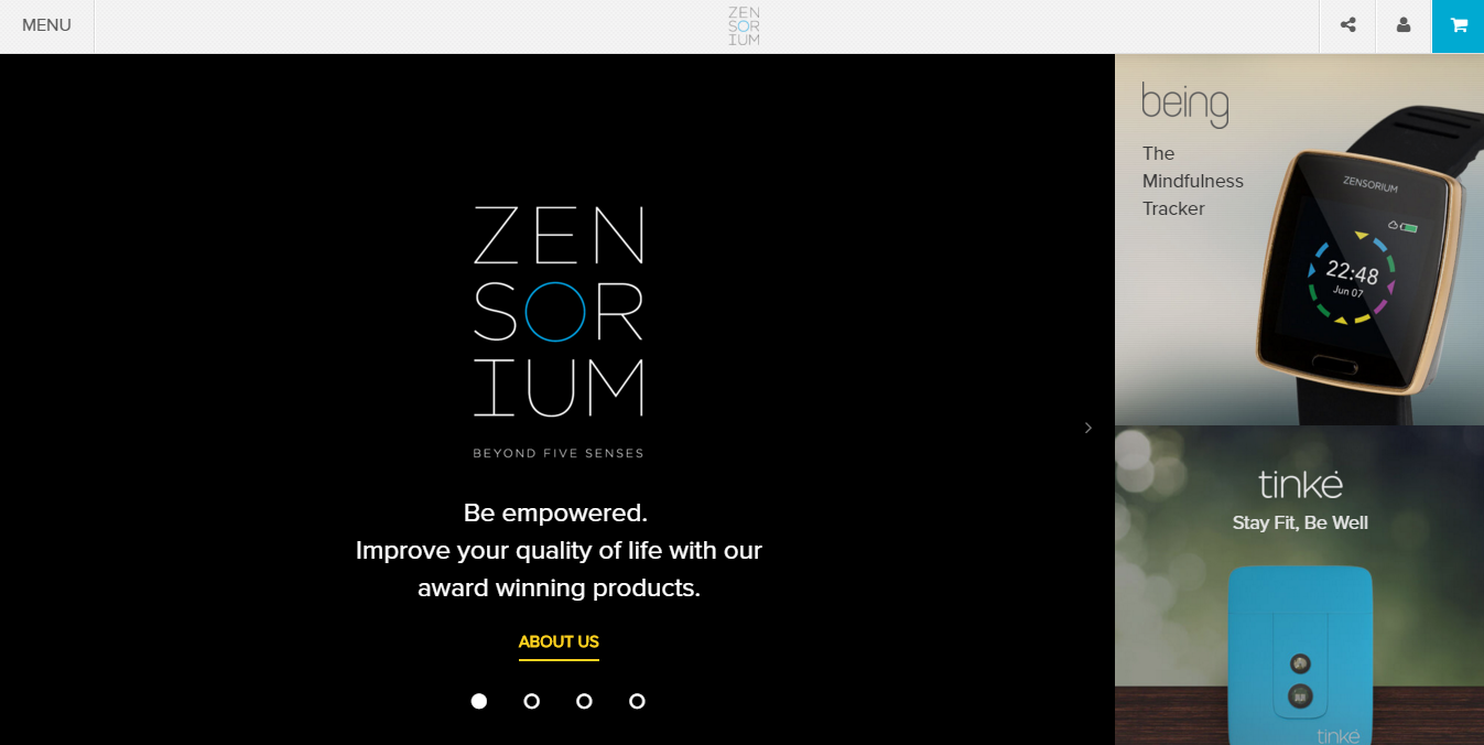
Let’s walk through this one as well:
Great contrast that highlights the headlines – a total win. I don’t mean just the main one. But on the side, if you notice for the products Being and Tinke, the headlines are made to stand out by just changing font colour and playing with space.
It draws attention to not just the text, but also to the product images on the side!
Positioned just above the fold, with nothing cut off abruptly. And hey when you scroll down, the main screen with the slide-ins remain intact – it is the product bar on the side that moves!
Rather clever eh?
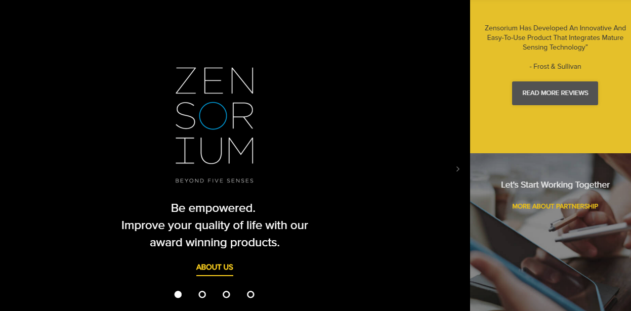
Placing a testimonial right on the home page makes a very compelling reason for a user to think positively of the product
Providing the same headlines for the products in all images makes it easier to remember.
Doesn’t take a genius to figure out how each page is linked to the other. Also, gives the user exactly what he wants without unnecessary clutter.
The image of Being/ Tinke is clickable and takes you to the respective product’s page.
For a change, let us look at a B2B company in this industry.
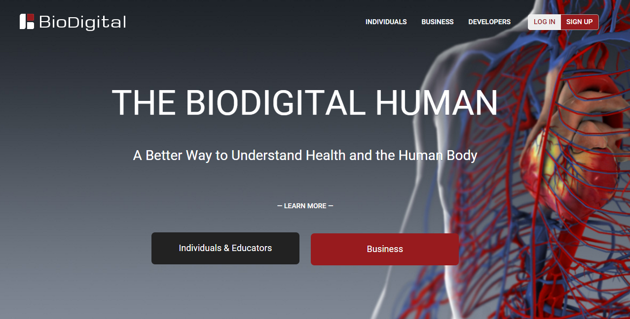
You are looking at an interactive 3D software that can help you understand the human body better (did I mention interactive 3D?). Though it is free for teachers and students, businesses can use it to showcase their fitness- related products.
Though I am quite excited about the learning potential in this software, I am also totally thrilled with their website. I shall tell you why.
The home page, is a real visual treat! Bold and clear headlines, great spacing and an excellent depiction of the human heart – gives you a fair idea of what they are about. As website experts put it – they ‘set the context’ instantly.
If you notice, they have not specified click-bait Call To Actions like – Get this now! or Hurry!. Instead, it is rather a separation of customers based on intent. So depending upon my business needs, I will know exactly where to go once I land on this page. Nicely done, I thought.
Want to know what happens below the fold?
Kudos again folks for respecting the fold-line logic. It is rather nice to see (or not -see) abruptly cut off information! Scrolling down doesn’t disappoint at all.
Immediately below the fold line, this is what you see.
Nothing like someone else’s (a rather popular someone) praise to make you form a good opinion. Not only were their testimonials well chosen, but speaking from the design POV, the white background against a continuous sea of grey gives a good contrast to the eye.
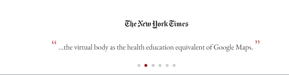
This is again followed by announcing their product features and then the various awards that they have won. So when they say “award winning technology” they have proof to back it up – proof you can see!
Further scrolling reveals certain other aspects of the platform and a live quote from a happy user.
Now comes the best part – after announcing their credibility, their features and how happy their customers are, they give you the CTA.
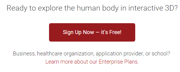
A very nice way to build up customer trust and interest; essentially builiding a solid case for yourself before presenting an action.
Also, notice that they have specified “it’s Free” right on the button. A further compelling reason to click. Well done guys! Seriously.
With cosmetic surgery being all the rage, I myself admit to being rather surprised that it took us so long to get a hit on this sector.
Well, since it is pretty obvious what we are looking at, I shall not spell it out for you. Let us directly dive into the website aspect.
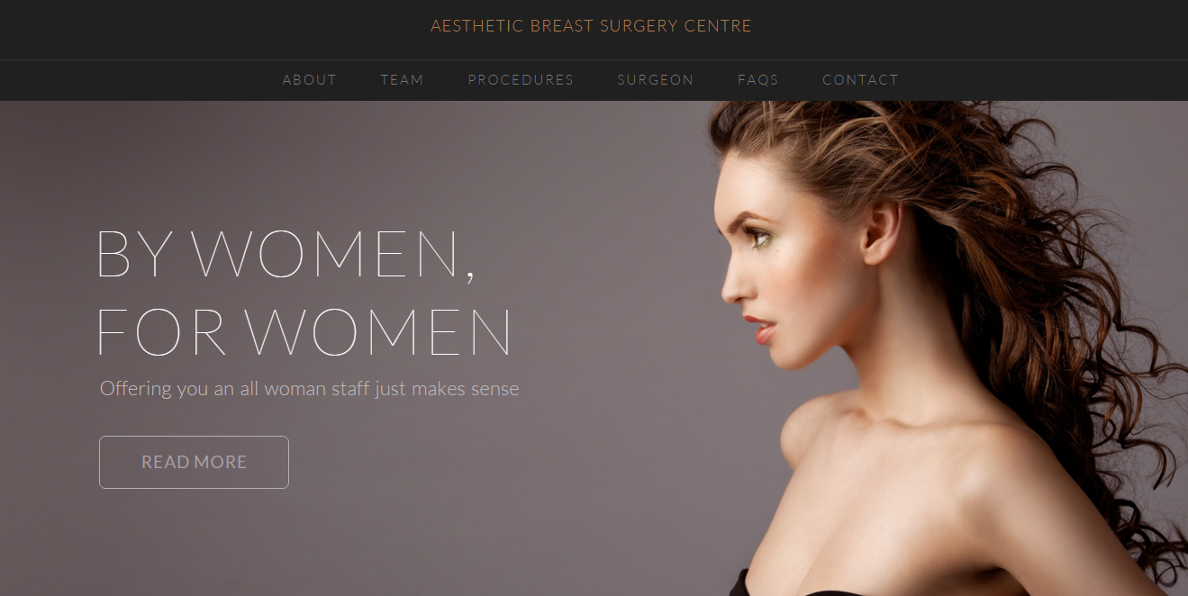
You can’t look away from the woman can you? And if you manage to tear your eyes away from her (artfully highlighted image – way to go!) you automatically look at what she is looking at – the headlines.
Did you see what just happened? By highlighting the woman’s picture, every other detail on the website was suitably “dimmed”. The headlines, while being subtle is no less attention grabbing than the bold ones we have seen so far.
Their message – that it is for all women establishes a connect between their services (and team) and the prospect who is viewing the site. An immediate bond that gains the customer’s loyalty.
Keeping with the theme of the whole page, the CTA is also suitably subtle (imagine if it was a bold green or red – *shudders*) and the message is not a click – bait either.
Giving your prospect the opportunity to learn more about what they have to offer instead of aiming for a sale shows that they have totally understood their audience. C’mon, how many people you know would get a cosmetic surgery done without getting atleast some information about it?!!

This is the only navigation toolbar on the entire page! The stark contrast between the page colour and the tool bar colour makes it stand out, while being subtle.
Let us look below the fold.
So they have a lead capture form at the bottom of the page. Before you get to it though, you are guided through what the company has to offer.
As a feminist, I could really appreciate that there is no body shaming involved. Neither do they say that you have to “get beautiful” with their treatment, nor do they denounce those who are against such procedures. They simply propose their business and give you the freedom of choice. That had me all teary -eyed!
Ever hunted for fitness classes in your neighborhood? Having shifted two places in one year, let me tell you that it is no fun.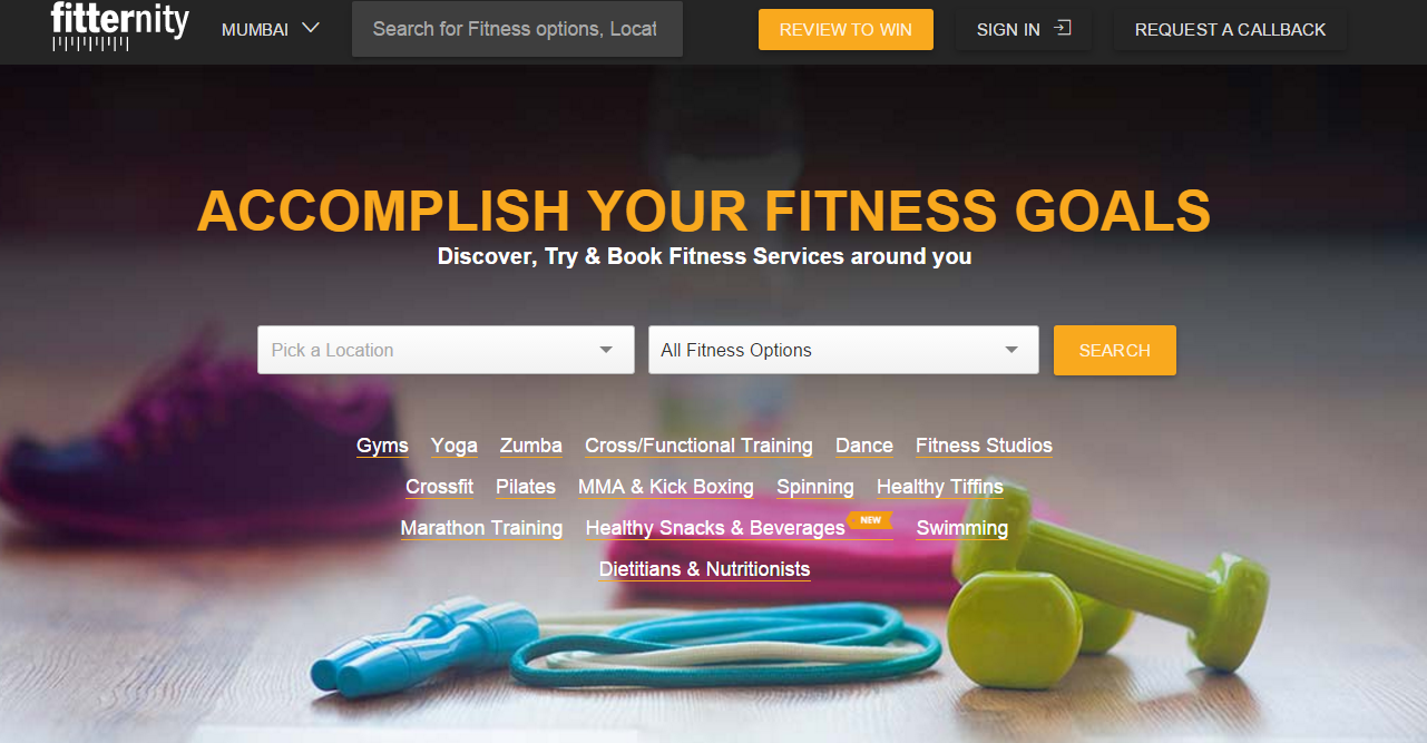
Which is why this website caught my attention in the first place – it really catered to a need. Incidentally, Fitternity is also featured in our online lead generation options for fitness marketing.
Great look and feel. Doesn’t distract the user from his main purpose – on the contrary high lights what he might be looking for.
I like the way they have worded the headline – it speaks to the audience and sets the context immediately.
Also, have you noticed – their CTAs and headline are in the same colour? It immediately tells the prospect where to devote his attention.
Speaking of CTAs, there are actually four CTAs on the page. No, that is not an overkill. By colour -coding them (a nice orange), they have done a very smart thing. A first time user would be interested in the search results and be eager to convert because of the contest.
A second or third time – returning customer wont need such bold CTA to either Sign – in or ask for a call back. Beautifully executed folks!

The quick search button on the top bar (that lets you type your requirement) is a real win.
Looking below the fold
Scrolling down shows you that the below the fold line, the background is alternates between blank and grey- which keeps up the interest in the offer provided.
Also, they have totally kept up the colour scheme till the end – the testimonials being a nice orange – the headlines orange!
Guess what – the “find what you are looking for” trend has not stopped just with fitness. It has extended to healthcare as well. ZocDoc is once such website that caters to such needs.
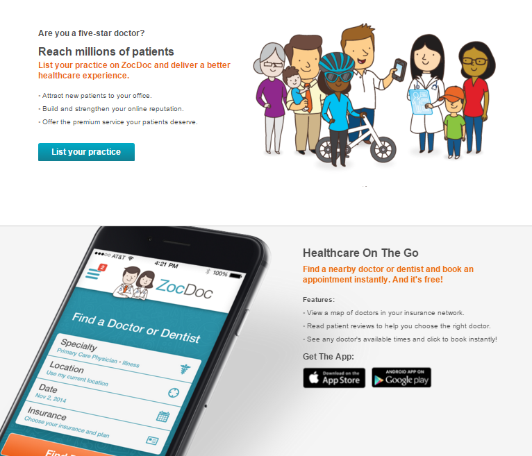
ZocDoc is by far a refreshingly simple website that I have seen in quite a while. Without fancy background and alluring graphics, they manage to capture the user’s interest immediately. In fact, the minimalistic design actually helps draw attention to their lead capture form – the form having the boldest colour on the page.
Well positioned headline right on the capture form keeps your attention tied to it. They also focus on the user – his requirements [Find a doctor YOU like, Get the care YOU need”], making it further appealing to the prospect. Had they worded it like : For finding the best doctor and getting needed care, it might not have worked so well.
Also, I am sure you noticed the “It’s Free” tag on top of the form. That my friend is very strategic positioning – one more reason to encourage conversion. It’s in the little things..
Having a testimonial right next to the lead capture form boosts the trust factor. It makes the prospect much more amenable to conversion.
Below the fold
I am sure that you know by now that I am not a fan of those who don’t respect the fold line. I am happy to say that this website does respect it!
Scrolling down is rather an interesting experience. It alternatively projects the uses of ZocDoc for both doctors and patients respectively.
When I say alternate, it encompasses their message (first to doctors, then to patients) then the background colour scheme (blank and light blue) and finally the text – image alignment. Well done people! Consistency just reached new heights.
The whole website has been built for the primary objective getting the value proposition across. Which is why the navigation tool bar with the nitty gritties like “About us” and “FAQs” have been delegated to the bottom of the page.
I personally applaud this decision. Being an impatient visitor myself, I know that I would have easily been side tracked by these numerous details. Keeping my attention solely on the conversion form and their value proposition has much better chance of me converting.
Well, that’s that people! Hope you agree with my list.
Do tell me what you think are the ones that should go on this list. Am all ears (or eyes).

Enter your details and we'll send you a quick confirmation email to verify your address.


 How to Crack Hyperlocal Marketing for Your Fitness Business