


EDUCATION
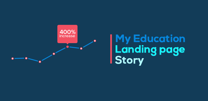
How I Increased Education Landing Page Signups by 400%
Contents
In 2014, I met Tapan Rayguru, who was the director of Sunstone Business School at the time, to talk about the landing pages they were using for their distant MBA courses. I was expecting a beer in the evening, but it turned out to be tea in the morning.
It was my first client meeting. I was confident, over confident to be true. As we met in his luxurious bungalow located in Whitefield, Bangalore, he started to tell me about the campaign. I listened patiently, but being a full-time graphic designer I was thinking only about look and feel, and nothing beyond that.
Coming back to the actual problem, they were targeting working people on LinkedIn: 25 to 35-year-old techies who wanted to see themselves as managers. The idea was for them to come to this landing page after clicking an ad. They wanted LeadSquared’s help in getting the most out of these landing page visits, in other words to improve their conversion rates.
It was a success! Data said that the conversions went up from 4% to 16%. That, right there, is a 400% increase in conversion rates.
This gave a boost to my ego, which eventually turned out to be false. We will talk about that as we go deeper, but for now, let’s focus on the landing page.
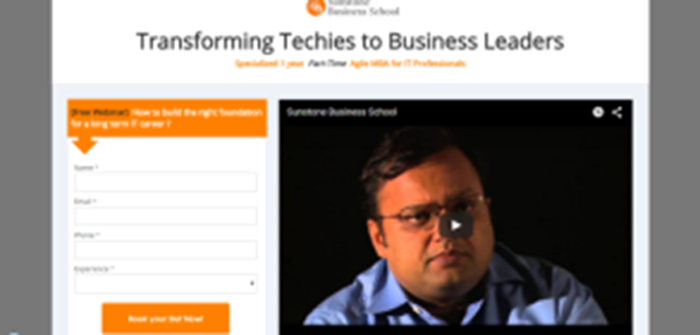
This is what their landing page looked like. (I am sorry about the bad image quality. I don’t have access to the original links or the snapshots right now)

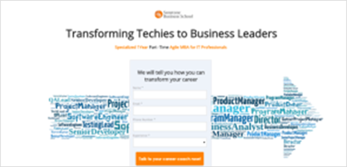
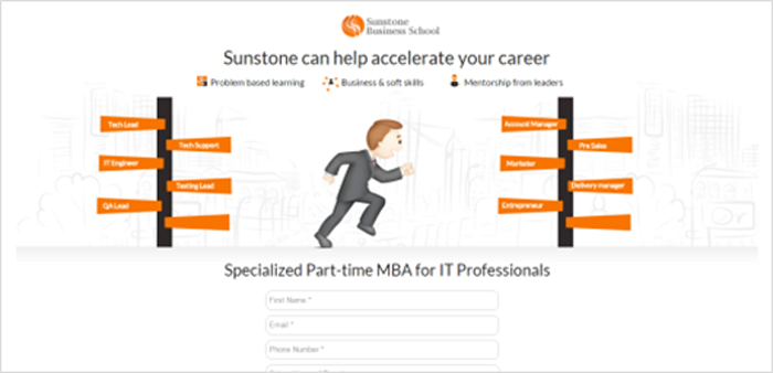
We tried 7 variations of the same landing page. Take a look:


Any guesses who the winner may be?
Well, It was #1
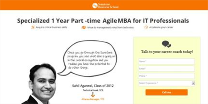
This was the first one I made for them, and it remained unbeaten over the course of a month. Here are some reasons that I think could explain why this particular version was so successful.
Relevance – We tried images, videos, visual cues, contrasting forms, but nothing worked as well as this. That is because the brand is being promoted by someone they can relate to. This was another fellow student with similar aspirations who says that he went from a tech lead to a product manager in 2 years.
That struck a chord and was the main reason why more visitors filled up the form than they usually would.
Trust – Testimonials, third-party validations, ratings are proof that you are at the right place. There were multiple testimonials that were arranged in a slideshow of sorts, as you can see below.
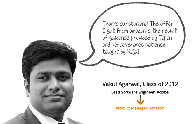
Again, I apologize for the bad image quality, but on the landing page, this looked quite good. Maybe the transition of image helped in capturing attention, and the trust and relevance converted the attention into action (filling up the form).
Clear cut and actionable offer – “Talk to your career coach today”. This offer was also used on most of the other variations so I can not confidently say that this was a distinguishing factor. But still, I’d like to highlight how the offer was pushing the visitor to take an action. I mean a serious prospect would definitely be tempted.
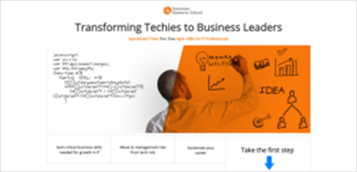
The look and feel – When I made these landing pages, I thought that the look and feel of the page was the design. But it really isn’t. It is just one aspect of the design. Now I know design is about clear communication, not just the look and feel. It was simple enough that it enabled the visitor to understand what Sunstone wanted to say, without much trouble.
Icons – The long paragraphs, the highlights of the MBA course were broken down and presented with the help of icons. That helped us in eliminating the clutter on the page, break the wall of words and gave the visitor much less information to process.
Now coming back to the original claim of 400% increase in conversion rate. The title of the post is not intended as click bait, however, in retrospect, I am not very convinced. Mainly because the page was not tested for a longer duration of time. I followed up with them after 1000 clicks. Though this is substantial data, it is not very conclusive. Ideally, I should have followed up after a month for me to be certain.
The second reason I am refraining from calling this as 100% accurate is because it wasn’t tested parallelly. The pages were a series of experiments. You can’t really prove how conclusive your findings are until you test your pages simultaneously. This eliminates the effect of particular hours, days and weeks. That is how A/B testing works. And that is what I didn’t do.
The third conflict was that we did not test different elements separately. This way we couldn’t figure out which factors were the actual cause of the hike. As much as I, or anyone for that matter, brag about the role of testimonials, contrast or icons, it needs to be proved beyond doubt. Testing multiple elements of a page is multivariate testing. Something else that I did not do.
Also, check these 14 Higher Education Marketing Strategies shared by industry leaders.
Many of us place a lot of value on our hunches. After all, It is too much work to test each element of a landing page in parallel. But that’s the only way to draw solid conclusions. Trust me, when I say that you may end up finding something quite contradictory to what you believed. Let me throw in a quote by Flint McGlaughlin for added effect,
“There are no expert marketers, just experienced marketers, and expert testers.”
I would like to conclude by saying that conversion optimization is a process, not an act. You need time, patience and clicks to confirm how successful you are.
There is just no other way around!
What has been your experience with landing pages so far? Let’s talk in the comments. And, if you are looking for a student acquisition software, you can check it out here
Enter your details and we'll send you a quick confirmation email to verify your address.


 Marketing Vs Sales – The Blame Game