Webinars have been a driving factor for lead generation at LeadSquared. In the last 3 years, we have experimented and tried different things to up our webinar registrations. Some worked. Some didn’t. But we have finally got it right!
Last month, 6% of our revenue came in from the leads we’d captured from our webinars. On an average, each new webinar session gets us around 80 unique leads and a 40% hike in prospect engagement!
So how to set up a webinar that actually generates leads for your business?

While our webinars do well today, that wasn’t always the case. Not very long ago, we were struggling to increase our registrations, which had been stagnating between 200 to 250 for a while. This prompted us to re-invent our webinar strategy, piece by piece. And today, after months of continuous experiments, our registrations have shot up by 300%! Here are some of the hands-on insights we picked along the way :-
Make the right ‘first impression’
We send our webinar emails to a list of ~25K people, all of whom have previously expressed interest in our content. Despite the volume, and the fact that these are relatively ‘warm’ leads, our open rates used to average a dismal 14% earlier. Here’s the subject we used for an older webinar on Google AdWords :-
[Free Webinar] Optimizing Google AdWords Campaigns
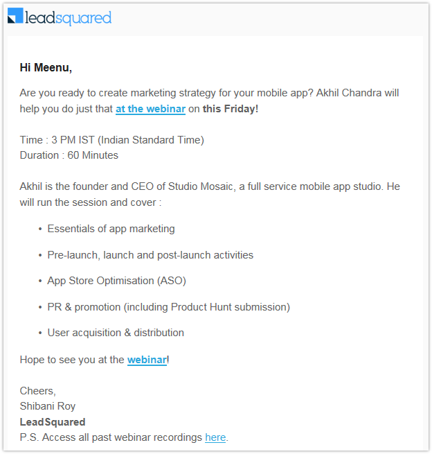
Here’s the subject we used for another webinar that we did a couple of weeks back, on the same topic :-
You’re invited: Master Class on Google AdWords!
And this subject line got us an open rate of 18.6%! Let’s see why that 33% jump in opens happened: –
- Earlier, we had a clear-cut format for our subject lines, that is, the term ‘[Free Webinar]’, followed by <Topic>. We thought this consistency would make it easier for our regular attendees to spot our mails in a sea of others. But here’s the thing – people who didn’t attend our webinars were using these familiar subject lines to identify (and ignore) our emails. That is why we started changing the subject line for each email. This helped us deflect from the ‘pattern’, brought in an element of surprise to our mails, and hence, saved them from getting trashed on first look!
- Many people do not know exactly what a webinar is (we’ve had some people enquiring about the venue!). Others think it is too much of a hassle to attend. In general, the word ‘webinar’ seems to have a connotation of complexity associated with it. Hence, we started using alternative terms instead. For our last email, we used the phrase ‘Master Class’– which is easy to understand and sounds substantially more value-packed.
- We used to preface our subject lines with the words ‘[Free Webinar]’. That made the email sound like an impersonal company announcement. Besides, the word ‘free’ has been hackneyed to death, particularly in promotional emails. Replacing it with ‘You’re invited!’ has helped us personalize the subject line and lent an element of exclusivity to the event.
Tell a story in your emails
Earlier, our click rates used to be quite poor (ranging from 0.8 to 1%)This was a clear sign that something was wrong with the emails we were sending across :-

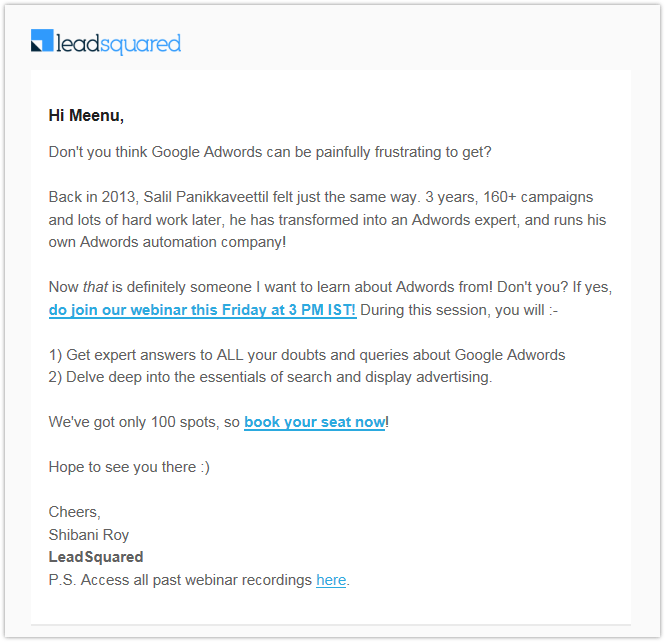
Things took a turn for the better when we decided to get a little more creative with our approach! Our click rates now average between 2.5-3%, almost three times the numbers we averaged before. Take a look at the last email we sent across, which had a click rate of 2.6%:

Let’s try to understand why emails of this kind have worked better for us than the previous ones :-
- Knowing how people dislike promotional emails (particularly if it’s long), we’d always been sticklers for brevity. What we did not realize was, that in an effort to keep our message as short as possible, we were being abrupt, boring, and information-loaded. We started adding a story at the beginning of our emails (for instance, in the last one, we discuss how our guest presenter became an AdWords expert). Additionally, we made attempts to personalize the emails and build a sense of oneness with the reader (refer: ‘Now that is someone I’d like to learn about AdWords from! Won’t you?’).
- Secondly, we did away with the descriptive takeaways – they took up too much space, and resulted in repetition, because they would appear on the landing page anyway. Also, we realized we weren’t highlighting an important segment of our webinars – the 30-minute Q&A session that followed the speaker’s presentation. So, we began to highlight the Q&A sessions as the key takeaway from our webinars, in order to widen their appeal. For example, in the last webinar email, if we simply highlighted the AdWords related topics that our speaker would cover, there would have been no incentive for people already well-versed with those topics, to sign up. But, almost everyone has specific doubts and confusions relating to AdWords, so by not restricting ourselves to particular sub-topics within AdWords, we made the session sound appealing to a significantly larger audience.
- Finally, we started adding a line about ‘only 100 spots available’ in the emails. This creates a sense of urgency and strengthens the CTA. Besides, it conveys an impression of exclusivity, which in turn makes people more likely to think of the webinars as high-quality content.
Make signing-up as easy as possible
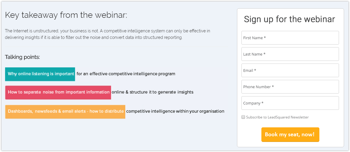
Earlier, our webinar landing pages had a conversion rate of 45% on average, but we realized that for as valuable a resource as a free webinar, this rate could have been higher. Here’s how our older landing pages looked:-

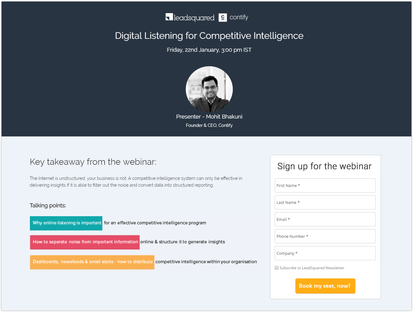
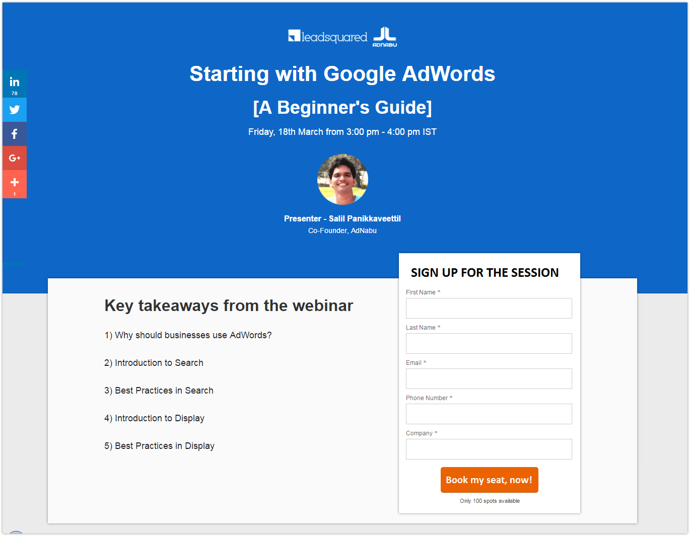
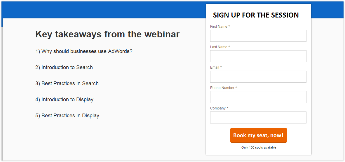
Here’s a snap of the landing page we used for the last webinar :-

Using this format for our landing pages has helped us up our conversions up to 65%. The one shown above has been our most high-performing webinar landing page so far. Let’s understand why :-
- Firstly, our new landing pages are more focused on conversion. In the previous landing pages, the takeaways were highlighted in multiple bright colours, which took our visitor’s attention away from the call to action. In the new versions, we removed all conflicting colours, and also made the main form pop out.

In this landing page, the attention ratio is 1:4, that is, there are 4 elements that can capture the attention of the visitor and 1 of them is the call to action.

In this landing page, the attention ratio is 1:1, that is, there is only one element that captures the attention of the visitor, and that is the call to action.
- Secondly, in the new landing pages, we use a brighter blue colour, which is more pleasant and captivating than the previous one. It also provides more contrast to the landing page, which helps retain the visitor’s attention for a longer period of time. Besides, in the new landing page, we use the Arial font, which is more readable than the previously used Raleway.
- Also, we now put a line about ‘100 spots available’ below the ‘Book my spot’ button. This creates a sense of urgency and leads to more conversion. While we already mention this line in the email, it is important to add it on the landing page as well, as a few of the visitors come from our social networks or from the top-bar on the website.
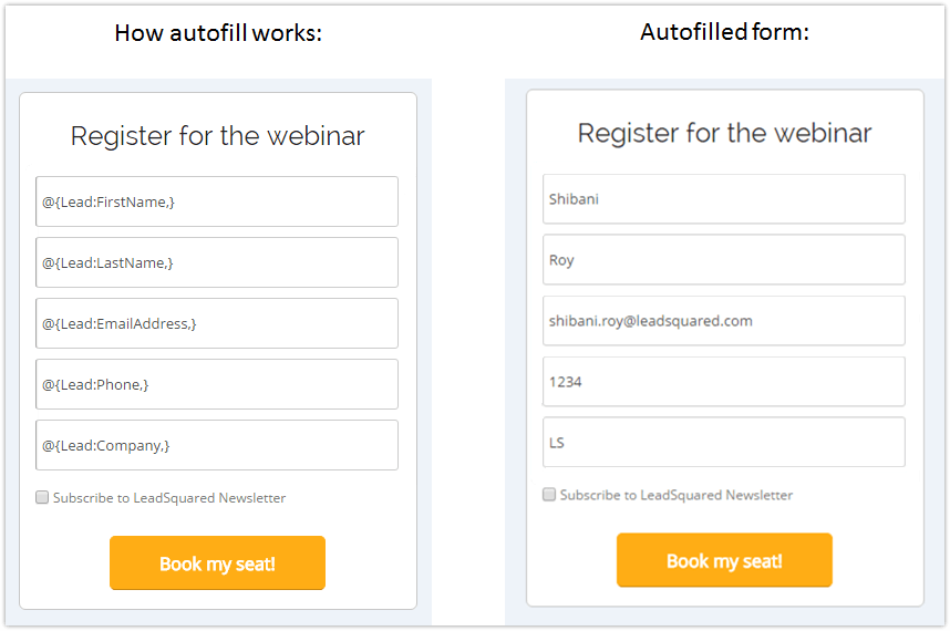
- Fourthly, we’ve begun to use auto-fill on the landing page.

This makes signing up an easy, one-click process for those who are already captured as leads in our system, so that they do not have to fill out the same details repeatedly. By doing so, the percentage of registrants actually attending the webinar has gone up by in general. Having compared that number to those shared in this 2016 Webinar Benchmark Report, I don’t think that’s not bad at all.
- Finally, we’ve begun to add social sharing buttons on our landing page. Our landing pages get shared 50-70 times because of these, and while this doesn’t improve conversion, it does lead to more unique traffic and registrations!
Because of all of these changes, our last webinar recorded 720 registrations, which is almost 3X the numbers we used to manage previously!
I hope you find some value in our learnings and I hope it helps you improve your webinar conversions.


 How to Improve Customer Experience with Marketing Automation?