


MARKETING
Landing Page Optimization
Contents
Landing page optimization means constantly improving the landing page for conversions. It is usually done by improving design, copy or adding psychological triggers to the landing page, which will prompt the visitors to fill the form on the page.
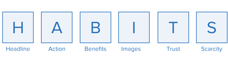
After many hit and trials, I identified a formula to make sure I do not miss any important element on the landing page. It is called “HABITS.” You won’t ever fail in getting conversions, if you have all these elements correctly on the page.

On the average, five times as many people read the headline as read the body copy. When you have written your headline, you have spent eighty cents out of your dollar.
David Ogilvy, Hailed as the Father of Advertising
Studies reveal that you have about 2 seconds to attract a visitor’s attention, and headline is usually the first thing they see. Imagine yourself as a salesman at the prospects’ door and you have just one line to say before they slam the door on your face. That’s your headline.
Let’s take an example : You are selling travel packages for Ladakh on your landing page –

A. Book 5d/4n package in Ladakh (What’s the benefit) ![]()
B. Enjoy a great stay at Ladakh (No Clarity) ![]()
C. The best Ladakh packages (Not believable) ![]()
D. Book 5d/4n of bliss in Ladakh, starting at Rs. 20,000 ![]()

D is a better headline compared to others because
a) Positive emotional trigger – Bliss
b) Clarity – 5d/4n and Rs. 20,000
c) Believable – No hyperbole of “best” or “greatest” – it is easy to believe and act upon

a) Join the #1 MBA Institute in India (Not believable) ![]()
b) Join our MBA program today (Lacks benefit) ![]()
c) Get ahead in your career with flexible MBA program ![]()
C is a better headline because
a) Positive emotional trigger– Get ahead in your career
b) Benefit – The course is flexible
c) Believable – It doesn’t have superlatives like best, amazing and #1.
Action, Call to Action or in plain terms, a button on a landing page is meant to provoke an action from the audience.
Call now, click here, download it now, share this are typical examples of calls to action found on a landing page.
What’s the ultimate goal of your landing page? To encourage the visitor to take an action, right. It is what you want your visitors to do in response to your offer. Consider your form to be a mini landing page which has the capability of converting even if everything else is removed from the landing page. Like the example below:

Like the headline, your call to action should be clear, benefit oriented and action centric. It should evoke an action from the visitor, because this is what you want your visitors to not miss. Below are some tips for an effective call to action:
Your call to action should be visually contrasting to the other elements on the page. For this, you can do the very popular squint test.
Stand a little further away from the monitor and squint your eyes. Do you still see the call to action button clearly?
Check out the images below to understand this:

and then, these:

The second set of images fails the test, as the call to action is not distinctly visible after blurring (squinting the eyes). You can use the color wheel to make the choice of colors. Choosing the opposite colors in the color wheel gives a good contrast most of the times.

Note – Don’t get me wrong. The color itself will not make your button gets clicked. It’s what written on the button (your offer) what matters the most. The aim of the color here is to highlight the offer.
Keeping the CTA above the fold increases its chances of getting clicked. If your page is long, repeat the CTA below the fold as well.


The first landing page has a better chance of converting because the viewer can see what is expected of him (or what he wants to see) without making the effort of scrolling down.
Colors deliver information really quickly . They can also change the meaning of the message, influencing the buyer’s decision. For example, we see red at a traffic signal and we stop. We see green and we feel we are good to go. We perceive color before we absorb any other form of information.
Check out the ads below. I have changed the color tones of the McDonald’s banner ads

You will notice that each of them is highly saturated (with bright colors) and catches attention. But, something looks wrong in the altered colors, because it fails to evoke the right type of emotion.
The green banner makes the burger look like a vegetarian one.
The Blue banner gives the perception that the burger would be cold.
The red fits just right.
You might have noticed that most of the fast food chains use the color red. It’s because the color increases heartbeat, and is proved to increase hunger.
But remember all of this will not work, unless your offer is great as well.
A man who goes into a hardware store to buy a Quarter-inch drill bit does not need a quarter-inch drill bit – he needs a quarter-inch hole ”
Unknown
People do not buy medicine, they buy relief from pain.
This is the classical marketing battle between features and benefits. Feature is a specification or technical information, while benefit is the end result a visitor or a consumer is after.
Let’s take a great example from “The copywriter’s handbook” by Robert W. Bly

How would you describe this pencil?
Feature – Yellow exterior
Benefit – Bright, attractive exterior—stands out in a pencil holder or desk drawer
Feature – Pencil is 7½ inches long.
Benefit – 7½-inch graphite core ensures long writing life.
See how beautifully the features are flipped into benefits. That is what we get to do on our landing pages. Benefits stick in the mind of the visitors because that is what they want. Who cares about the color and dimension. People want attractive and long lasting pencils.
We worked with REMtech (a LeadSquared client, and a leader in engineering education segment in India), to create a landing page for PPC just before the UPSEE counselling. They took a different approach than the usual “Take admission with us” or “Come to our booth” which most colleges do. As a result, they received more student inquiries than ever.

“It worked. Instead of yelling “take admission in our college” we actually provided useful advice to the students. The campaign was a success & we got many calls. Cannot tell you the numbers, but they were more than ever.”
 Naman Jain, Vice Secretary – REMTech
The ability to draw and communicate visually can no longer can be seen as optional.
First rule: Never place an image on the landing page just for the heck of it. Use it only if it helps a visitor understand your offer in a better way.
Case in point – this test that we ran on our homepage, using 2 variations that had images as the background, and 1 variation without an image.


We were surprised when the version without a background image (solid color) got the most conversions (22% more than the two versions with the image). The possible reason could be that the page loaded faster, and the plain background made it easier for visitors to read the content (we had used dynamically changing text, making readability very important).
So, as important as images are, this example shows that sometimes you are better off without them.
We tested two landing page versions for our “lead management” ad.

and this one

Result: The second landing page converted 50% more than the first.
Humans have a low attention span, even lower than gold fish at the moment. The image on the page explains the product very clearly. It it processed way faster than the huge chunk of content that appears on the first version of the landing page.
That said, it doesn’t mean any random image would convert better. It has to be super relevant, and be powerful enough to replace the complete explanatory text.
Do not use studio-like fake stock images. Everybody knows that’s not you. Try to use real images (if possible); if not, use a believable looking stock photo, or just keep it plain if you can’t find one.
Most people say that Shakespeare rocked merely because most people say that Shakespeare rocked.
Trust here refers to social acceptance and proof. People turn to peers or a trusted authority when in doubt.
Following trends, scanning reviews before going to movie, asking your friends which car to buy are some of the everyday examples.
Reviews, Testimonials, Certifications, Awards, Recognition are trust elements which provide credibility to the offer on your landing page.

On the other hand, negative social proof can be devastating for your business. How many times you have booked the hotel without reading the reviews on portals like Trip Advisor? And how many times you have been turned off by negative customer reviews?
Sunstone (one of LeadSquared’s clients in Education Segment) was struggling with low conversions on their landing pages. They wanted to capture interested students as leads from social media channels. We tried 7 different variations of landing pages.

Here’s the winning variation:

The conversion rate of this landing page was 18%, which was way more than any other variation. The reason was Trust. The prospects were students, and trusted the testimony of fellow students. The role transformation highlighted in the testimonials enticed them, and encouraged them to check the course out, prompting more form fills.
Without a sense of urgency, desire loses its value.
Limited offer, Till stocks last, Limited Time are some examples of scarcity (urgency).
You might not use this element always on your page. But, when you have a “limited time offer,” or a product that you can regularly create scarce offers around, it would work wonders, (if it seems genuine).
For example:

See how Neil Patel, founder of Kissmetrics uses it

Peep Laja from Conversion Xl says urgency works for him the best

Now, let me show you an example of scarcity that we used on our webinar landing pages.
These were the 2 versions that were tested against each other – it was for the same webinar, and everything else on the pages was kept identical, except in version B, there was text that said “Only 100 spots available” just under the form CTA.

The conversion rate for version A (without the scarcity text) was 47.6%, and the conversion rate for version B (with the scarcity text) was 57%. This is a 19.75% increase, which is pretty good for such a small change.
So, try and test the element of scarcity on your landing page, if possible. There are good chances that you’d be able to increase the conversions on the page.
[Also read: How we increased conversions by 39% with these landing page design hacks?]
Landing page optimization is really a never-ending process, that entails continuous experimentation. The underlying principle is the popular thought “if you are not (testing and) failing, you are not learning anything new.”
However, before you test, you should know the 6 essential elements that should be a part of all your landing pages. The elements that we call HABITS. Because knowing them would help you test just the right things. To reiterate them:
a) Strike instant relevance with the Headline.
b) Encourage the visitors to act by using a powerful offer and Call To Action.
c) Connect with the visitors using Benefits instead of features.
d) Enhance the clarity of your concept with the right Image.
e) Reinforce action with Trust.
f) Make them act faster by adding Scarcity.
Below is an example of an conversion optimized landing page complete with all the elements of the HABITS framework:

This brings us to the end of Chapter 2 of the landing page guide. Now, let’s check out some great examples of the landing pages and why they work.


 Examples of high converting landing pages
 David Ogilvy, Hailed as the Father of Advertising
 Bette Fetter, Author, Being Visual
 Mokokoma Mokhonoana, Author- N for Nigger
 Jim Rohn, Entrepreneur and Motivational Speaker